The network for creativity
Join 1.25M professional creatives like you
Connect with clients, get discovered, and run your business 100% commission-free
Creatives on Contra have earned over $150M and we are just getting started
Back to feedPost

Published a new Contra project:
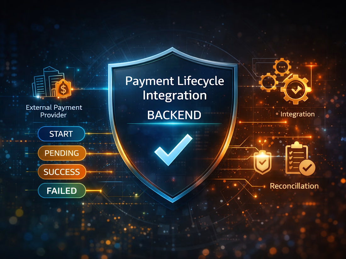
Payment Lifecycle Integration Backend
This project focuses on a backend problem I care about a lot:
how to keep an internal payment workflow correct when the external provider is asynchronous and outside your control.
The system models:
· explicit payment state transitions
· idempotent create requests
· webhook-driven updates
· audit logs
· reconciliation for recovery
Project link:

Interesting project. Payment workflows can get tricky, so this is a cool problem to tackle.
Exactly — the tricky part isn’t just calling the provider, but keeping the internal workflow correct when events are async and outside your control.
That’s a great point. Handling async events without breaking the internal workflow definitely makes things more complex.
Yeah, exactly. The hard part is handling async events without letting the internal workflow drift. And once it drifts, recovery adds another layer.

Engineering Team here !
Thanks! I really enjoyed designing the lifecycle and reconciliation parts of this one.
The network for creativity
Join 1.25M professional creatives like you
Connect with clients, get discovered, and run your business 100% commission-free
Creatives on Contra have earned over $150M and we are just getting started





Related posts

A recent SaaS website design project done for a modern healthcare platform.


love the project. honestly this is impressive

NetworkAI — AI-Powered Campus Network Monitoring System
A real-time network monitoring dashboard designed to help campus IT teams observe network health, monitor interfaces, and identify potential issues from a single interface.
What I built
Real-time network monitoring with live interface and system status
Network interface analytics showing traffic and connection activity
Historical monitoring data for analyzing network behavior over time
Live WebSocket communication for continuously updated monitoring data
Network controls to start and stop monitoring directly from the dashboard
Interactive charts and visualizations for easier interpretation of
network metrics
Responsive dashboard UI designed for clear monitoring rather than unnecessary complexity
FastAPI backend providing REST APIs and WebSocket communication
React frontend with a modern monitoring-focused interface
Why I built it
The goal was to create a practical campus network monitoring system that demonstrates how real-time networking data can be collected, processed, and presented through a modern web interface.


cool project bro. live data + history in one place is useful. how do you handle reconnecting when the websocket drops?

Honestly these colors 👍