The network for creativity
Join 1.25M professional creatives like you
Connect with clients, get discovered, and run your business 100% commission-free
Creatives on Contra have earned over $150M and we are just getting started
Back to feedPost


The network for creativity
Join 1.25M professional creatives like you
Connect with clients, get discovered, and run your business 100% commission-free
Creatives on Contra have earned over $150M and we are just getting started





Related posts

Two cuts of the same Outlier promo. 24 seconds each, one framed wide, one framed for the phone. 1 or 2. Why?🤔
8 voted
50%
8 voted
50%
16 votes
Closed

Going with 2. Most people will watch it on their phone anyway and the tighter framing feels punchier. 1 looks more cinematic though.

Meet Creative Square, a logo for university students. Same mark, two personalities: loud and energetic, or calm and editorial. Which one would you pick?
13 voted
48%
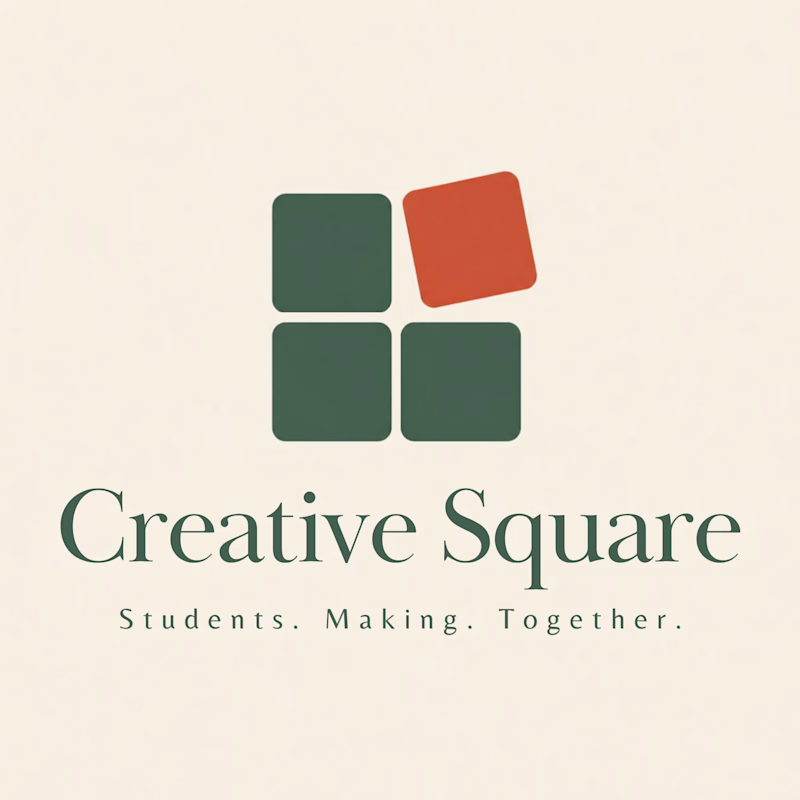
14 voted
52%
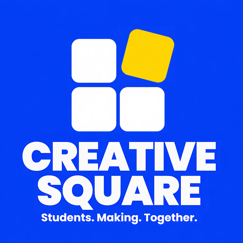
27 votes
Closed

The bold are so attractive that's incredible I choose it ❤️❤️

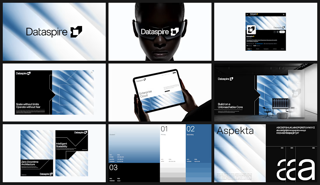


feels very sure of itself. i can picture this blown up on a conference stage