The network for creativity
Join 1.25M professional creatives like you
Connect with clients, get discovered, and run your business 100% commission-free
Creatives on Contra have earned over $150M and we are just getting started
Back to feedPost

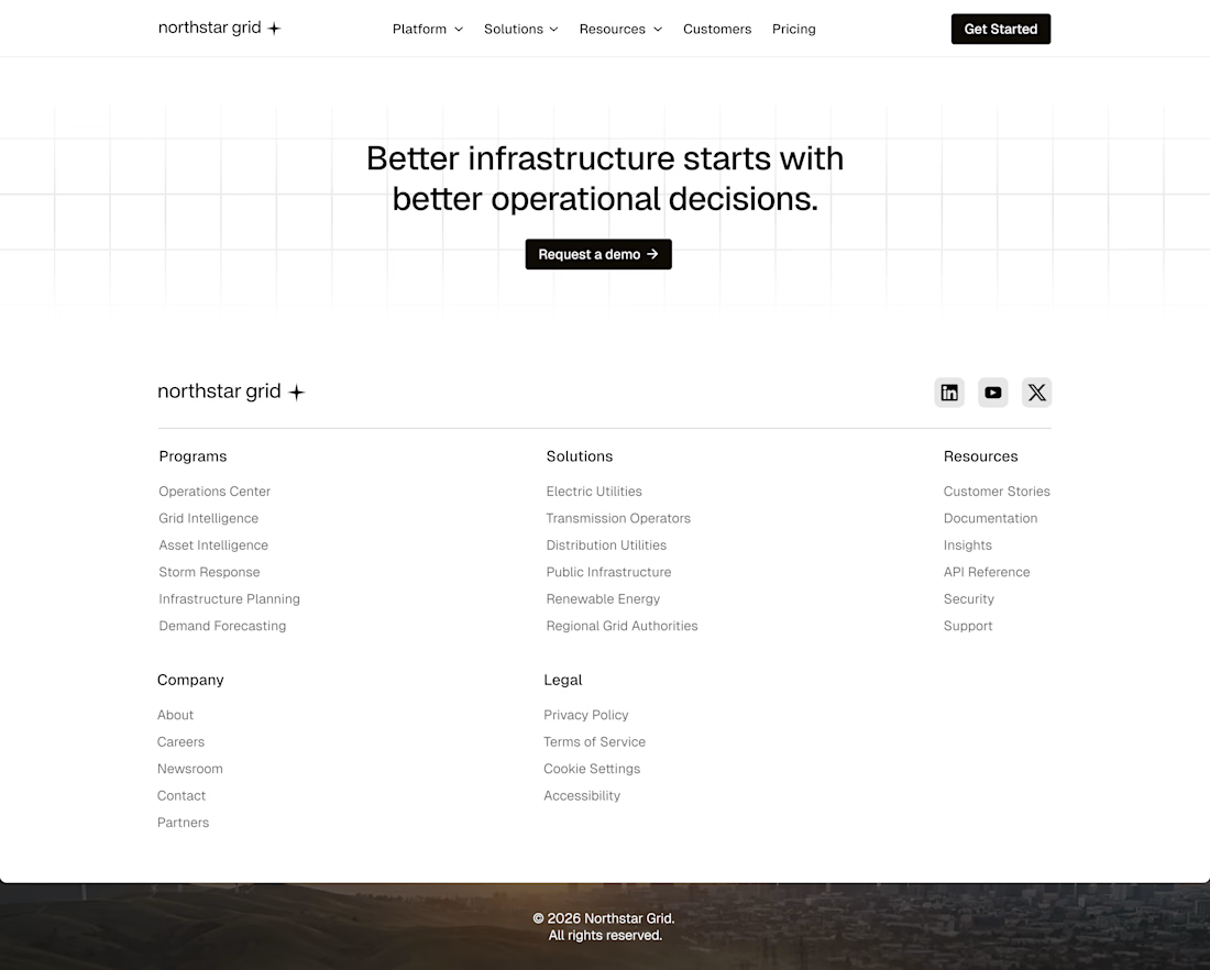
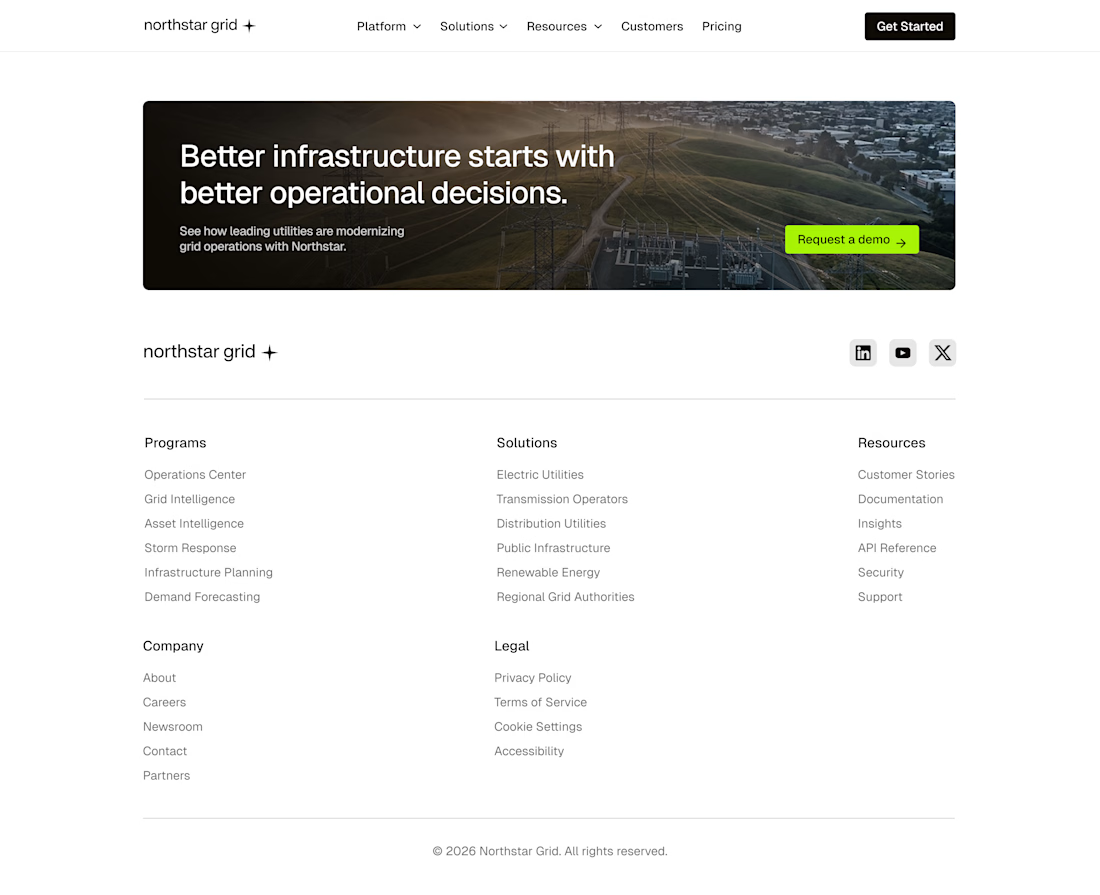
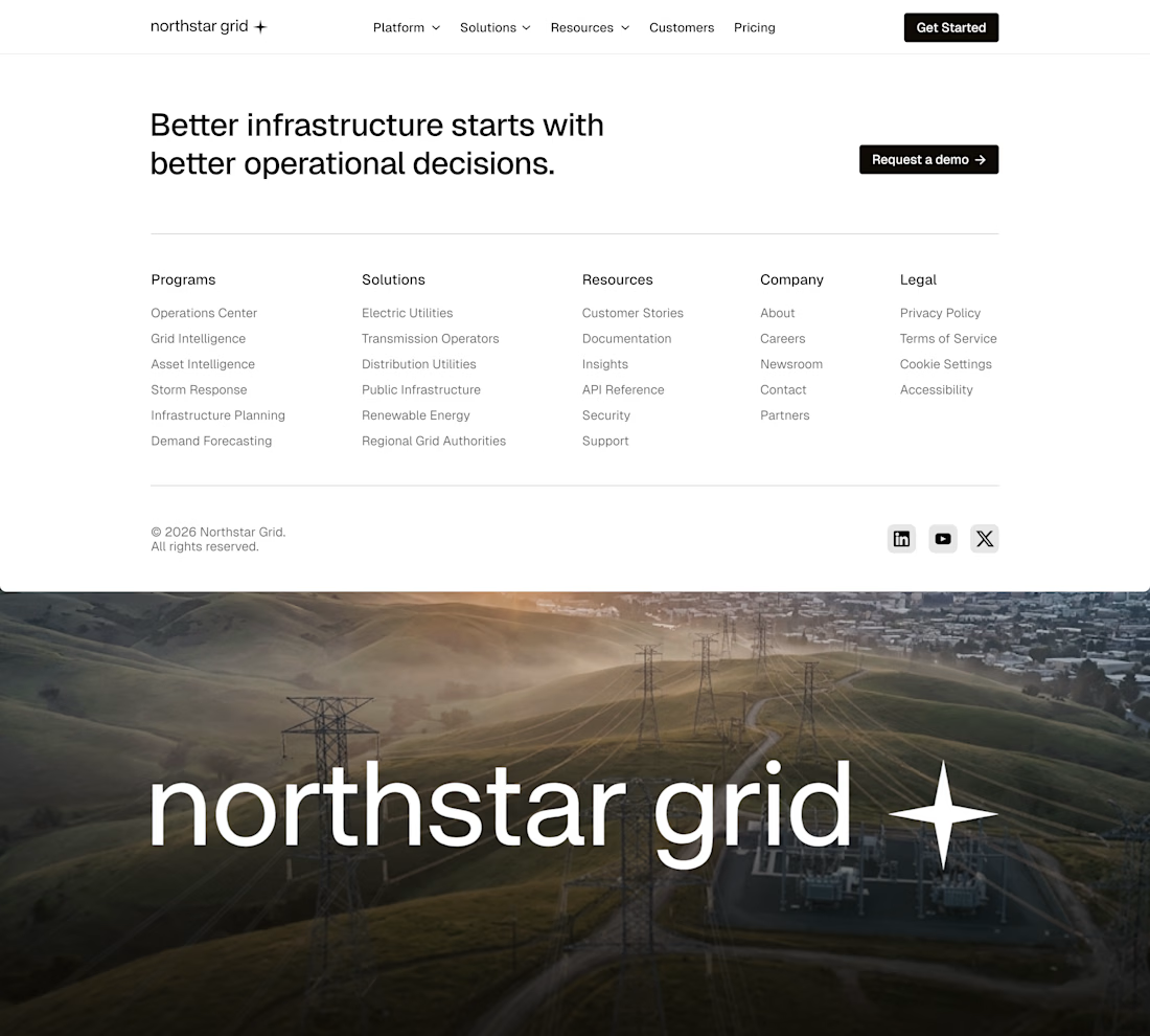
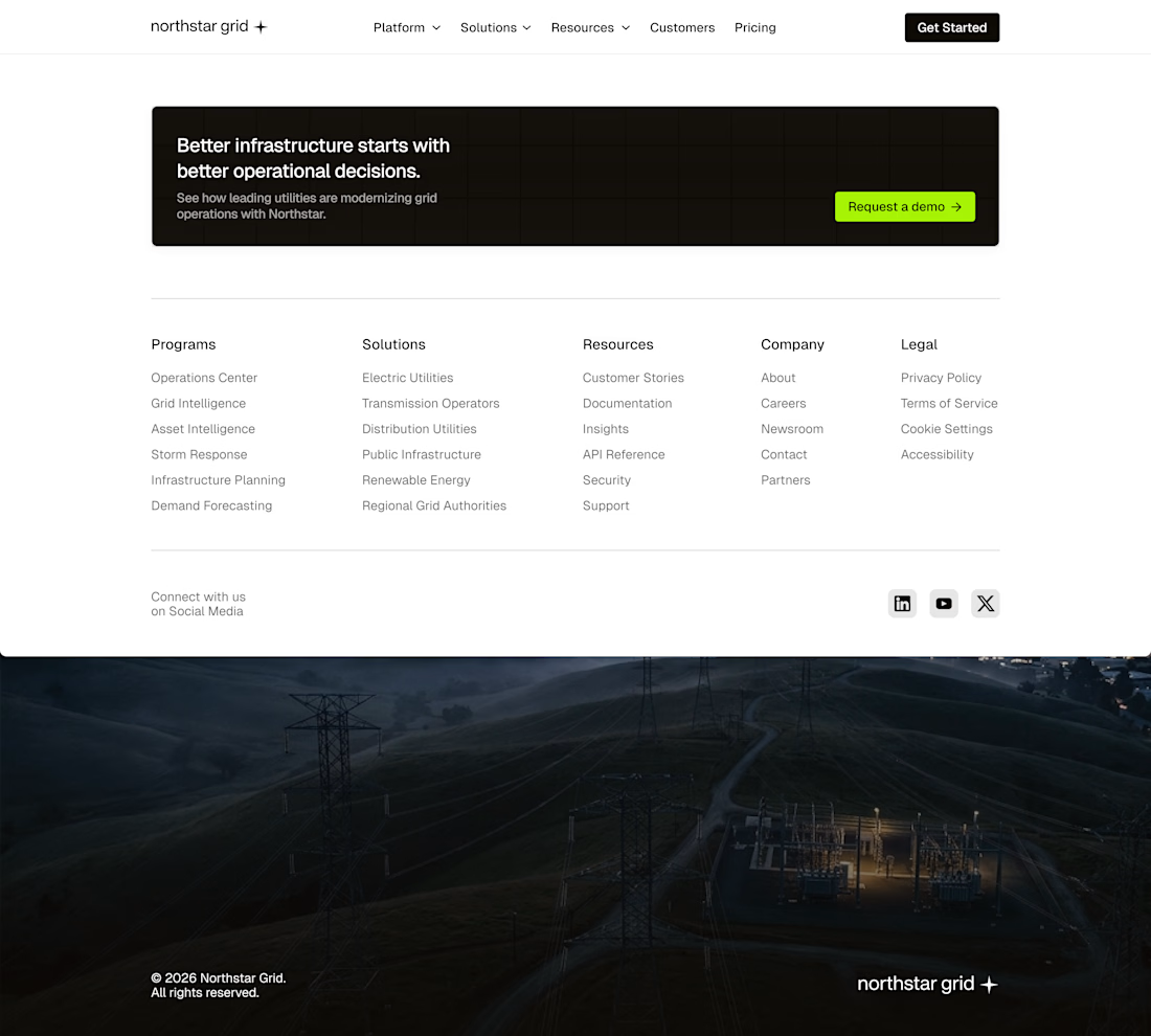
CTA + Footer Exploration
Exploring different approaches to the closing section of a Grid Intelligence Platform.
The goal was to create an ending that encourages action while providing a structured, easy-to-navigate footer for enterprise users. Each concept experiments with different ways of balancing conversion, navigation, and brand presence.
Which direction feels the strongest to you?


The network for creativity
Join 1.25M professional creatives like you
Connect with clients, get discovered, and run your business 100% commission-free
Creatives on Contra have earned over $150M and we are just getting started







Related posts

Recent work on MAE - Visual identity


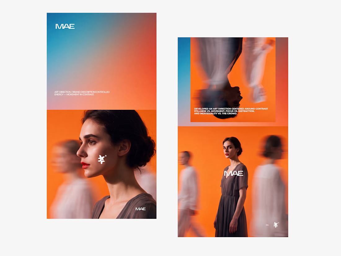

The motion blur on the figures gives the orange-to-blue gradient a reason to be there, and the small star mark stays readable on both the cheek and the shirt. Did the star come first as a standalone mark, or did it grow out of the photography direction?

What if your watch collection had a dashboard this luxurious?
Meet Chronova. Built for collectors who care about every detail.
Would you use this?

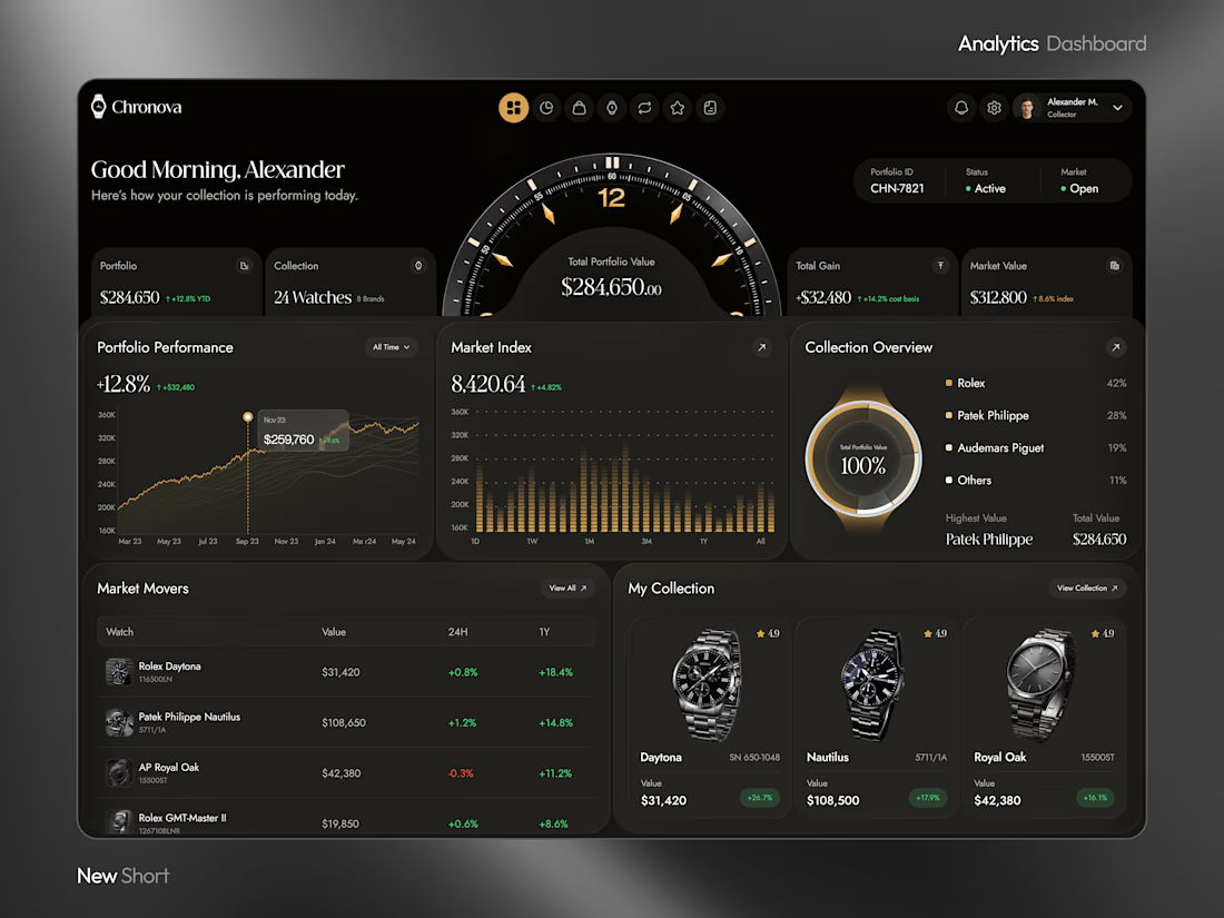

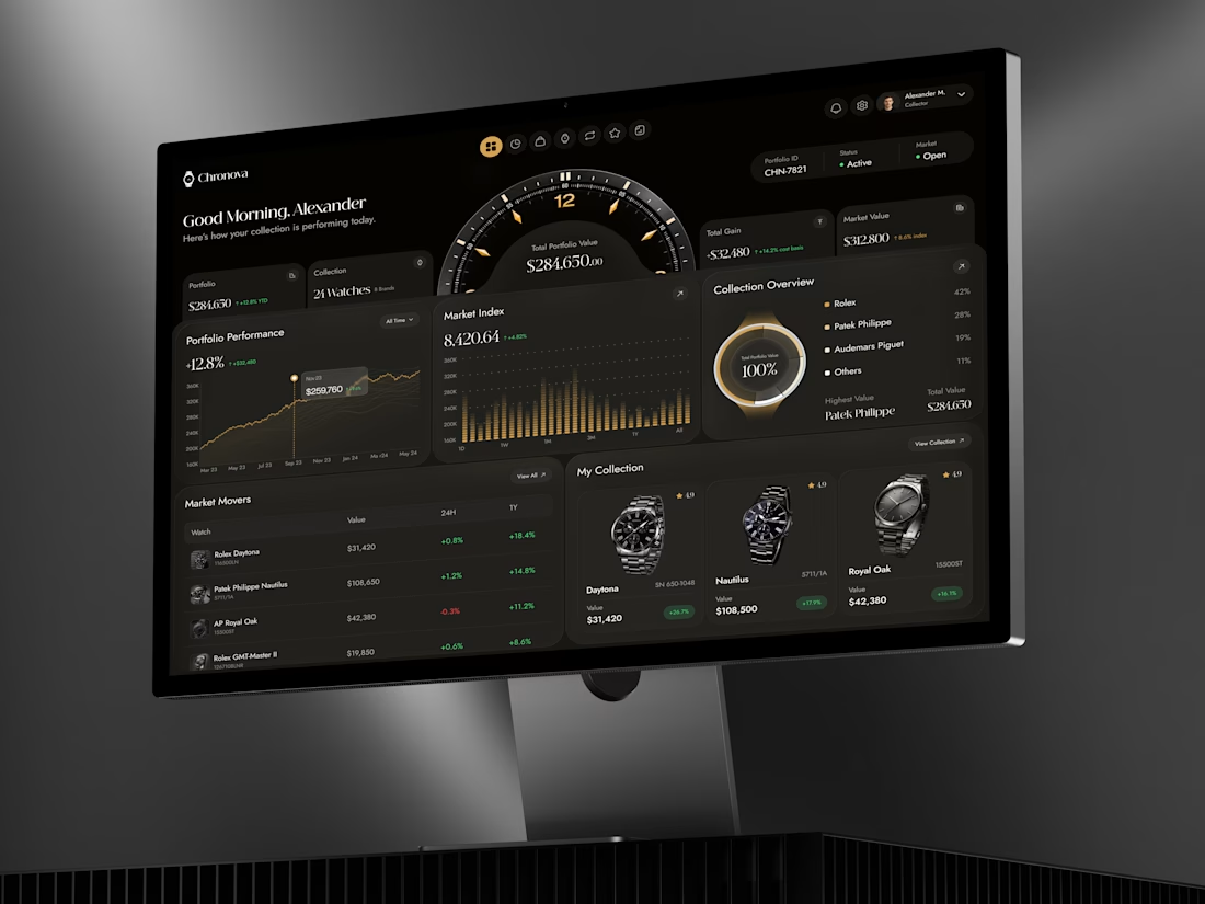

a dark dashboard makes sense here, the watches get to be the brightest thing on screen. how do you show a collection's value changing without it feeling like a trading app?

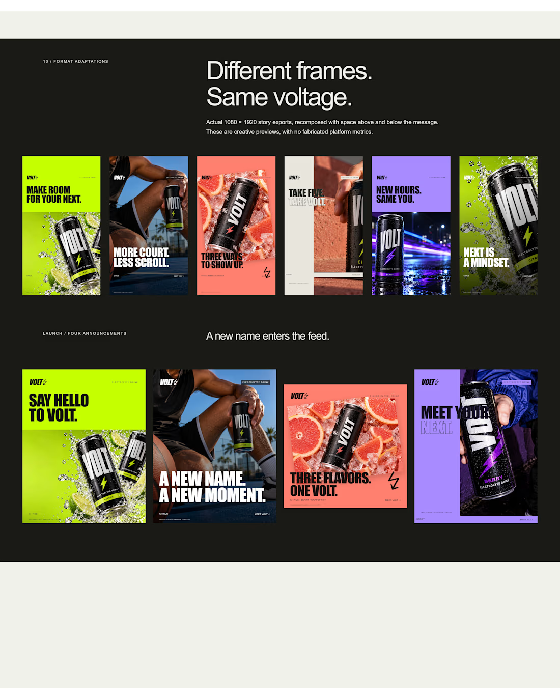
an electrolyte beverage campaign concept I created🚀👇
5 creatives. 20 static ads. One bold visual system built to stop the scroll.


This is genuinely creative! What I love most is how the design manages to stand out while still feeling intentional and well thought out. There’s something about the overall execution that naturally draws your attention and makes you want to take a closer look. It’s always...