The network for creativity
Join 1.25M professional creatives like you
Connect with clients, get discovered, and run your business 100% commission-free
Creatives on Contra have earned over $150M and we are just getting started
Back to feedPost
Taste Test

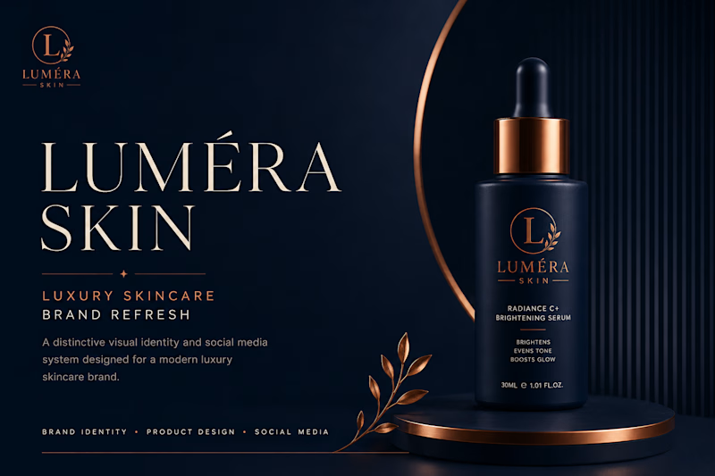
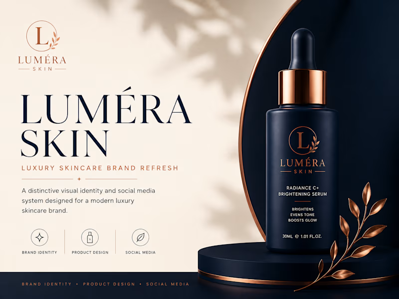
"Working on a luxury skincare brand refresh for Luméra Skin
I created two versions of this brand presentation and I need YOUR opinion!
Which one speaks luxury to you?
👆 Design A — Dark & Dramatic
👇 Design B — Warm & Sophisticated
Which one speaks to you? and tell me why?
2 voted
67%
1 voted
33%
3 votes
Closed
The network for creativity
Join 1.25M professional creatives like you
Connect with clients, get discovered, and run your business 100% commission-free
Creatives on Contra have earned over $150M and we are just getting started











Related posts

Same Design.com promo, two crops. Square keeps the desk tight, wide gives the room its light. 1 or 2.
11 voted
73%
4 voted
27%
15 votes
Closed


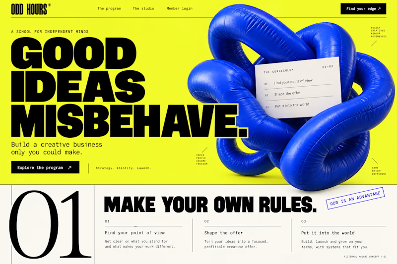
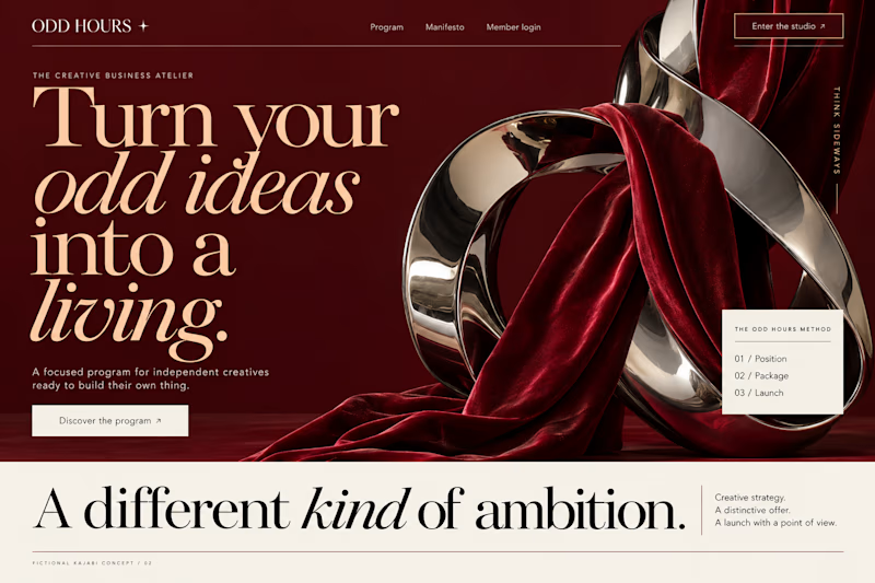
Which Kajabi direction would stop your scroll?
Meet ODD HOURS, a creative-business academy concept.
A / Acid Play: electric yellow, oversized type and a sculptural blue knot.
B / Velvet Rebellion: oxblood, chrome and velvet with fashion-editorial typography.
Two original AI-generated concepts. Same offer. Completely different energy.
Which one pulls you in, and why?

15 voted
65%
8 voted
35%
23 votes
Closed

It's only Acid Play it's unbelievable 🔥🔥🔥🔥
Great job Kraig🎉🎉

Hey everyone! 👋
Working on Cortiva, an AI-first hospital branding project.
I've already finalized the color direction, but I thought it would be fun to explore two different moods.
Option 01💚 or Option 02? 💜
Both have their own personality, and I'm curious to see which one you prefer!
Let's see which one wins! 👀
5 voted
33%
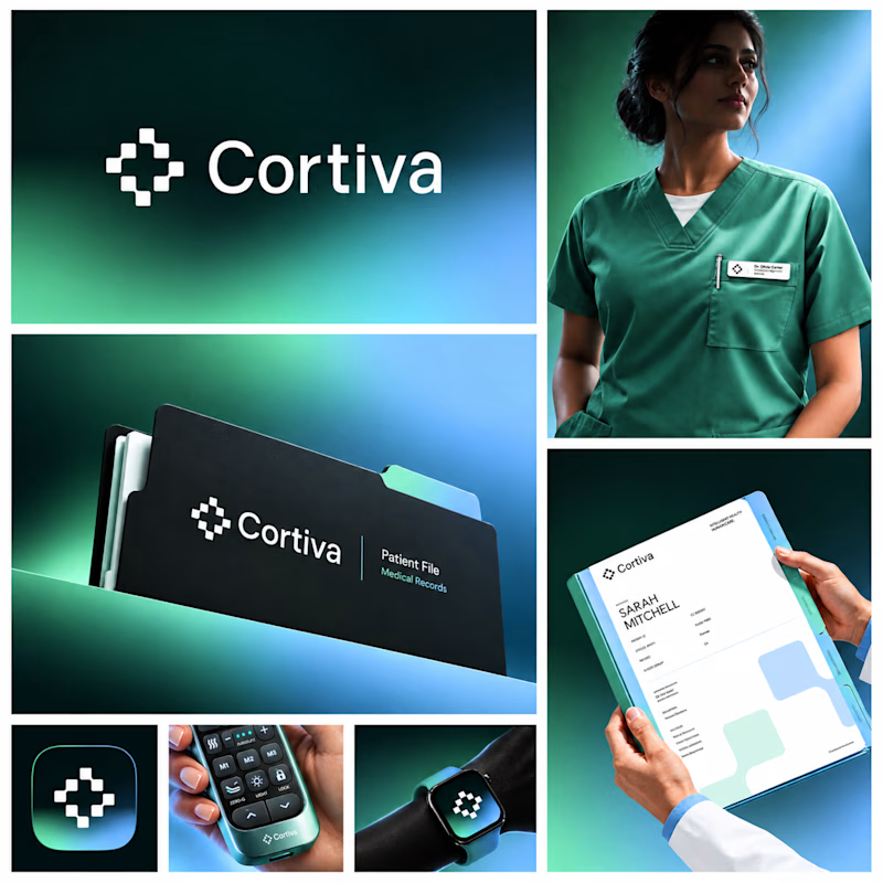
10 voted
67%
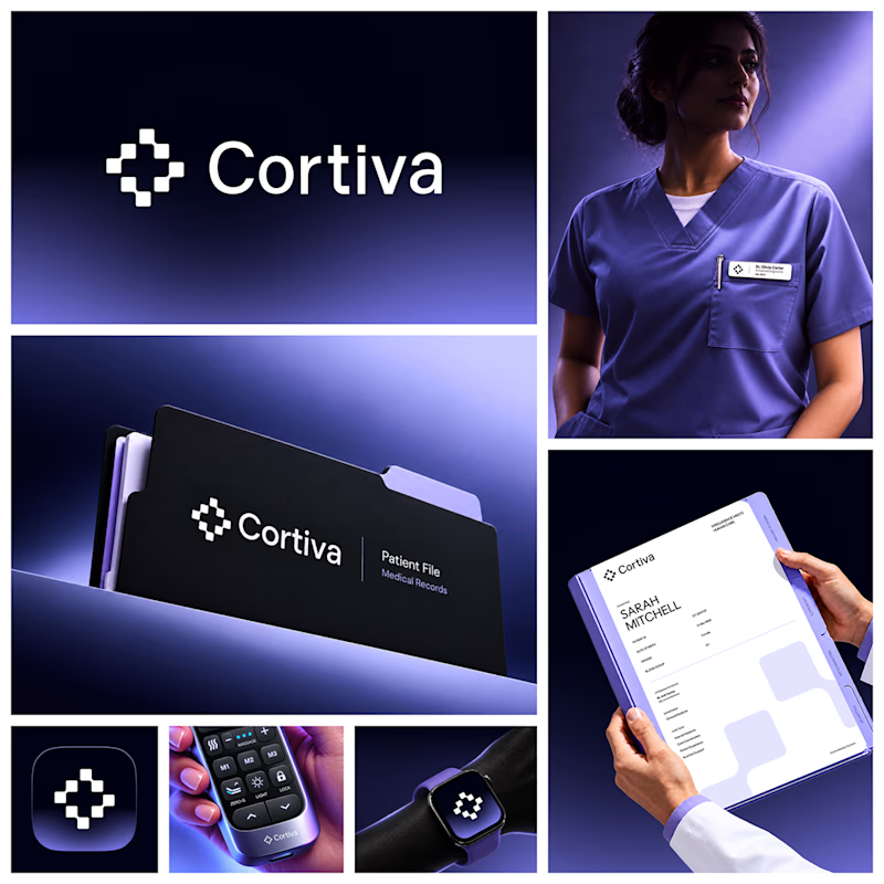
15 votes
Closed

Both directions are strong, but I'm leaning towards Option 01. The green feels instantly like "care" and trust, which is perfect for a hospital. Option 02 looks more techy and premium. Curious, which mood are you aiming for - clinical and calm, or friendly and modern?