The network for creativity
Join 1.25M professional creatives like you
Connect with clients, get discovered, and run your business 100% commission-free
Creatives on Contra have earned over $150M and we are just getting started
Back to feedPost
Taste Test
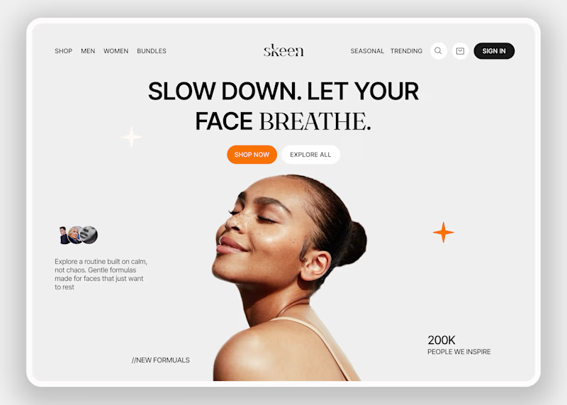
Skeen sells skincare online. People shopping for skin products are often unsure and overwhelmed by choices. The homepage has to make them relax first, and only then help them shop.
I kept the layout simple so the eye goes to one place and nothing fights for attention. Then I tested the mood with two backgrounds.
A is neutral grey, so nothing distracts from the product.
B is a warm peach that feels closer to skin and more caring.
Which one would make you trust a skincare brand more?

3 voted
33%
6 voted
67%

9 votes
Closed

Its a win for B

Thanks!The peach felt warmer and made the photo sit in the page instead of on top of it.

Great work, Seemak
Thanks

I really appreciate it.

On one will like normal bg in this context, B feels alive and actually grab focus ⭐

B - Gradient. The warm tone matches the "slow down and breathe" copy perfectly. A feels slightly too cold.
Thanks! Connecting the warm tone to the mood of the page is a useful point, and I'll keep it in mind.

Love the clean layout and soothing vibe! Option B (Gradient) looks really smooth!
Thanks

B – Gradient for me. 👌 The warm peach tone feels more welcoming and aligns beautifully with the skincare category. It creates a softer, more trustworthy first impression. ✨
The network for creativity
Join 1.25M professional creatives like you
Connect with clients, get discovered, and run your business 100% commission-free
Creatives on Contra have earned over $150M and we are just getting started











Related posts

Exploring two hero sections for Timmly 🛠️
A - split with the app
B - centered, just the words
Which one would you ship? 👀
Designed with Claude

6 voted
100%
0 voted
0%
6 votes
Closed

Ship A, Grima. The split with the app gives instant context: visitors see the product in action before they read a word. The centered version looks clean but the app screenshot sells it.

A little peek at the brand work we did for Elio Mortgage.
A warm, approachable identity full of warm vibrant colors paired with soft sun rising inspired gradients, inner glows and custom illustrations & more. Loved this direction!
Full case study coming soon, from process to final identity.
Plenty of logo explorations to share too!


That color palette takes the whole identity to a different level!! I loove it.

FOCUS — Creative Portfolio & Digital Art Website 🌸✨
A visually expressive website concept for a creative portfolio, built around digital art, bold imagery, and visual storytelling
The design combines vibrant pink tones, soft gradients, experimental typography, and immersive photography to create a distinctive editorial experience
Special attention was given to:
• Bold editorial hero composition
• Vibrant pink and dark color palette
• Experimental typography and visual details
• Immersive photography and digital artwork
• Creative project gallery and navigation
• Responsive mobile experience
• Clean layouts with a strong visual identity
The result is an expressive digital experience that puts creativity, emotion, and visual storytelling at the center of every screen 💗
Looking to create a standout portfolio or website for a creative brand? Let’s connect 🚀




