The network for creativity
Join 1.25M professional creatives like you
Connect with clients, get discovered, and run your business 100% commission-free
Creatives on Contra have earned over $150M and we are just getting started
Back to feedPost
Not everything needs to be made simple.
Some things just need to make sense.
That was my approach here.
The topic was complex,
AI-powered HR analytics.
The challenge was clear,
make complexity easy to follow.
Without losing credibility.
Without over-simplifying the message.
So I chose:
Editorial design.
Clear hierarchy.
Intentional spacing.
Easy visual flow.
The goal?
Don't remove the essence of the topic's complexity.
Remove the confusion.
That's exactly where it resonated with client's vision.
Here’s the full project 👇
https://www.behance.net/gallery/252369045/AI-Powered-HR-Analytics-Editorial-E-book
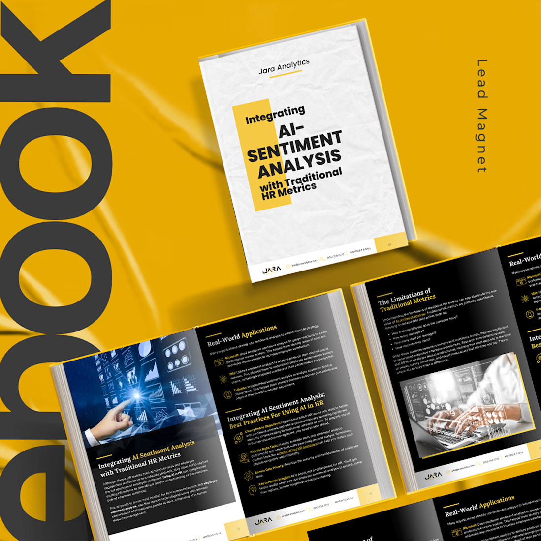

📌
That's what I like about editorial design.
It doesn't fight complexity.
It gives complexity a clear direction.
📌
Clarity doesn't mean removing the difficult parts.
It means helping people move through them.
📌Quick check:
Can your design handle complexity
without making the reader feel overwhelmed?
Yes or no?
📌
Be honest:
When a topic gets complex,
do you simplify the content…
or improve the structure?
The network for creativity
Join 1.25M professional creatives like you
Connect with clients, get discovered, and run your business 100% commission-free
Creatives on Contra have earned over $150M and we are just getting started





Related posts

Saint Laurent — Fashion E-commerce Exploration. Now bringing the full experience to life.
The complete landing page in motion, animated in Jitter. A little more rhythm and personality while keeping the editorial feel intact.

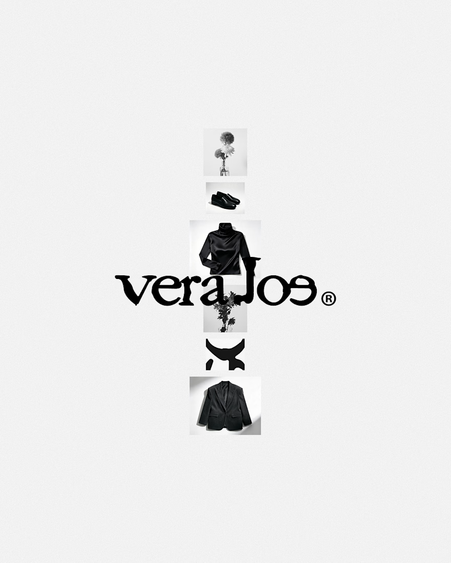
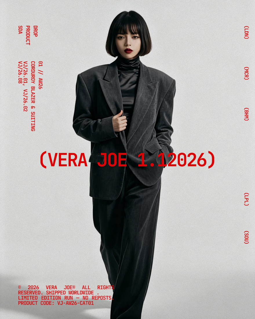
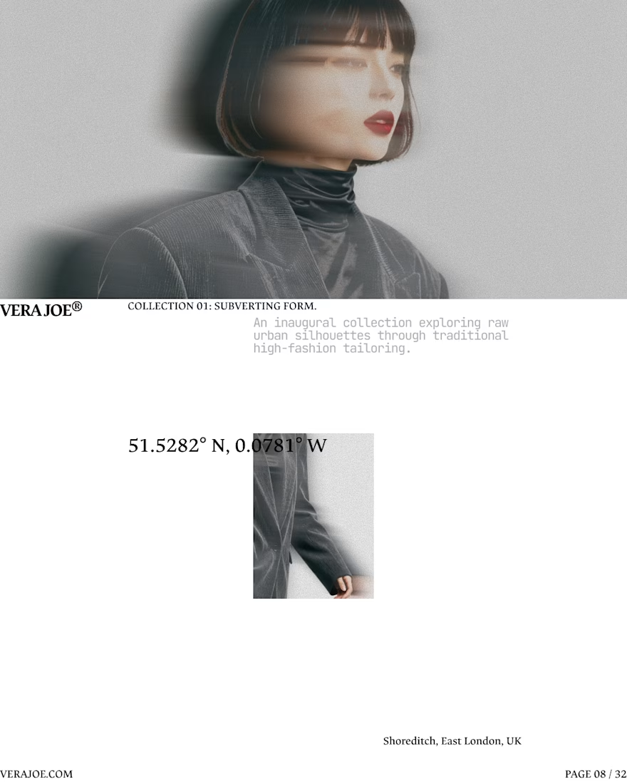
An editorial exploration for VERA JOE® Autumn/Winter 2026.
Exploratory Brand Identity & Visual Campaign.



Like the art direction

This one is for teams that hand everyday work to AI agents. In one view you can see what got automated, how much time it saved, how each agent is doing, and you can ask the AI assistant anything.
In the video, I ask "Who might churn this week?" and Lyra replies with three at risk accounts and check in emails ready to send.
My goal was calm and minimal, with lots of white space, while the screen still feels alive.
What would you add or remove? I'd love your feedback.


