The network for creativity
Join 1.25M professional creatives like you
Connect with clients, get discovered, and run your business 100% commission-free
Creatives on Contra have earned over $150M and we are just getting started
Back to feedPost

AI Automation Agency — Landing Page Design (StackD)
UI/UX Design, Landing Page, Figma
Designed a conversion-focused landing page for StackD, an AI automation agency serving property managers and building administrators.
The brief: translate a technical service (AI-driven workflow automation — supplier emails, issue follow-ups, booking management, insurance claims, resident communications) into a page that speaks to time saved and control gained, not features.
What I designed:
A clear, editorial hero with a serif/sans pairing for contrast — "Your management, automated" — paired with a quantified value prop (40h saved/month, 0 forgotten emails) instead of generic claims
A "before/after" section mapping manual tasks directly to their automated equivalent, so the visitor immediately sees their own workflow reflected
A soft, high-contrast palette (black, white, lime accent) to keep the page feeling premium and calm rather than "salesy"
A modular services grid ("What we build for you") designed for easy expansion as the agency's service list grows
Tools: Figma (full UI design, component structure, layout system)
My role: sole designer — wireframes, visual design, component system, and final high-fidelity mockup.


The network for creativity
Join 1.25M professional creatives like you
Connect with clients, get discovered, and run your business 100% commission-free
Creatives on Contra have earned over $150M and we are just getting started











Related posts


🌲 Nordhaus | Prefab Timber Homes Website (Framer)
Homes that grow quietly with the forest, now on the web. 🏡
Nordhaus is a website for a Latvian builder of prefabricated timber homes, created in Figma and built in Framer as a responsive site for desktop, tablet and mobile. It brings the brand's calm Nordic character through full-screen photography, a scroll-driven process story, a horizontal model gallery and interactive testimonials.
✨ Template coming soon to Framer.


Wonderful design man


I created a brand identity concept for Velora, an AI productivity platform. I explored the logo, colors, typography, and how the brand could look across a website, mobile app, and everyday products. I wanted everything to feel consistent, modern, and easy to recognize.


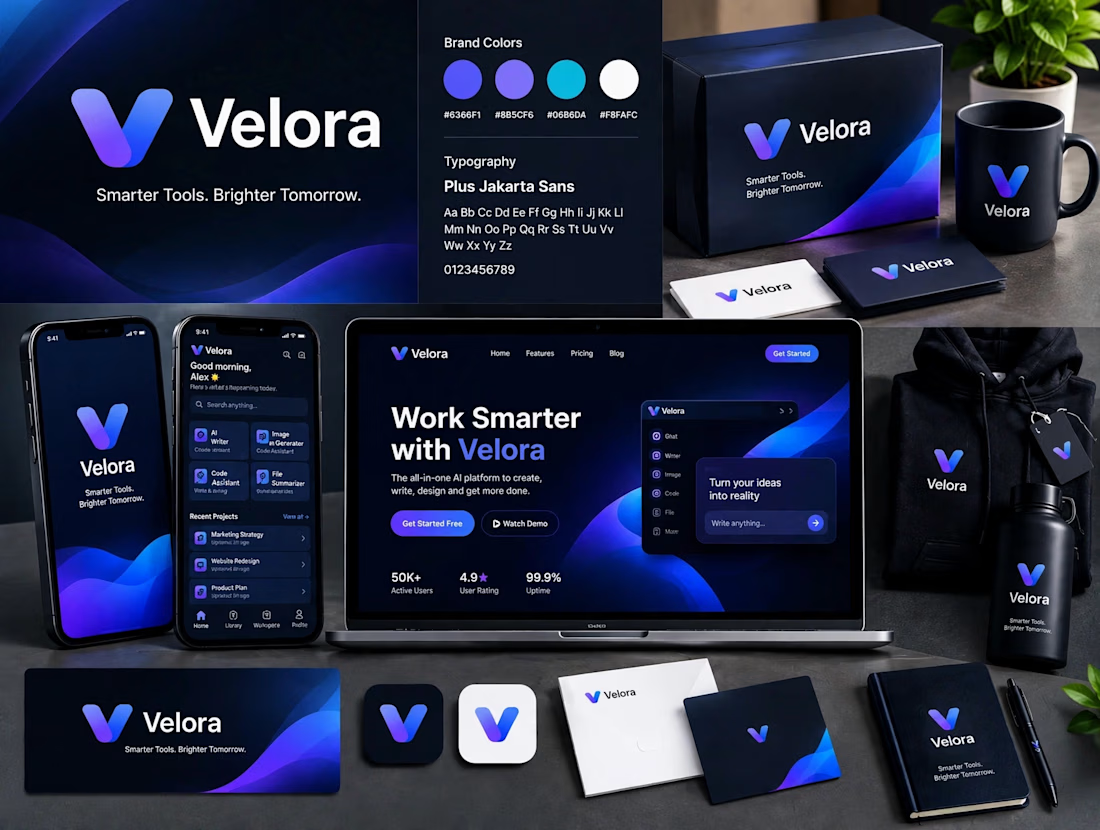

The blue is perfect for this. I’ve seen so many AI brands do boring black/white but this gradient gives it energy. And Plus Jakarta Sans was a great choice, keeps it friendly.