The network for creativity
Join 1.25M professional creatives like you
Connect with clients, get discovered, and run your business 100% commission-free
Creatives on Contra have earned over $150M and we are just getting started
Back to feedPost
Refined the hero section with a softer ivory palette, increased side padding, and a more editorial layout structure. Updated typography and introduced a muted clay accent for a timeless luxury feel, along with a structured CTA to improve hierarchy and conversion focus.
What do you think about it ?


Clean and Awesome!

Thank you Umar for the appreciation and support 🙌

💯 😍
The network for creativity
Join 1.25M professional creatives like you
Connect with clients, get discovered, and run your business 100% commission-free
Creatives on Contra have earned over $150M and we are just getting started





Related posts


dovvstudio.com just got an Honorable Mention on @awwwards.
Stickers you can peel off, type that reacts to your cursor and a PS2 version of me that boxes when you click it.
Designed and coded by hand.

Well deserved — peelable stickers and boxing PS2 charm.

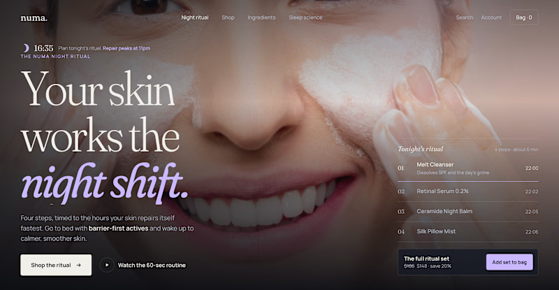
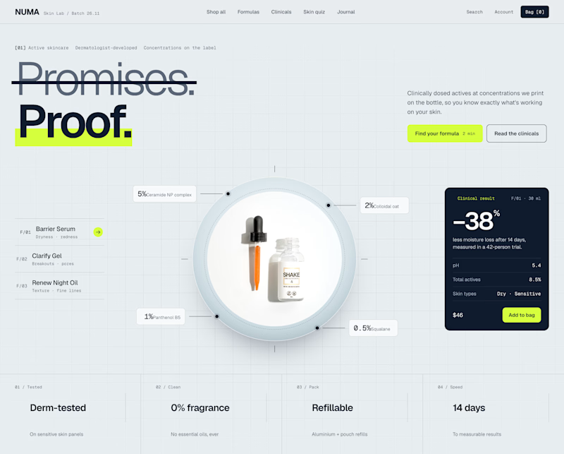
Two Shopify hero sections. Same skincare brand. Two different approaches.
Which one would you choose?
Option A: Night Ritual
Immersive photography, emotional storytelling, and a complete skincare routine with a direct add-to-cart option.
Option B: Lab Specimen
Bold typography, ingredient breakdowns, clinical information, and a clear path to purchase.
Both serve the same brand but take different approaches.
A builds an emotional connection and sells the experience.
B builds trust through product transparency and helps shoppers understand the formula.
But which approach would drive more conversions?
If you were designing this Shopify storefront, which would you choose?
A: Lifestyle & Storytelling
B: Product & Science
And why?

2 voted
18%
9 voted
82%
11 votes
Closed

I'd go with Lab Specimen! 🔥 The bold typography and clean, futuristic layout really stand out. Night Ritual looks beautiful too, but Option B feels more unique and memorable.

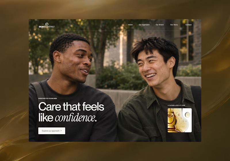
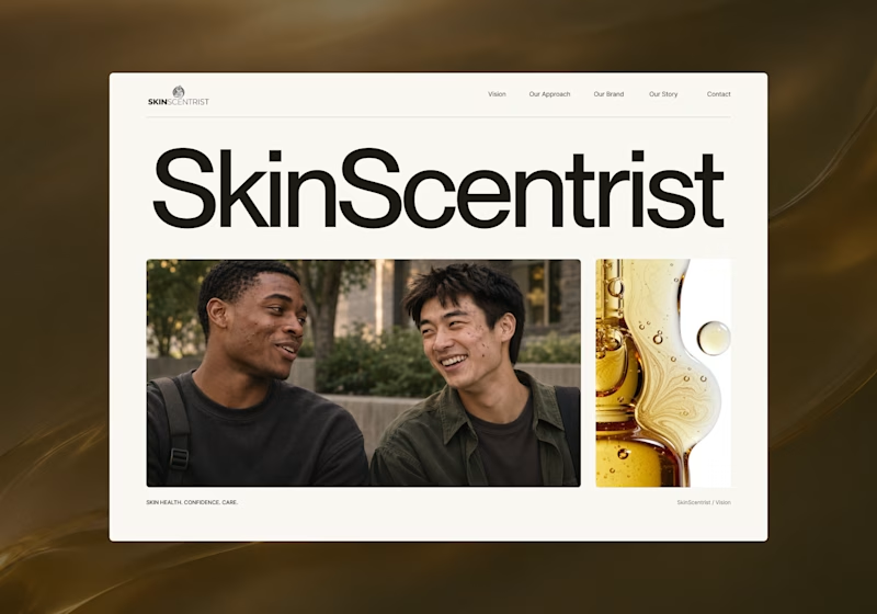
I’m exploring two homepage hero directions for SkinScentrist, a skincare brand focused on helping young men feel more confident in their skin.
Both concepts use the same imagery but take very different approaches to storytelling and visual hierarchy.
Direction 1 feels more emotional, immersive, and lifestyle-driven. The full-screen photography and bold messaging create a stronger connection to confidence and self-care.
Direction 2 feels more minimal, editorial, and brand-focused. The oversized typography, clean layout, and product imagery give it a more refined, contemporary skincare feel.
Direction 1: immersive, personal, emotional
Direction 2: minimal, editorial, premium
Which direction feels stronger for a modern skincare brand?

14 voted
93%
1 voted
7%
15 votes
Closed
Direction one — the full-screen photo feels warmer.