The network for creativity
Join 1.25M professional creatives like you
Connect with clients, get discovered, and run your business 100% commission-free
Creatives on Contra have earned over $150M and we are just getting started
Back to feedPost

The network for creativity
Join 1.25M professional creatives like you
Connect with clients, get discovered, and run your business 100% commission-free
Creatives on Contra have earned over $150M and we are just getting started

Challenges
View all


Related posts

The About hero is a three-state sequence that does the identity work and the product explanation at the same time.
It opens on a hexagonal floor plan drawn in full detail, with walls, fixtures and dimension strings. Red blocks then resolve over sections of the layout, marking the kind of issues Heron is built to catch. Finally the plan lifts into an isometric view and folds into the Heron wordmark's symbol, with the dashed hexagon beneath the mark matching the original building footprint exactly.
The mark was constructed from the plan rather than drawn separately and rationalised later, which is why the transition holds. It also means the About page opens by demonstrating the product loop before any copy about the founders appears.


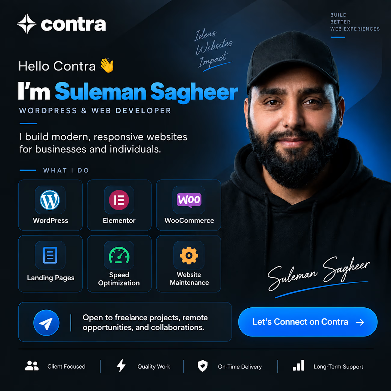
👋 𝐇𝐞𝐥𝐥𝐨 𝐂𝐨𝐧𝐭𝐫𝐚! 𝐈’𝐦 𝐒𝐮𝐥𝐞𝐦𝐚𝐧 𝐒𝐚𝐠𝐡𝐞𝐞𝐫, 𝐚 𝐖𝐨𝐫𝐝𝐏𝐫𝐞𝐬𝐬 & 𝐖𝐞𝐛 𝐃𝐞𝐯𝐞𝐥𝐨𝐩𝐞𝐫.
I build 𝐦𝐨𝐝𝐞𝐫𝐧, 𝐟𝐚𝐬𝐭, 𝐫𝐞𝐬𝐩𝐨𝐧𝐬𝐢𝐯𝐞, 𝐚𝐧𝐝 𝐛𝐮𝐬𝐢𝐧𝐞𝐬𝐬-𝐟𝐨𝐜𝐮𝐬𝐞𝐝 𝐰𝐞𝐛𝐬𝐢𝐭𝐞𝐬 using 𝐖𝐨𝐫𝐝𝐏𝐫𝐞𝐬𝐬, 𝐄𝐥𝐞𝐦𝐞𝐧𝐭𝐨𝐫, 𝐖𝐨𝐨𝐂𝐨𝐦𝐦𝐞𝐫𝐜𝐞, 𝐇𝐓𝐌𝐋, 𝐂𝐒𝐒 & 𝐉𝐚𝐯𝐚𝐒𝐜𝐫𝐢𝐩𝐭.
I’m currently𝐨𝐩𝐞𝐧 𝐭𝐨 𝐟𝐫𝐞𝐞𝐥𝐚𝐧𝐜𝐞 𝐩𝐫𝐨𝐣𝐞𝐜𝐭𝐬, 𝐫𝐞𝐦𝐨𝐭𝐞 𝐨𝐩𝐩𝐨𝐫𝐭𝐮𝐧𝐢𝐭𝐢𝐞𝐬, 𝐚𝐧𝐝 𝐜𝐨𝐥𝐥𝐚𝐛𝐨𝐫𝐚𝐭𝐢𝐨𝐧𝐬.
If you’re a 𝐛𝐮𝐬𝐢𝐧𝐞𝐬𝐬 𝐨𝐰𝐧𝐞𝐫, 𝐚𝐠𝐞𝐧𝐜𝐲, 𝐨𝐫 𝐟𝐞𝐥𝐥𝐨𝐰 𝐜𝐫𝐞𝐚𝐭𝐢𝐯𝐞, 𝐥𝐞𝐭’𝐬 𝐜𝐨𝐧𝐧𝐞𝐜𝐭 𝐚𝐧𝐝 𝐛𝐮𝐢𝐥𝐝 𝐬𝐨𝐦𝐞𝐭𝐡𝐢𝐧𝐠 𝐠𝐫𝐞𝐚𝐭 𝐭𝐨𝐠𝐞𝐭𝐡𝐞𝐫. 🚀
#WordPress #WebDeveloper #Elementor #WooCommerce #Freelance #WebDesign #Contra #OpenToWork

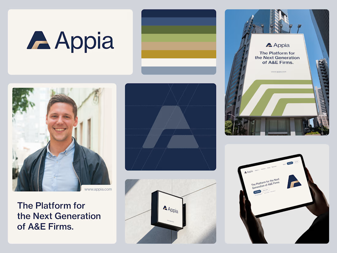
Finalized Logo & Branding for Appia Platform
A technology-enabled platform helping architecture and engineering firms build for the future.
The symbol combines the letter “A”, a strong foundation, and a subtle pathway in negative space, representing infrastructure, connection, and long-term progress.
The result is a clean, timeless mark designed to communicate stability, growth, and forward direction without relying on traditional A&E clichés.
This is the final direction, I’d love to hear your thoughts on the concept. 👀
Follow for more amazing branding shots.