The network for creativity
Join 1.25M professional creatives like you
Connect with clients, get discovered, and run your business 100% commission-free
Creatives on Contra have earned over $150M and we are just getting started
Back to feedPost


The network for creativity
Join 1.25M professional creatives like you
Connect with clients, get discovered, and run your business 100% commission-free
Creatives on Contra have earned over $150M and we are just getting started







Related posts

Is it Mood-board 01 or Mood-board 02!
Which mood-board do you think the client selected?

13 voted
76%
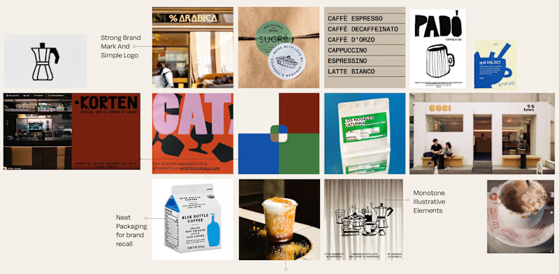
4 voted
24%
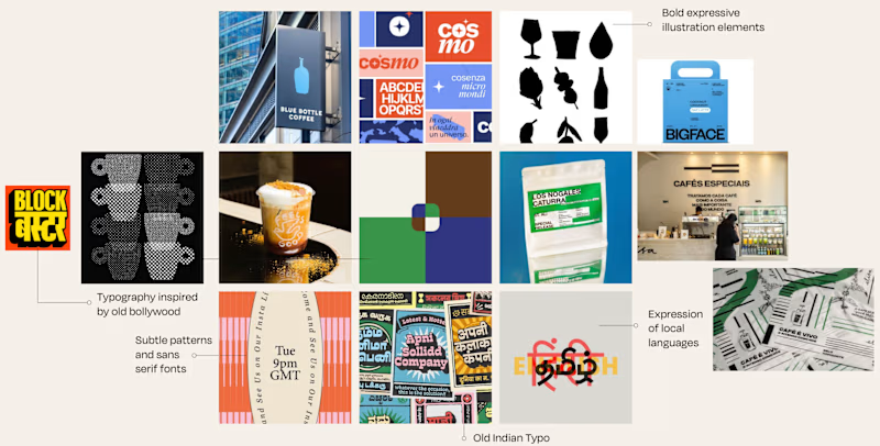
17 votes
Closed

Going with 01, it feels tighter and more intentional while 02 reads a little busy. Clients usually pick the one that looks safe to sign off on, and 01 has that calm confidence. Curious to hear which one won.

AI & Tech YouTube Thumbnail - Designed for Maximum Views
I designed this thumbnail for an AI / Tech YouTube channel to compete with big channels like Think Media, MrBeast-style tech, etc.
Design Strategy:
Futuristic look with neon blue, electric purple, and dark background for AI feeling
Huge bold text: "AI WILL REPLACE YOU?!" or "This AI is INSANE!" (Curiosity gap)
Shocked / excited facial expression + AI robot / ChatGPT logo visual
Glowing effects, arrows, and icons to make it pop in YouTube feed
Optimized for mobile - text readable even on small phone screen
Why it works: Tech viewers click on fear + curiosity + new technology. This design uses all 3.
Perfect for: AI channels, Tech reviews, ChatGPT tutorials, Make money with AI, Tech news
Tools: Canva Pro, Photoshop, Adobe Photoshop, Illustrator
Skills: High-CTR Thumbnail Strategy, Tech Branding, YouTube Growth
Delivery: 24h delivery + 2 free revisions + Source file
I help AI & Tech YouTubers go from 0 to 100K views with thumbnails that the algorithm loves. Let's make your channel blow up!

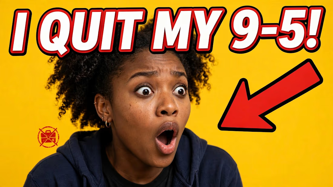

The dark-background rule is the one I'd want numbers on before committing to it. A big share of the audience is browsing in dark mode, where a dark thumbnail sits against a dark UI and loses its outer edge entirely, whereas the yellow one here keeps its shape in both themes. Do...

Logo design for Lurea App — an emotional AI companion.
©2026
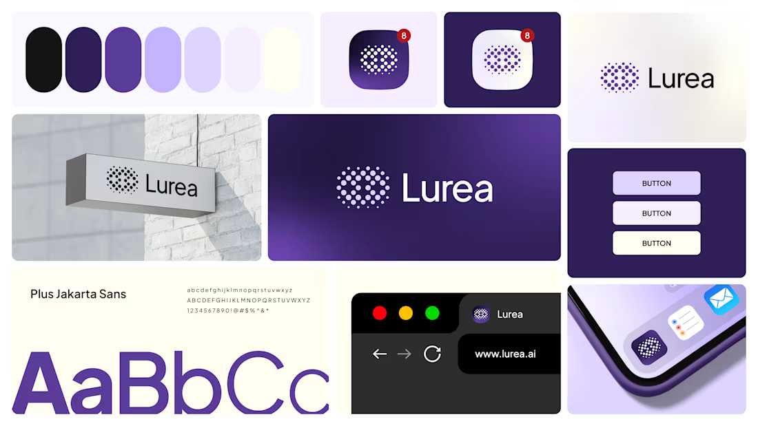

I like how you design the logo by dots it was a unique idea ❤️❤️