The network for creativity
Join 1.25M professional creatives like you
Connect with clients, get discovered, and run your business 100% commission-free
Creatives on Contra have earned over $150M and we are just getting started
Back to feedPost
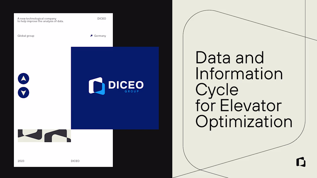
Branding developed for a German company a few years ago.
The DICEO logo uses thin lines that convey a minimalist and modern visual style, with blue as the main color — a tone already present in the three brands that make up the company. Other shades of blue are also incorporated, along with black and gray.
The slogan was positioned below the letter “E” because it contains three parallel horizontal lines, reinforcing the partnership between the three companies.
In its applications, we developed a more serious communication style, aligned with the corporate tone of the business.
The network for creativity
Join 1.25M professional creatives like you
Connect with clients, get discovered, and run your business 100% commission-free
Creatives on Contra have earned over $150M and we are just getting started
Related posts
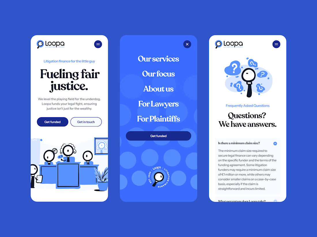
The branding and webdesign for Loopa is still kicking!
Done with @Mary Delaney 💅
Good Work !
Meet Brand Interpreter.
For decades, brand identity existed in two irreconcilable forms: the static PDF a designer handed to a client, and the living codebase a developer actually built from. Between them sat hours of manual translation... colours re-entered, typefaces re-specified, rules re-explained. This work asked designers to be data-entry clerks.
Brand Interpreter proposes a different relationship between document and canvas. A brand guidelines PDF is the designer's most complete creative statement, read by an AI agent that understands not just the colours and fonts on the page, but the rules governing their use, the errors hiding in their specification, and the personality encoded in the language surrounding them. From this reading, the agent constructs a living design system directly on a connected canvas: structured, editable, and ready to export as code.
What the agent builds is the document's intent, distilled, but made operable.
→ Full process + copy-paste prompts: https://flower-cruiser-92b.notion.site/Brand-Interpreter-Claude-Code-Paper-MCP-345b0a5cd9188093886ae856182ebc34 Enjoy!
Built with @claudeai + @paper_design for the Paper × Contra Hackathon.
fantastic work very insightful for me :) Followed you for your future posts :)
AI is redefining logo design and brand identity — faster concepts, smarter iterations, and data-driven creativity.
From idea to identity in minutes, not weeks.
Modern branding, powered by intelligence.
#AI #Branding #Design
Trending
Runway
AI video generation is exploding. What are you dreaming up in Runway?
Contra University
Learn from expert creatives how to earn more using next-gen AI tools.
creativeaiflow
Creative AI workflows are evolving. What tools do you use, and what are their strengths and weaknesses?
portfolioreview
The best portfolios tell a story, not just show a grid. Share yours for feedback.
freelancerlife
Freelancer life is wins, pivots, and everything in between. What’s yours right now?