The network for creativity
Join 1.25M professional creatives like you
Connect with clients, get discovered, and run your business 100% commission-free
Creatives on Contra have earned over $150M and we are just getting started
Back to feedPost

Completed official stamp/seal design for Caruso Injury law Firm #logo #seal #emblem #stamppdesign #notarystamp

RECOMMENDED
“10/10 - I have worked with Noor on a few projects and I will continue. Its very hard to find an amazing designer would intuitively knows your concept and how to bring it to life.”

Alec J Caruso
The network for creativity
Join 1.25M professional creatives like you
Connect with clients, get discovered, and run your business 100% commission-free
Creatives on Contra have earned over $150M and we are just getting started






Related posts

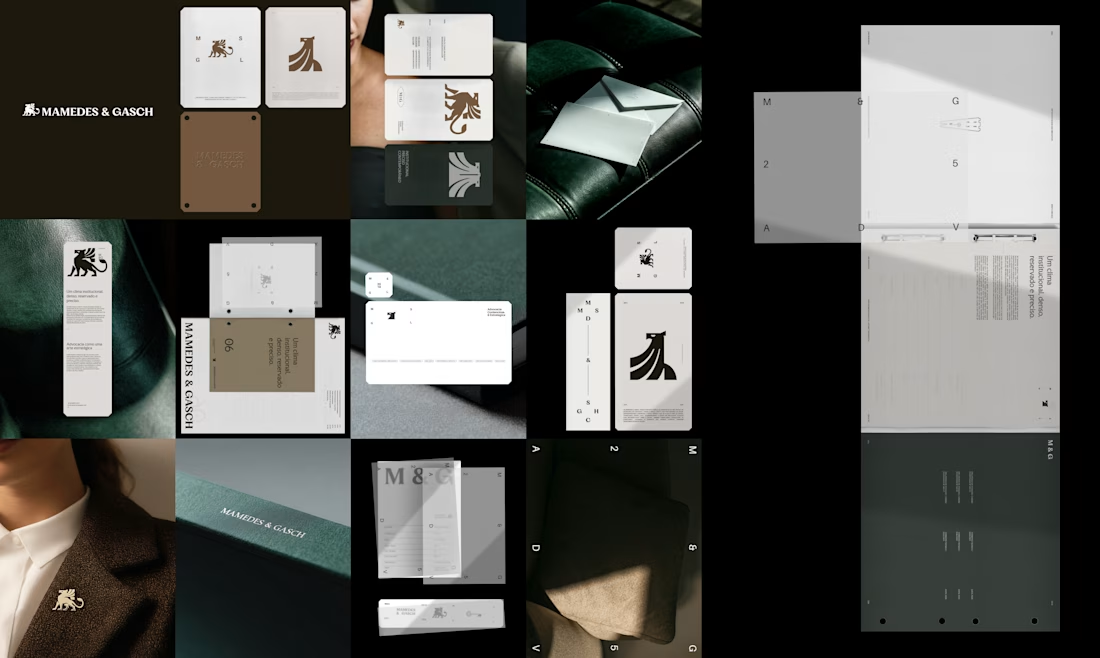
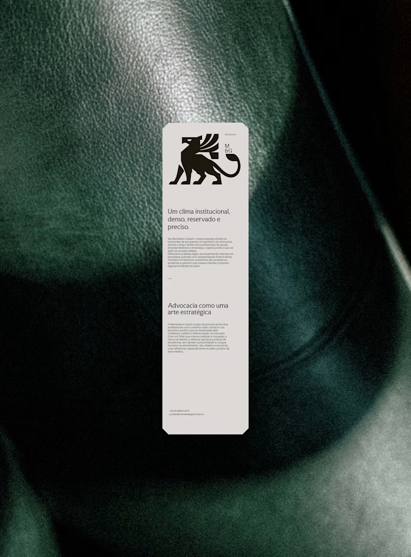
A griffin, not a gavel.
For Mamedes & Gasch, a law firm focused on litigation and legal consulting, the mark is a solid griffin with sharp cuts, set with high-contrast serif type and a deep green-black and bronze palette.
Which legal cliché would you retire first?


The gavel — the griffin already says strength better.

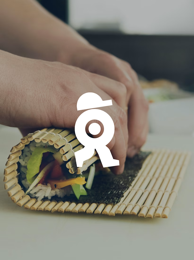
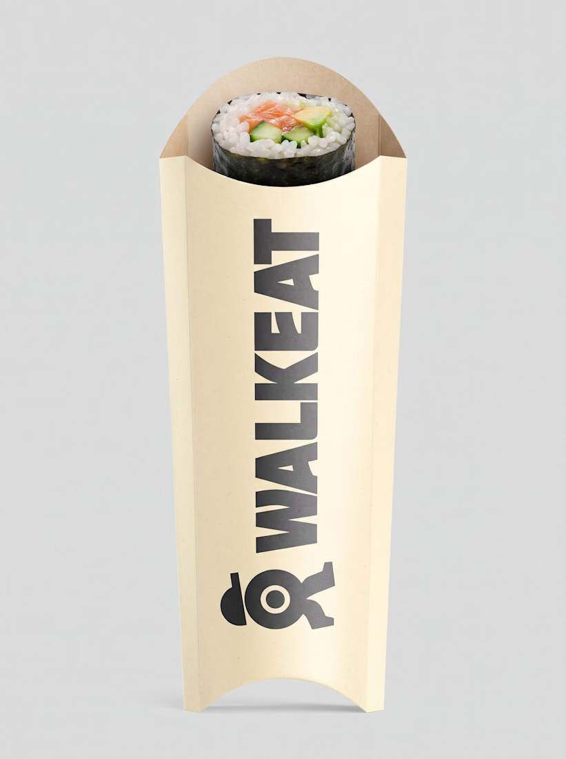
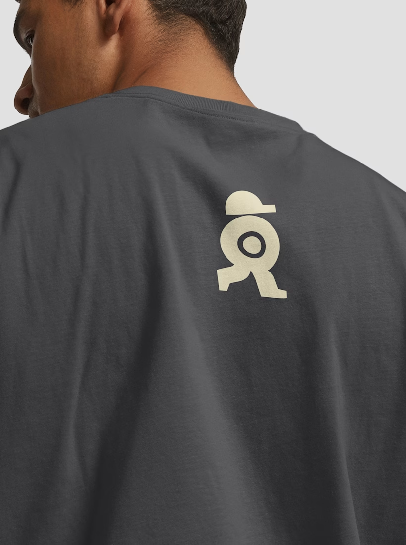
A sushi roll with a life of its own.
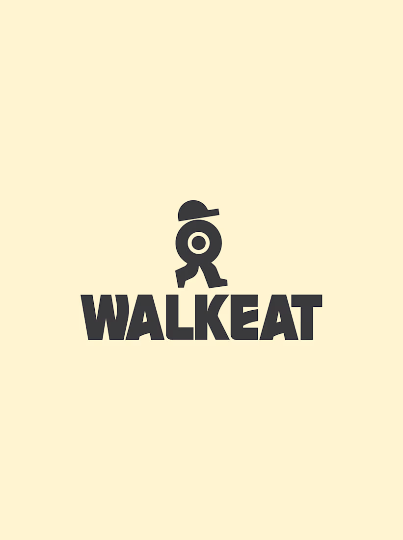
The WALKEAT identity transforms the shape of a sushi roll into a walking character. Its circular center references the cross-section of the roll, while the cap and legs bring movement and personality to the figure.
The custom-designed wordmark reinforces this concept through subtle modifications to the W, A, and E, creating a visual connection between typography and symbol.
A simple, playful and contemporary identity that communicates the product without relying on literal Japanese imagery or an overly cartoonish character.


Great work!!


The sharp V pops against that vivid gradient.