The network for creativity
Join 1.25M professional creatives like you
Connect with clients, get discovered, and run your business 100% commission-free
Creatives on Contra have earned over $150M and we are just getting started
Back to feedPost
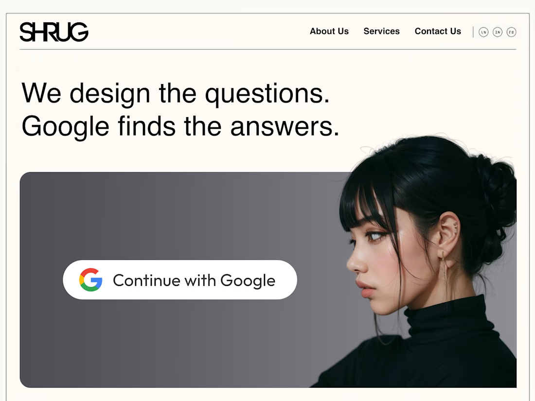
Most small business websites have the same problem.
Not bad design.
Not bad branding.
Just too many choices.
I often see homepages with:
• 8 “Learn More” buttons
• 6 service boxes
• 4 different CTAs
• links going everywhere
When someone clicks an ad or finds you on Google, they’re usually looking for one thing.
If the page sends them in five directions, they leave.
A simple rule I use when designing landing pages:
One page = one goal.
✨ Remove extra links.
✨ Tighten the message.
✨ Give visitors one clear action.
Conversion rates usually improve immediately.
Curious what other designers do here.
Do you prefer multi-path homepages or focused landing pages?
🤙
The network for creativity
Join 1.25M professional creatives like you
Connect with clients, get discovered, and run your business 100% commission-free
Creatives on Contra have earned over $150M and we are just getting started
Related posts
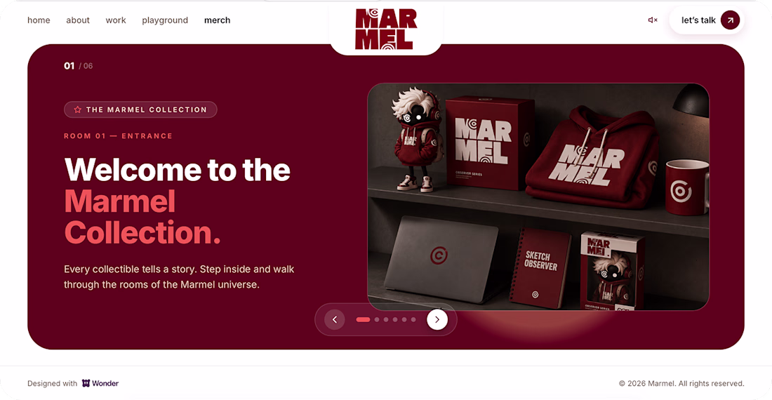
My submission for the Wonder Challenge is live ✨
I created my personal portfolio website with Wonder — from prompt-based design exploration to a complete Marmel portfolio experience.
Wonder helped me build the design foundation quickly, Claude helped bring it into code.
Live portfolio:
Web site live
Don’t forget to leave me a message in the Playground section. I’d love to read it.
Great
I shared that faceted V logo yesterday. Here's what it was for.
Vantage Access, a Framer template for high-rise window washing and rope access companies. Wanted to bring the story full circle for anyone who was following along.
Here's the thing about this industry: it doesn't sell on price. It sells on trust. Certifications, safety record, real project history, that's what actually gets a facilities director or property manager to sign a contract.
Most trade templates don't reflect that at all. So I built one that does: an editorial, credibility-first design with 5 CMS collections (Services, Projects, Safety & Certifications, Testimonials, Legal Pages), and certification cards that are text-only on purpose, no unverifiable badge logos.
It's free on the Framer Marketplace: https://www.framer.com/community/marketplace/templates/vantage-access/
Trending
Claude
Claude has entered the design space. How are you using Claude Design?
Contra University
Learn from expert creatives how to earn more using next-gen AI tools.
fifaworldcup2026
The World Cup is here and the whole world's watching. How are you designing for the world stage?
creativeaiflow
Creative AI workflows are evolving. What tools do you use, and what are their strengths and weaknesses?
freelancerlife
Freelancer life is wins, pivots, and everything in between. What’s yours right now?