The network for creativity
Join 1.25M professional creatives like you
Connect with clients, get discovered, and run your business 100% commission-free
Creatives on Contra have earned over $150M and we are just getting started
Back to feedPost

Most AI-native devs stop at "it works." I obsess over one thing that separates a working site from one that actually converts: visual hierarchy.
Every landing page I build with Claude Code + Next.js follows the same principle. The visitor's eye needs to land on exactly one thing first. Then flow to the second. Then the CTA.
On the skincare brand site I shipped last month, the hero had a full-bleed product shot, a 4-word headline, and one button. That's it. No competing elements. The client wanted to add a second CTA, a banner, and a testimonial carousel above the fold. I pushed back.
Here's the rule I follow: if everything is important, nothing is.
I build every section by asking three questions:
What's the single action I want someone to take here?
What's the minimum context they need to take it?
What can I remove?
This works whether it's a restaurant page with a reservation CTA, a fashion brand selling scarcity, or a mobile detailing business that just needs the phone to ring.
AI tools let me ship in 48 hours to 7 days. But speed without visual hierarchy just means you built a bad site faster.
The network for creativity
Join 1.25M professional creatives like you
Connect with clients, get discovered, and run your business 100% commission-free
Creatives on Contra have earned over $150M and we are just getting started





Related posts

Just like AI, soon we will be made to believe it's not AI anymore, it's SI. Something more advanced.
But the same way AI lacks a soul, so will SI.
Mastering the tool is good. Selling it as a replacement for humans is just hype.
Be at the top of your game. Build connections, do your own research and planning, and keep finding ways to improve.
It's not that AI is bad. I always wanted something to handle the boring tasks, so I could do the work I love. Not something that takes over the work I love, and botches that too.
P.S. This is a 4-second shot I made in 2023 for Paramount Students. I just added the labels AI and SI on top, and see how perfectly it fits, picturing another ERA OF HYPE SELLING!


Si is coming sooner than expected.

Something fun is coming 🍿
I’ve been working on the full identity of Popcorn Studio, from branding to the website, with lots of custom animation.
Can’t wait to show you the whole project.
Stay connected, more soon 💙
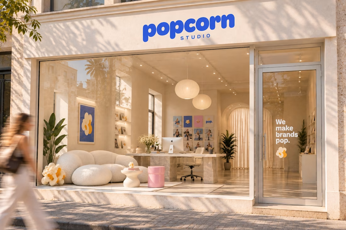

love the interior design, that sofa is the cutest for a brand like this!

We've been having a lot of fun testing AI recently in a brand and web projects.
I'm a big believer in everything we produce is human first and AI assisted to help spin up ideas of enhance our digital presence. Behind the scenes there isn't anything we can't achieve in digital now.
With Claude 5.5, An initial brief and just a few prompts later on a logo animation and I can visualise what I want for my animators and not just have to talk them through a few slides.
Most will say do we even need to improve what claude spits out, but I notice the little things and the little things are why we are always busy.
But this unlock has huge potential for us and our clients.


Good work