The network for creativity
Join 1.25M professional creatives like you
Connect with clients, get discovered, and run your business 100% commission-free
Creatives on Contra have earned over $150M and we are just getting started
Back to feedPost

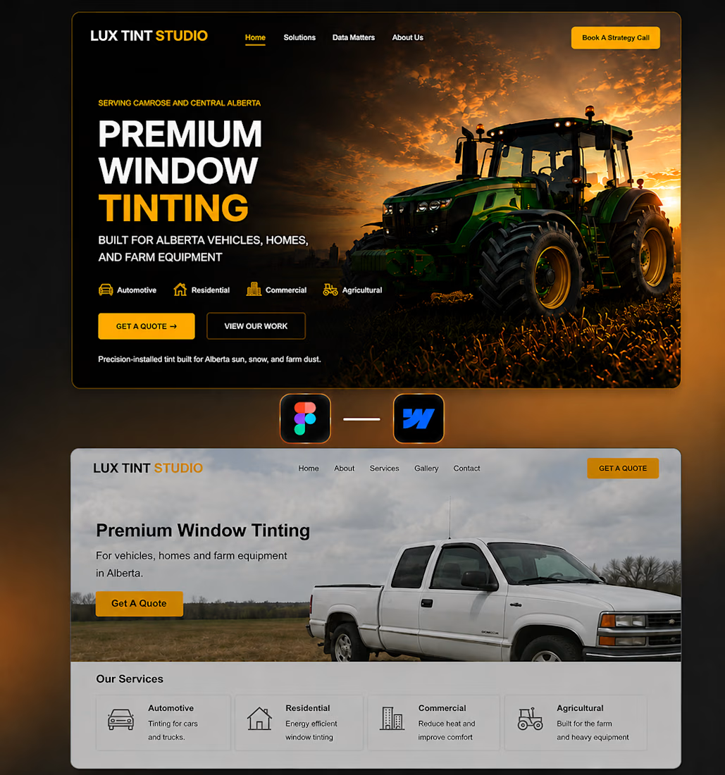
AI vs My Design — Lux Tint Studio 🚜✨
Client needed a modern website for a window tinting company serving Alberta's automotive, residential, commercial, and agricultural markets.
So I ran the same experiment again.
Image 1 (Top) → My Custom Design
Image 2 (Bottom) → AI Generated Design
My Take
The AI version (Image 2) is functional, but it feels exactly what most AI-generated websites feel like today: generic, predictable, and template-driven.
The layout relies on a stock-looking hero image, weak visual hierarchy, and a very common section structure that doesn't do much to differentiate the brand. While the information is technically there, it lacks the polish, trust, and visual impact needed to convert visitors into customers.
For my design (Image 1), the goal wasn't just to make it look better—it was to make the business look more credible, established, and premium.
What I Improved
✅ Stronger visual hierarchy that immediately communicates the service
✅ Premium hero composition with better image integration
✅ Higher contrast and readability across the entire hero section
✅ More intentional use of spacing and negative space
✅ Better categorization of services (Automotive, Residential, Commercial, Agricultural)
✅ Stronger CTA placement to improve conversions
✅ Cleaner navigation and overall page structure
✅ More premium and trustworthy brand perception
✅ Better balance between aesthetics and usability
Challenges I Faced
🔸 Creating a premium look while still appealing to a blue-collar service audience
🔸 Making agricultural equipment feel relevant without overwhelming the rest of the business offerings
🔸 Maintaining readability over a large background image
🔸 Designing a hero section that feels unique instead of another generic service-company template
🔸 Balancing visual impact with conversion-focused design principles
Design & Development Considerations
• Fully responsive layout for desktop, tablet, and mobile
• Component-based structure for scalability
• Optimized image treatment for performance
• Accessibility-focused typography and contrast
• Reusable design system for future expansion
• Development-friendly layout with clean section hierarchy
Final Thoughts
AI can generate layouts quickly, but it still struggles with the details that make a website feel intentional. The difference usually isn't the content—it's the hierarchy, spacing, visual decisions, and strategic thinking behind the design.
A website shouldn't just look good.
It should build trust, communicate expertise, and help the business generate more leads.
Which version would you trust more as a real business website? 👇
The network for creativity
Join 1.25M professional creatives like you
Connect with clients, get discovered, and run your business 100% commission-free
Creatives on Contra have earned over $150M and we are just getting started





Related posts

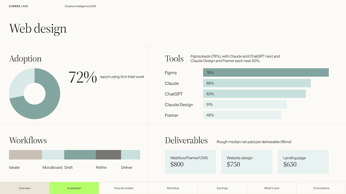
Web design is evolving and AI is becoming part of the process. ✦
Exploring the latest insights from Contra Creative Intelligence Report 2026 from the tools designers use to the workflows shaping how we create.
But the real question is: how are designers adapting?👀
#WebDesign #CreativeAI #Contra


Creative Intelligence Report against Artificial Intelligent!
Human Vs AI!🙌


Which design would make you more likely to join this ceramics course?
Two new AI-generated Kajabi landing-page concepts for Clay School: warm editorial or modern gallery. Same course, two different directions. Pick your favorite below.

18 voted
46%

21 voted
54%

39 votes
Closed

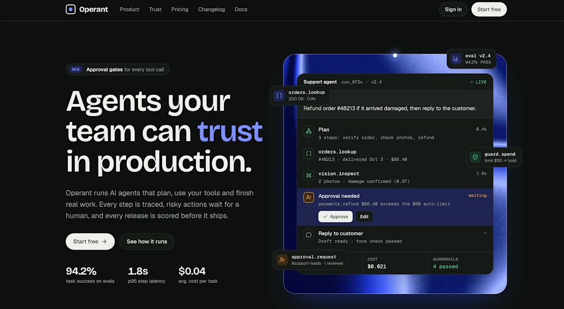
Just launched: Operant, a Framer template for AI agent products 🤖
AI agents are everywhere right now, but most of their landing pages look the same. So I designed Operant, a website template made for AI agent and automation products.
It’s built in Framer, and it’s ready to customize and launch in an afternoon.
What’s inside:
- A hero section that explains what your agent does in seconds
- Sections for features, how it works, and use cases
- Pricing, FAQ, and a call to action
- Fully responsive on desktop, tablet, and mobile
Clean components and styles, so you can easily change colors and fonts
Who it’s for: AI startups, agent builders, SaaS founders, and anyone launching an AI tool who wants a site that looks credible from day one.
👉 Get it here: https://breezy-variation-902666.framer.app/
I’m building more templates around AI and agent UX, so I’d love your feedback. What section do you always wish AI product sites had? 👇
#Framer #AI #AIAgents #WebDesign #FramerTemplate



Agree that most AI agent landing pages blur together. How did you show what the agent actually does above the fold, a live demo loop or a workflow diagram? That's the part I keep wrestling with on SaaS sites.