The network for creativity
Join 1.25M professional creatives like you
Connect with clients, get discovered, and run your business 100% commission-free
Creatives on Contra have earned over $150M and we are just getting started
Back to feedPost

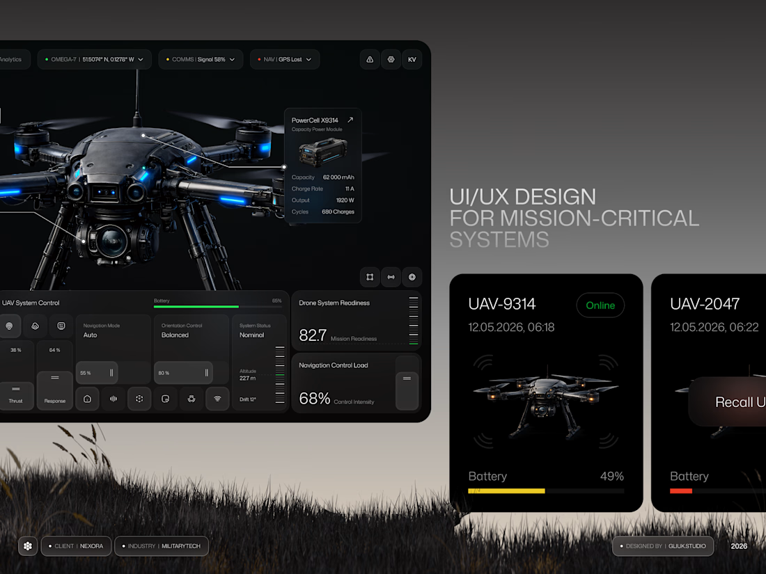
Nexora | Mission-Critical UAV Control & Telemetry Dashboard
This high-performance desktop ecosystem for Nexora delivers a state-of-the-art solution for military-grade drone monitoring, telemetry, and hardware oversight. The premium dark-mode UI unifies complex mission-critical data into a centralized, highly scannable command center.


The network for creativity
Join 1.25M professional creatives like you
Connect with clients, get discovered, and run your business 100% commission-free
Creatives on Contra have earned over $150M and we are just getting started
Challenges
View all


Related posts

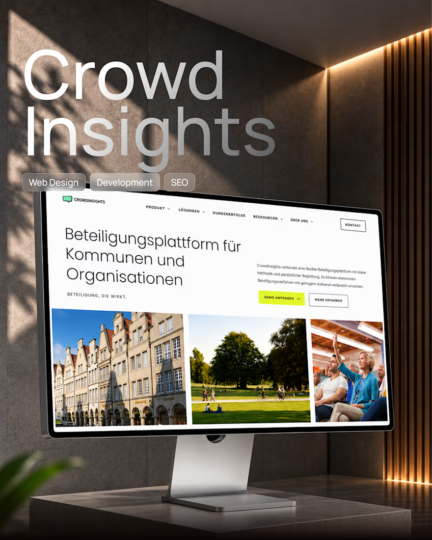
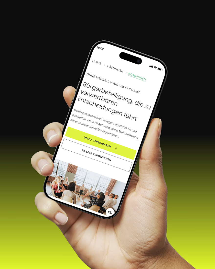
Framer Website Redesign for a Digital Participation SaaS Platform 🚀
A complete redesign and Framer development project focused on turning a complex software offering into a clear, modern, and scalable digital experience.
We created a new visual direction aligned with the product UI, reusable components, responsive layouts, CMS-powered content, and a strong technical foundation for SEO, AEO, accessibility, and future growth.
The result is a website that not only looks like part of the product ecosystem, but is also much easier for the internal team to manage and scale.
Design → Framer Development → CMS → SEO/AEO → Performance
#Framer #WebDesign #SaaS #UIUX #WebDevelopment #SEO #AEO
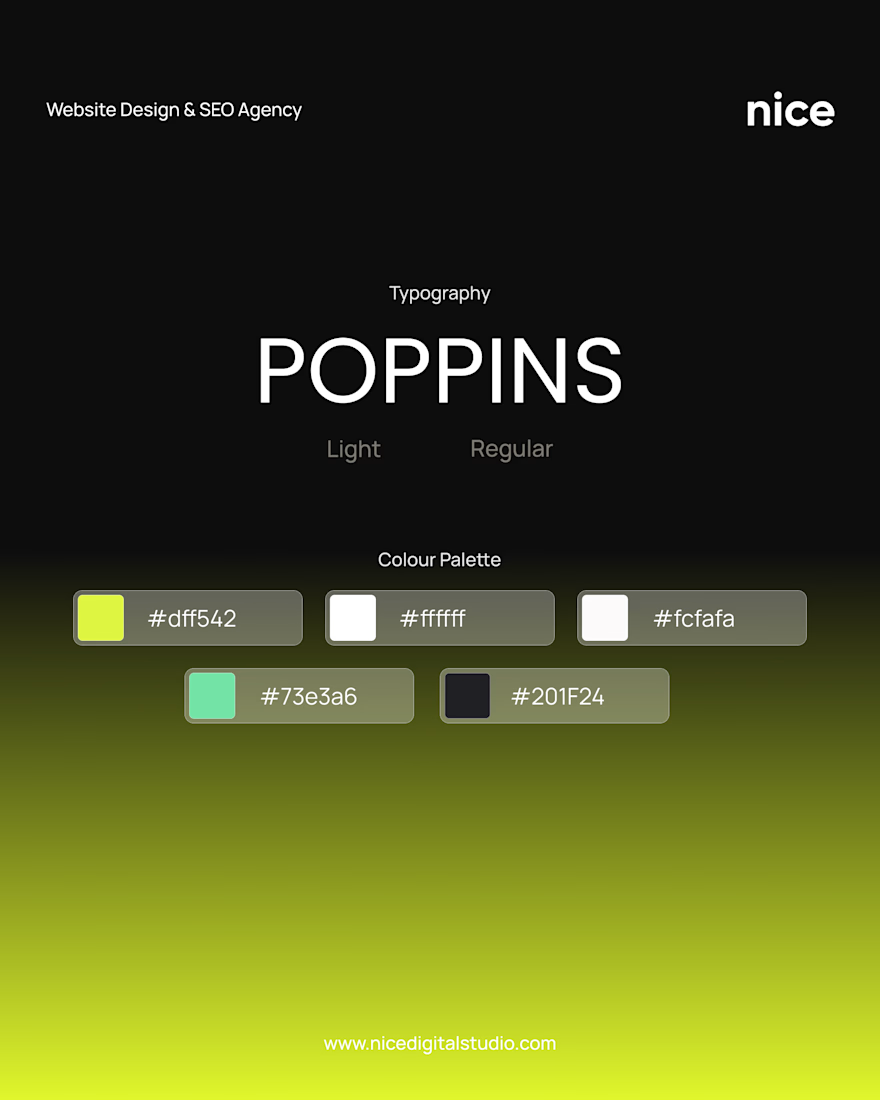

Never seen Poppins pop this well

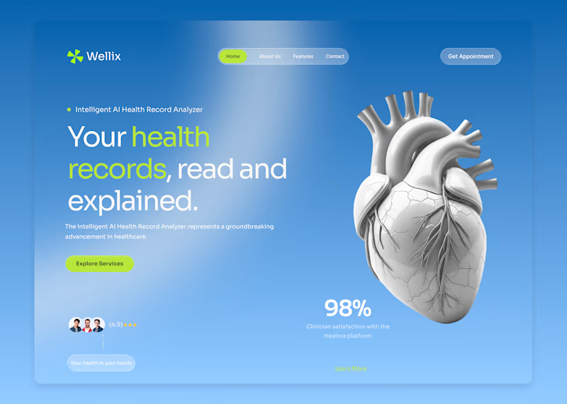
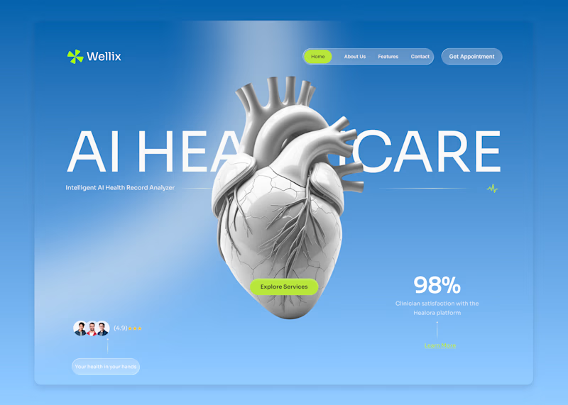
Wellix two homepage directions. Which one would you pick?
Wellix is an AI tool that reads health records and explains them in plain language lab results, scans, and charts turned into something a person can actually understand without a medical background.
Same brand, same palette, same illustration just two different ways of arranging the hero.
Which one would you go with, A or B? Drop a comment I'd like to hear which one lands better for you.
60 voted
61%
39 voted
39%
99 votes
Closed
Version. A does the job


Calibration as a moment of realization.
For Nibu, we made "learning the environment" a core part of the brand experience.
High-grain visuals. Deep shadows. A soft, warm glow. The interface tells you that the air is being sensed before the first data point even hits the screen.
Clarity beats polish.
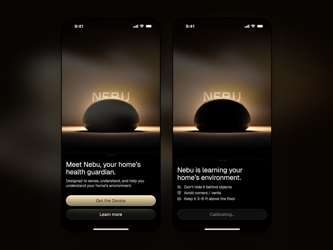

"Clarity beats polish" shows in the calibrating screen especially. Telling the user the air is being sensed before the first reading builds trust in the wait instead of making it feel like a loading bug.