The network for creativity
Join 1.25M professional creatives like you
Connect with clients, get discovered, and run your business 100% commission-free
Creatives on Contra have earned over $150M and we are just getting started
Back to feedPost
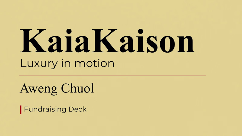
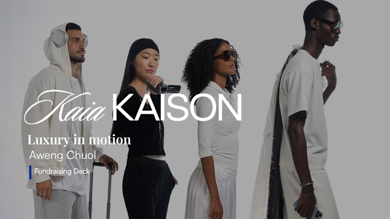
Taste Test

Here are the before and after coverdesigns for the pitch deck. Which one would you prefer?
2 votes
Ends in 1d

I will go with slide 2 💯
I like the background image and how its opacity is adjusted to make the white text clearly visible. Along with that, I like the font used for the word “Kaia,” and the overall typography in slide 2 is much better.
The network for creativity
Join 1.25M professional creatives like you
Connect with clients, get discovered, and run your business 100% commission-free
Creatives on Contra have earned over $150M and we are just getting started
Related posts

Every great founder knows the secret isn't the pitch, it's knowing who you're pitching to.
Elevator Pitch follows one woman, one sign, and one message across 10 floors. Each floor represents a different world.
The streets, the boardroom, the creatives, the investors.
Same woman. Same product. Completely different energy, language & outfit.
Because the best salespeople don't change their product. They change how they speak about it.
The elevator keeps rising. She keeps adapting.
That's the pitch.
Read the room. Every time. 🔥
Instagram: https://www.instagram.com/p/DV6YyZnjFjv/

I showed this to a friend and we both couldn't stop talking about it

Time to whiten!
A new packaging design project is coming soon. Excited to share the full case study shortly.


Trending
aivideo
AI video tools are moving at warp speed. Which ones are you experimenting with?
returntonature
Spring is a reset for creativity. What’s inspiring you outside the screen right now?
aidesignflow
AI tools are redefining design work. What's your current workflow?
freelancerlife
Freelancer life is wins, pivots, and everything in between. What’s yours right now?
allthingsmetal
Metal is having a design moment – from chrome to gates and grates. What designs are you forging?