The network for creativity
Join 1.25M professional creatives like you
Connect with clients, get discovered, and run your business 100% commission-free
Creatives on Contra have earned over $150M and we are just getting started
Back to feedPost
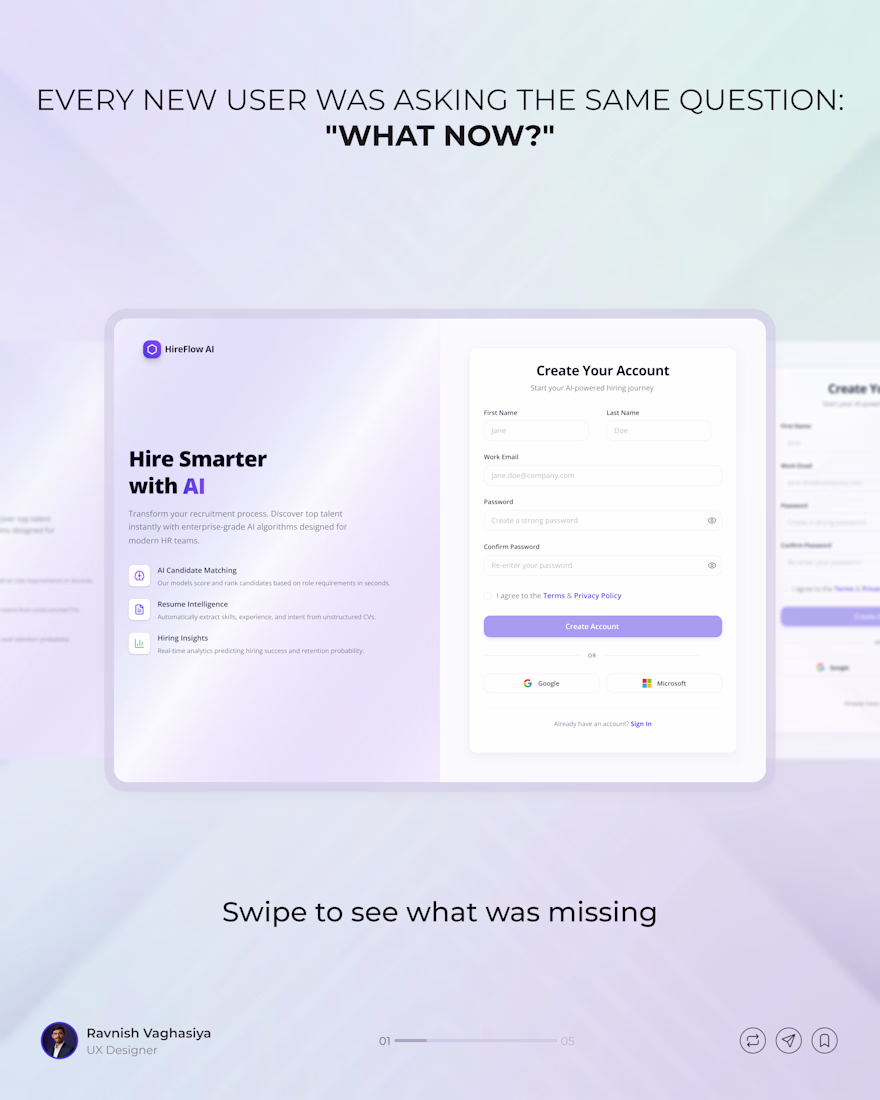
🚨 Users don't leave because your product is bad.
They leave because they don't know what to do next.
After signing up, users were taken directly to the dashboard.
The problem?
No guidance.
No context.
No clear next step.
For a new user, landing on a feature-heavy
dashboard can feel overwhelming.
Instead of helping users discover value, the experience creates confusion from the very first interaction.
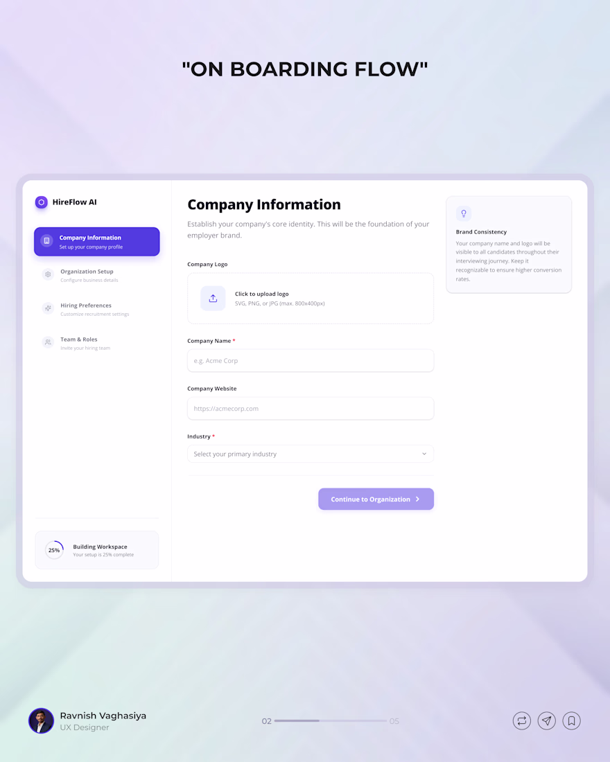
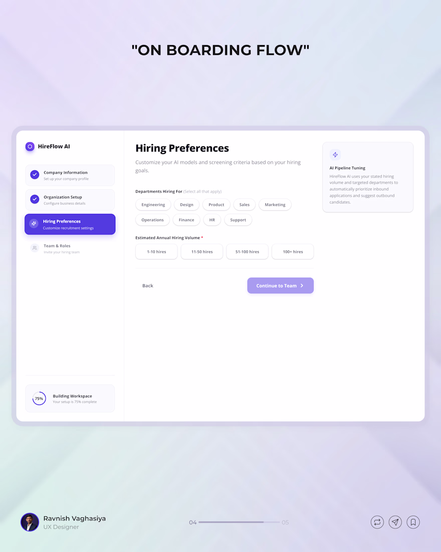
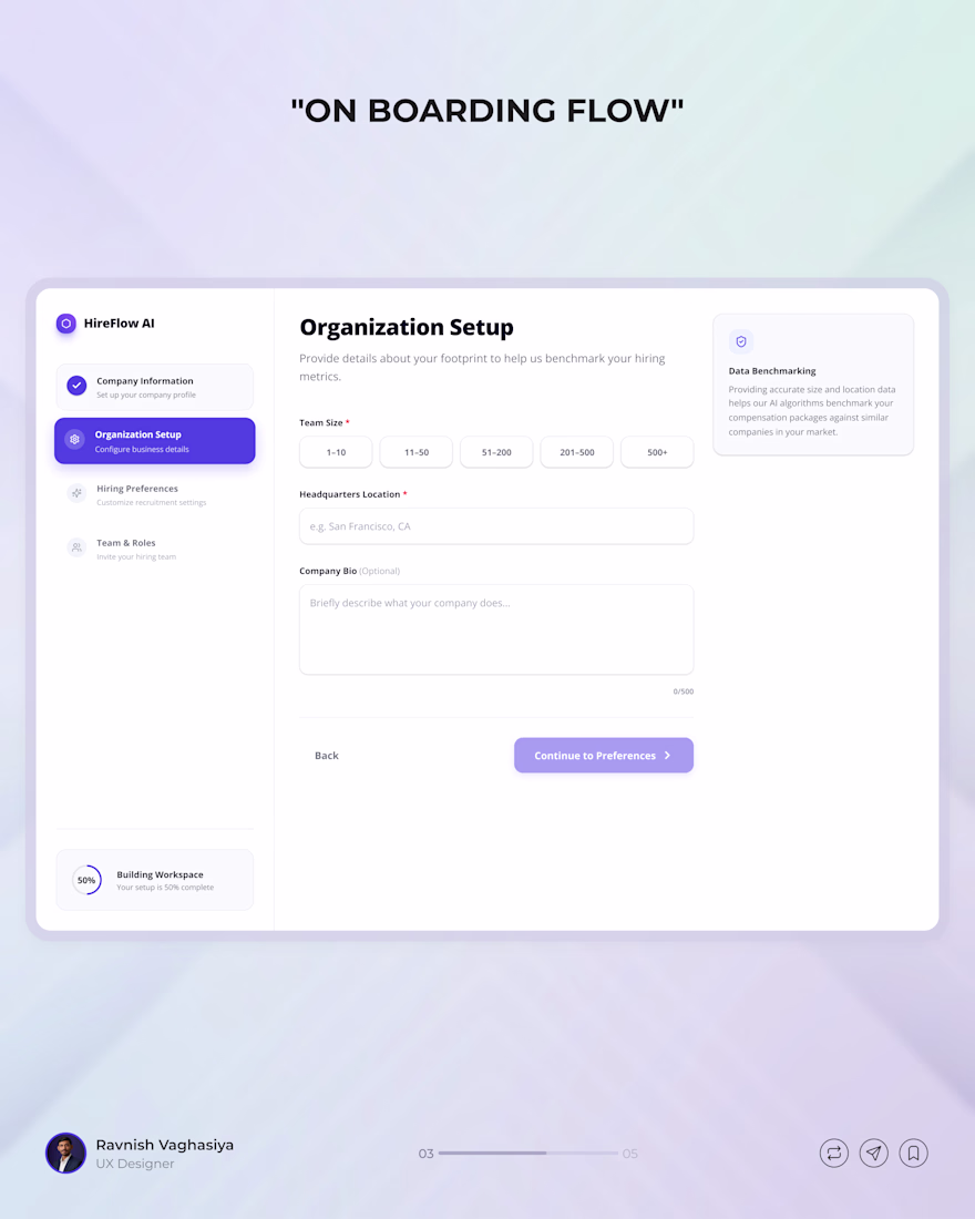
So I redesigned the flow by introducing a guided onboarding experience before users reach the dashboard.
✅ Clear starting point
✅ Step-by-step guidance
✅ Reduced cognitive load
✅ Faster path to value
Good onboarding isn't about explaining features.
It's about helping users achieve their first win as quickly as possible.
That's often the difference between an active user and a lost user.
What's your take?
Would you prefer users land directly on the dashboard, or go through a short onboarding flow first?
Save this post for your next UX project and share your thoughts below 👇
onboarding flow design, user onboarding experience, SaaS onboarding flow, dashboard UX design, first time user experience, product onboarding best practices, user activation strategy, UX case study, onboarding UX design, signup to dashboard flow, reducing user confusion in UX, SaaS user activation, product experience design, UX redesign case study, guided onboarding flow
The network for creativity
Join 1.25M professional creatives like you
Connect with clients, get discovered, and run your business 100% commission-free
Creatives on Contra have earned over $150M and we are just getting started
Trending
Claude
Claude has entered the design space. How are you using Claude Design?
Contra University
Learn from expert creatives how to earn more using next-gen AI tools.
creativeaiflow
Creative AI workflows are evolving. What tools do you use, and what are their strengths and weaknesses?
freelancerlife
Freelancer life is wins, pivots, and everything in between. What’s yours right now?
Related posts
Really excited to share this one. Stay tuned for a video showcasing the whole site, but even better, why don't you just experience it for yourself: https://thebluehorizon.ai/
These guys have received over 1 billion impressions on their videos and they came to us to make their website match the caliber of work they put out at an inhuman rate.
That website is incredible.
Added some motion to the Marigold concept over the weekend, first time playing with Figma motion as well. Pretty straight forward.
2 more
Nice design