The network for creativity
Join 1.25M professional creatives like you
Connect with clients, get discovered, and run your business 100% commission-free
Creatives on Contra have earned over $150M and we are just getting started
Back to feedPost

A few months ago, if someone had asked me how much I had earned from UX design, the answer would have been ₹0.
I completed 3 unpaid internships, worked on portfolio projects, redesigned screens, learned from feedback, and spent countless hours improving my skills.
There were moments when I questioned whether any of it would lead anywhere.
Today, I received payment from my first client.
What makes this moment special isn’t the amount.
It’s the fact that someone trusted my work enough to pay for it.
Looking back, every late night, every revision, every rejection, and every unpaid internship taught me something valuable.
I’m still at the beginning of my journey, and I have a lot to learn, but today feels like a small step in the right direction.
Grateful for everyone who supported me, gave feedback, and encouraged me to keep going.
On to the next milestone. 🚀
#UXDesign #UserExperience #ProductDesign #FreelanceDesigner #CareerGrowth #DesignCommunity #LearningInPublic #Figma #DesignJourney
The network for creativity
Join 1.25M professional creatives like you
Connect with clients, get discovered, and run your business 100% commission-free
Creatives on Contra have earned over $150M and we are just getting started











Related posts

Beyond grateful for every client and opportunity along the way. ❤️
Just getting started! 🙌

Huge congrats on $250K! 🔥 Super inspiring journey, Tamer. Just getting started indeed - on to $500K! 🚀

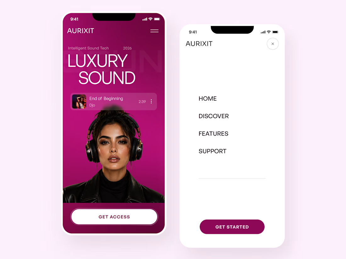
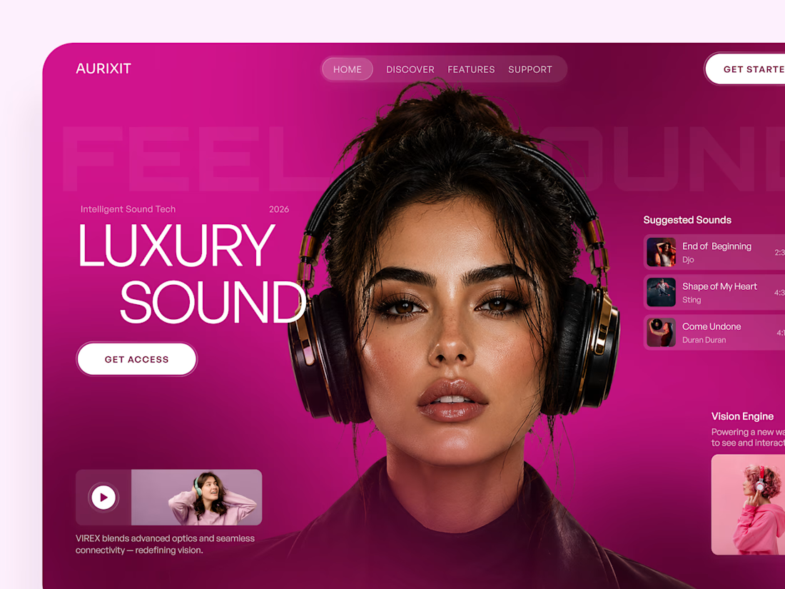
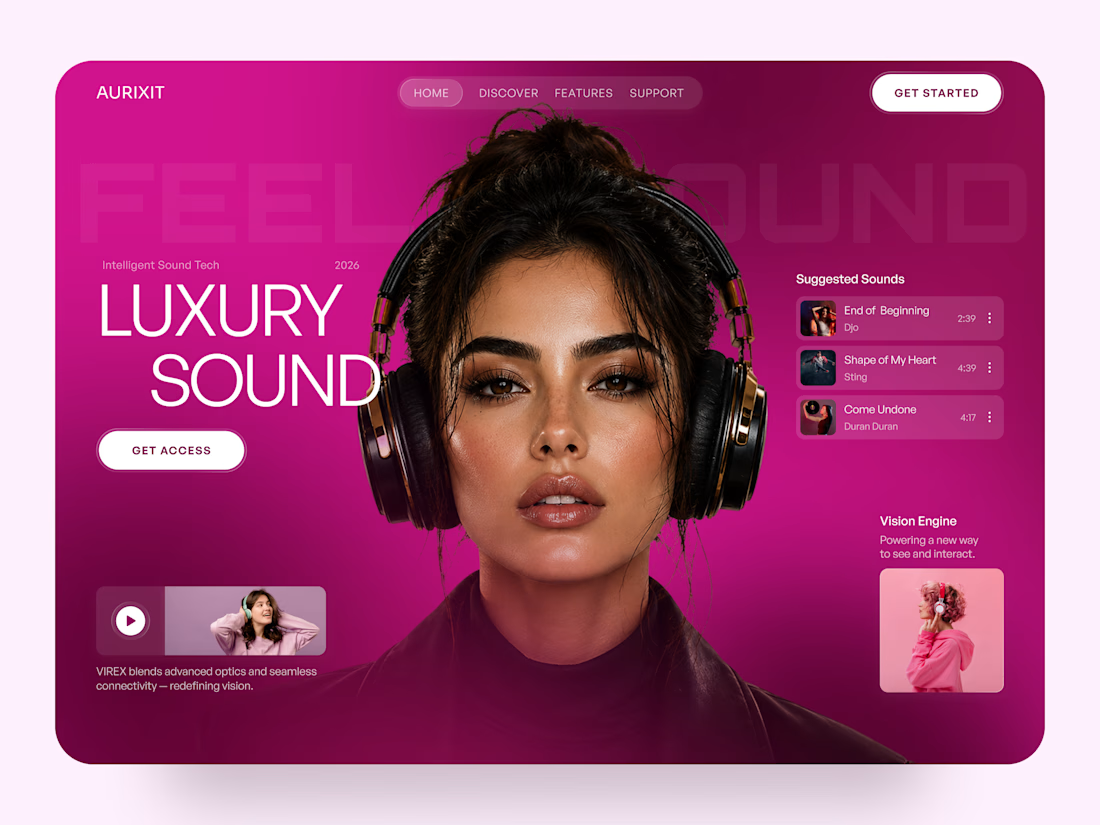
AURIXIT — Luxury Headphones Landing Page 🎧💗
A vibrant landing page concept for a premium audio brand, combining luxury sound, fashion-inspired visuals, and a bold digital experience
The design brings together bright magenta tones, oversized typography, lifestyle photography, and clean UI elements to create a modern, eye-catching aesthetic
Special attention was given to:
• Bold lifestyle-focused hero composition
• Vibrant pink and magenta color palette
• Clean, oversized typography
• Music playlist and suggested tracks
• Premium headphone presentation
• Clear CTA and minimal navigation
• Responsive mobile experience
The result is a fresh, stylish landing page that connects premium audio technology with fashion, music, and personal expression ✨



Magenta with the black headphones really pops. Was the small playlist text on pink tricky for contrast?


Three weeks into building the Pasted website, after the design was approved, an 11-page document arrived with a whole new vision.
It was beautiful work, and it described a different project at the agreed price.
I asked them to decide: keep the approved scope, or pause and price the new idea separately. On day six, they chose the original. We shipped two weeks later.


Offering to price the new vision as its own phase also lets the client see what the idea costs without it feeling like a no. Was a change-order process already written into your contract, or did you build that path on the spot?