The network for creativity
Join 1.25M professional creatives like you
Connect with clients, get discovered, and run your business 100% commission-free
Creatives on Contra have earned over $150M and we are just getting started
Back to feedPost

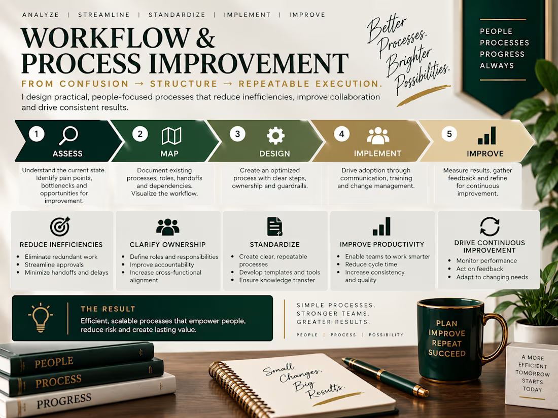
From confusion → structure → repeatable execution.
This one showcases process mapping, ownership, handoffs, bottleneck identification, workflow design, and continuous improvement.


The network for creativity
Join 1.25M professional creatives like you
Connect with clients, get discovered, and run your business 100% commission-free
Creatives on Contra have earned over $150M and we are just getting started
Related posts

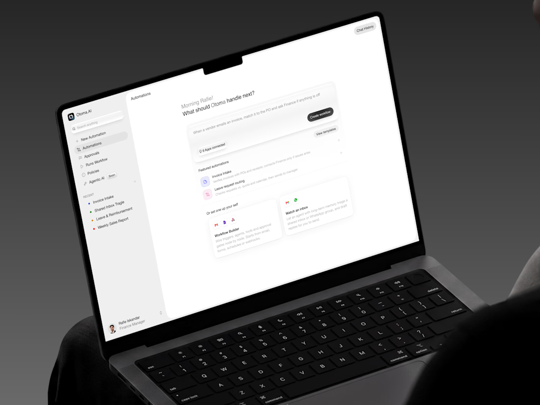
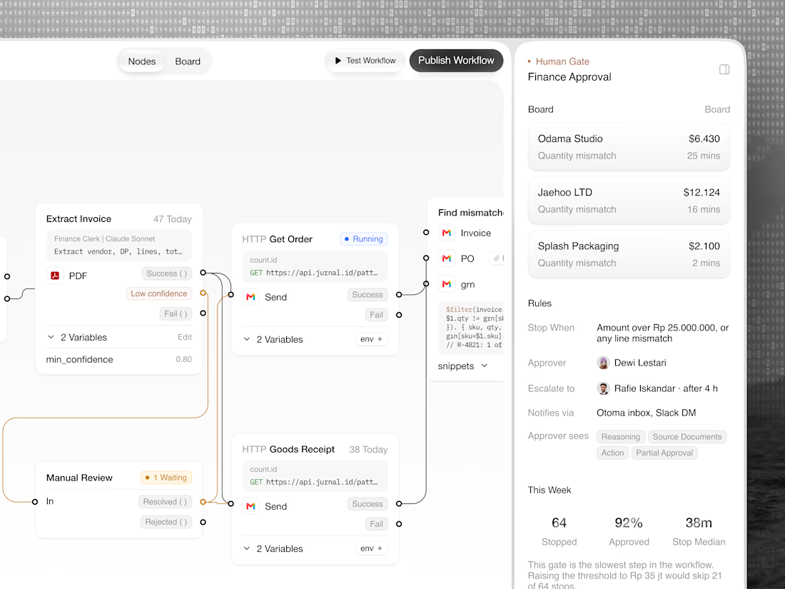
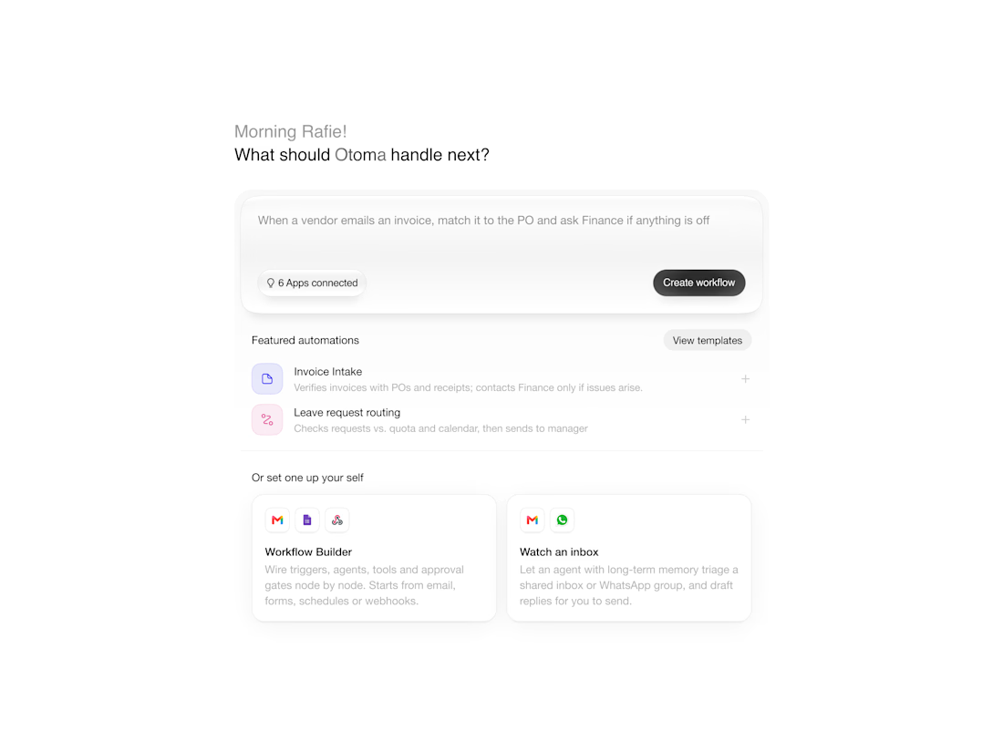
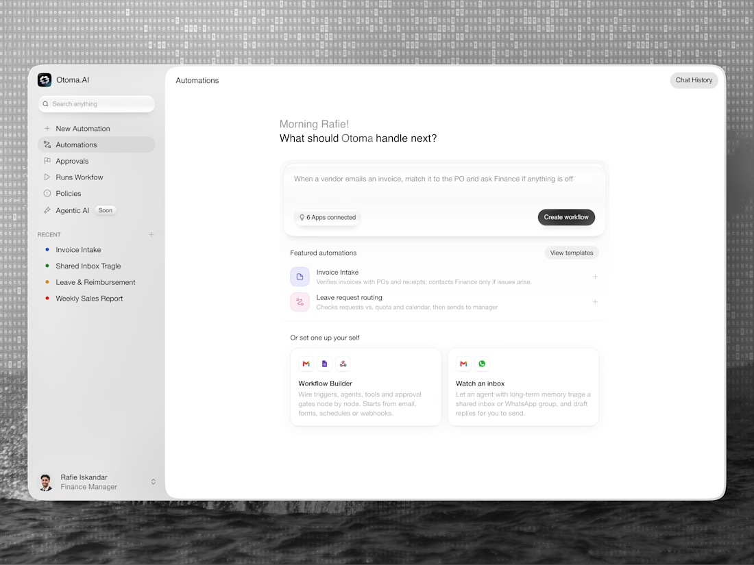
Otoma. AI — AI-Powered Workflow Automation Design
A simpler way to build workflows.
Otoma. AI turns plain-language instructions into working automations, helping finance and operations teams handle repetitive tasks while staying in control.


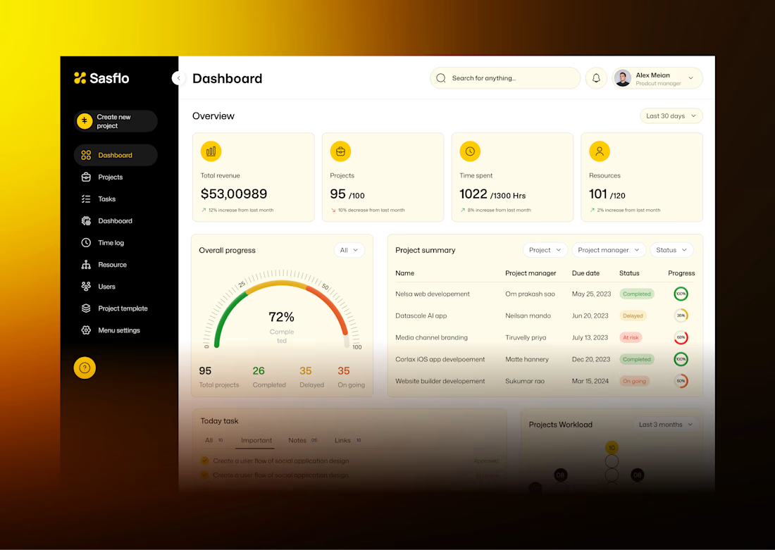
Sasflo — Project Management Dashboard UI Design 📊
A dashboard should do more than display data. It should help users understand their progress, track projects, and make better decisions with less effort.
For this concept, I explored a clean project management dashboard with:
📈 Revenue and project performance metrics
🎯 Overall project progress visualization
📋 Project summaries with status and progress indicators
🗂️ Task management and resource tracking
🎨 A clean layout with a warm yellow and neutral color paletteMy goal was to make complex project information easier to scan while keeping the interface professional and visually balanced.
Need a dashboard or web app that looks great and works for your users? Let's connect!


The four stat cards on warm yellow, the 72% gauge and the project summary table with coloured status pills are easy to scan, which was your goal. My challenge on your own line about better decisions with less effort: this dashboard shows how things stand but doesn't say what to...