The network for creativity
Join 1.25M professional creatives like you
Connect with clients, get discovered, and run your business 100% commission-free
Creatives on Contra have earned over $150M and we are just getting started
Back to feedPost
Sasflo — Project Management Dashboard UI Design 📊
A dashboard should do more than display data. It should help users understand their progress, track projects, and make better decisions with less effort.
For this concept, I explored a clean project management dashboard with:
📈 Revenue and project performance metrics
🎯 Overall project progress visualization
📋 Project summaries with status and progress indicators
🗂️ Task management and resource tracking
🎨 A clean layout with a warm yellow and neutral color paletteMy goal was to make complex project information easier to scan while keeping the interface professional and visually balanced.
Need a dashboard or web app that looks great and works for your users? Let's connect!

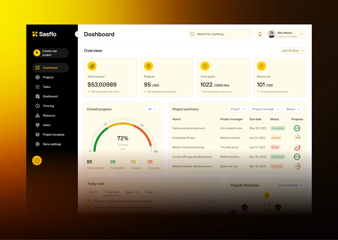

The four stat cards on warm yellow, the 72% gauge and the project summary table with coloured status pills are easy to scan, which was your goal. My challenge on your own line about better decisions with less effort: this dashboard shows how things stand but doesn't say what to...

Thanks for your valuable comments
The network for creativity
Join 1.25M professional creatives like you
Connect with clients, get discovered, and run your business 100% commission-free
Creatives on Contra have earned over $150M and we are just getting started



Related posts

i built a semi-3D interactive website with @Base44 for a Creative Production Studio, called STORM STUDIO,. that drafts 3D Digital unique experience for Brands.
STROM STUDIO specializes indesign, motion, 3D and Technology, working together to turn ambitious ideas into immersive digital experiences.
At STORM STUDIO, We create 3D visual storytelling and interactive web experiences that help brands stand out.
STORM STUDIO - https://stormstudio.base44.app
also, check it out on mobile, to get the full mobile experience
my walkthrough process will be below in my comment section

my walkthrough process
PS; if you opened the STORM STUDIO website on a Mobile phone, Shaking the phone rattles the rubik cubes like a shaken jar.
and,
on PC/DESKTOP, moving the cursor rattles the rubik cubes, also slowly scroll through the home page to have a full experience of the scroll animate effects, etc.
try it out 😊


I finally updated my personal website, and you can actually "dye" your own canvas on it! 🎨
I've been experimenting with how to bring something physical into a digital space. The idea came from my growing interest in natural dyes and traditional textile-making, which I've been exploring a lot lately.
I designed and built the whole experience in one day using Figma, Claude and Netlify. It's been pretty exciting to see how AI makes ideas that once felt technically out of reach something I can now experiment with and build on my own.
I'm also open to fractional creative director roles, so if you know a team building something meaningful, I'd love to connect!
Come play with it, and please let me know if you find any bugs 🐛
mya-nguyen.com


dyeing your own canvas on a personal site is such a nice idea. most portfolios just sit there, this one lets you play
