The network for creativity
Join 1.25M professional creatives like you
Connect with clients, get discovered, and run your business 100% commission-free
Creatives on Contra have earned over $150M and we are just getting started
Back to feedPost


The network for creativity
Join 1.25M professional creatives like you
Connect with clients, get discovered, and run your business 100% commission-free
Creatives on Contra have earned over $150M and we are just getting started






Related posts

A sushi roll with a life of its own.
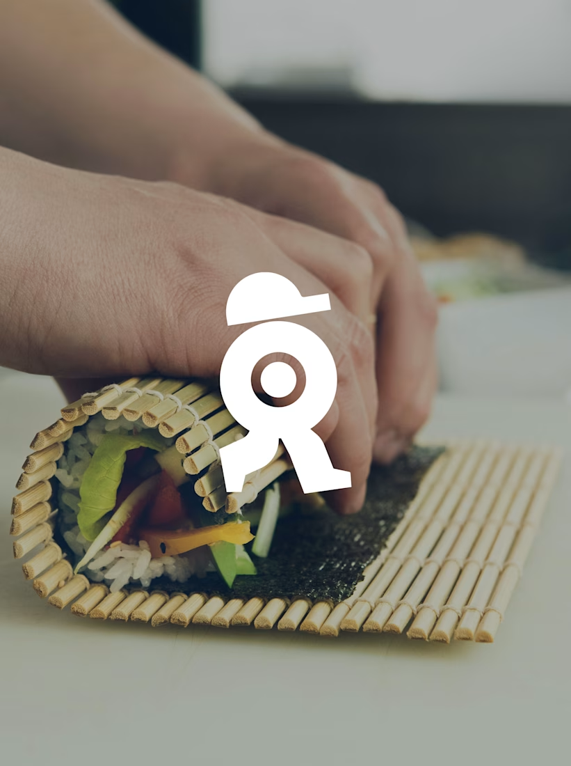
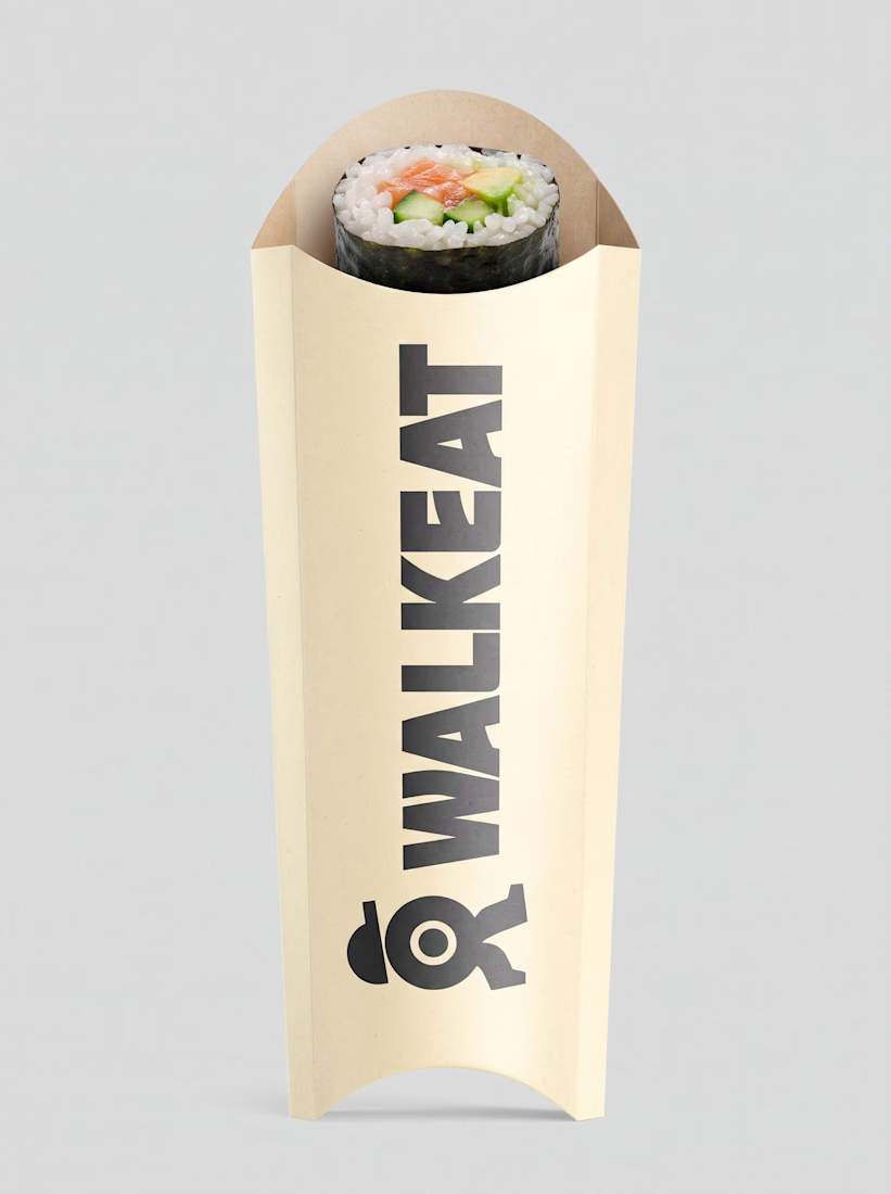
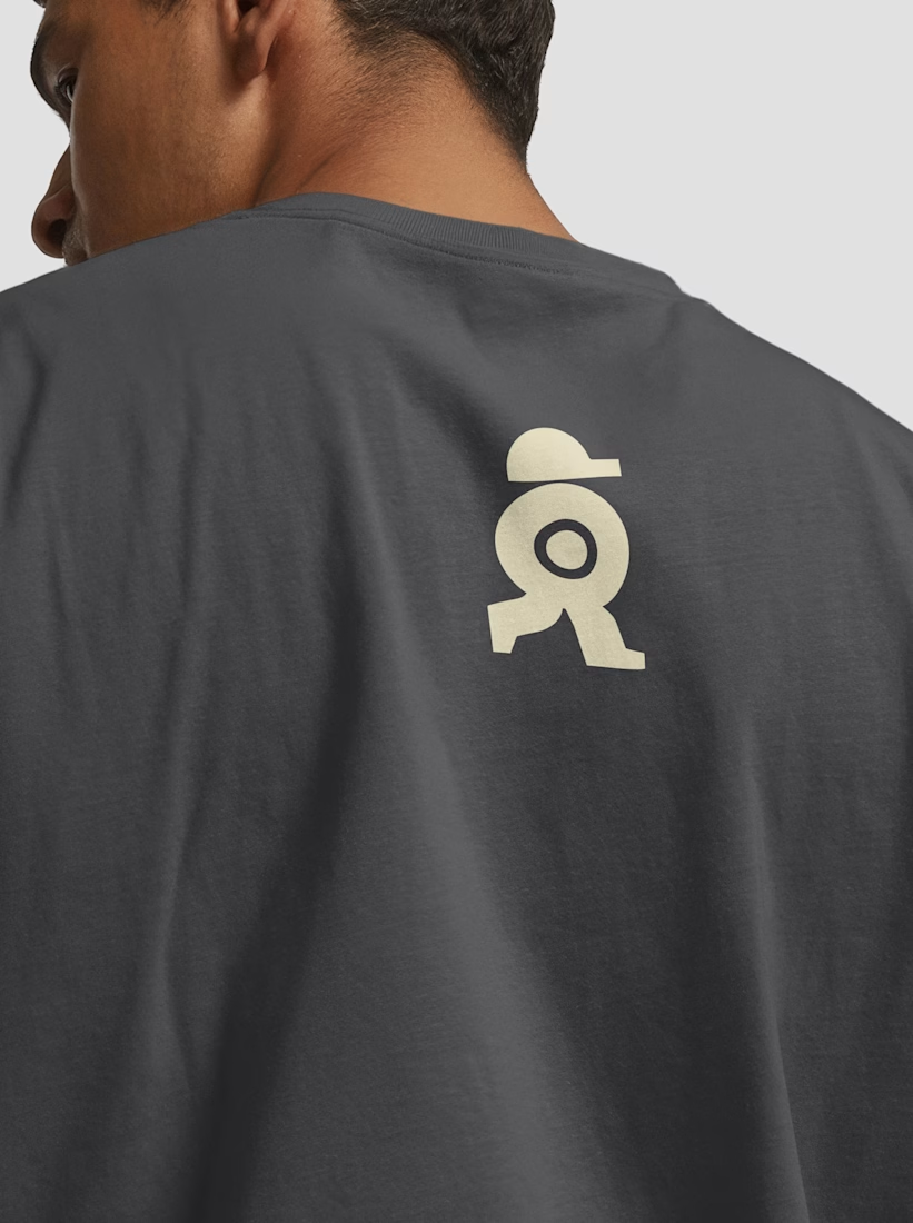
The WALKEAT identity transforms the shape of a sushi roll into a walking character. Its circular center references the cross-section of the roll, while the cap and legs bring movement and personality to the figure.
The custom-designed wordmark reinforces this concept through subtle modifications to the W, A, and E, creating a visual connection between typography and symbol.
A simple, playful and contemporary identity that communicates the product without relying on literal Japanese imagery or an overly cartoonish character.



Great work!!

Founders, if you need a website done by someone who has already worked with YC, A16z backed startups...well, I’m here. Send me a message.
I will help you figure out how to present your product and get your message across to the right people.

Great work!


We built a custom tool for a client to replace us. On purpose.
20+ custom assets delivered for their website. Then we built an internal app with the image style already dialed in.
Drop images in. Preview. Download.
Their team can make more assets in the same visual language, no agency needed.
We want to empower our clients to be independent.
nextstage.ai
Design @James Fortier


Love this approach! I’ve been building tools for internal use too. One is a tool that turns images into pixel art and animates them - https://mn-pixel-studio.vercel.app/ . It's still a work in progress 😊