The network for creativity
Join 1.25M professional creatives like you
Connect with clients, get discovered, and run your business 100% commission-free
Creatives on Contra have earned over $150M and we are just getting started
Back to feedPost


The network for creativity
Join 1.25M professional creatives like you
Connect with clients, get discovered, and run your business 100% commission-free
Creatives on Contra have earned over $150M and we are just getting started







Related posts

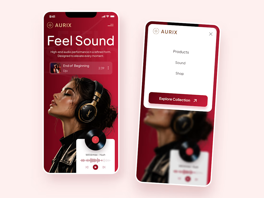
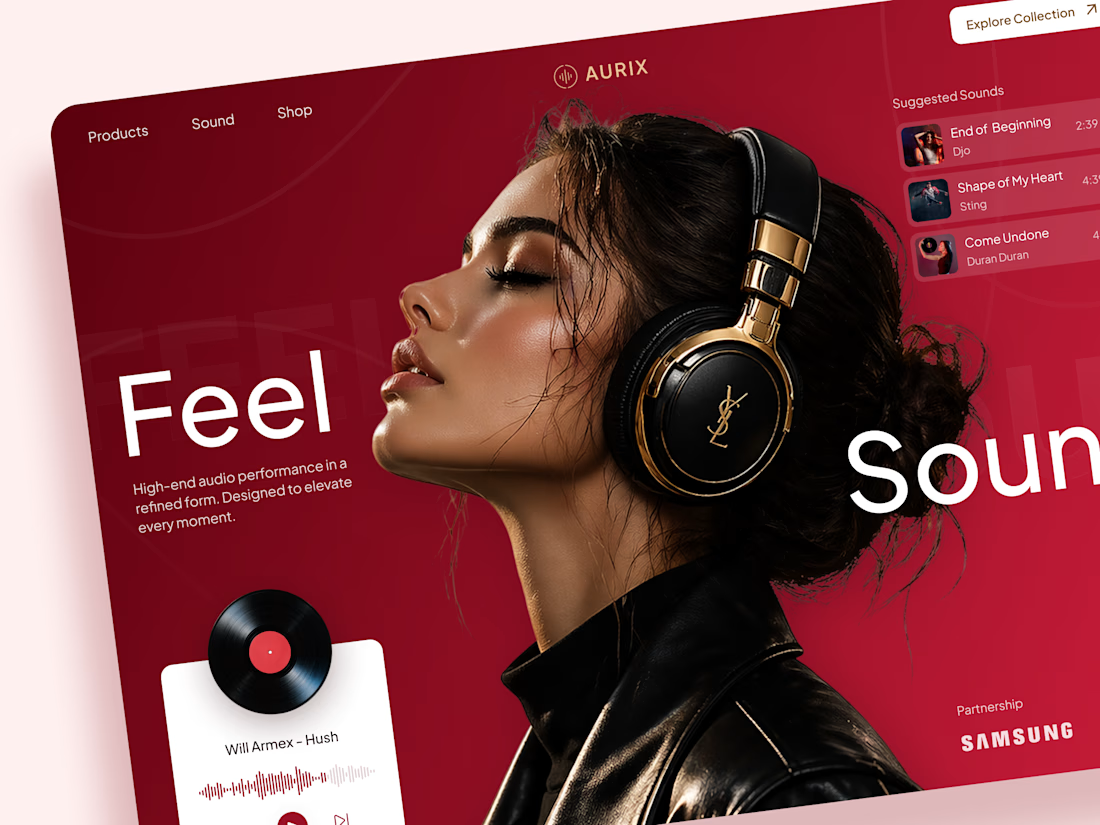
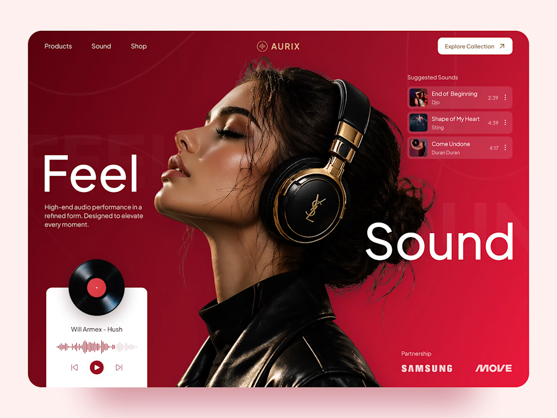
AURIX — Premium Headphones Landing Page 🎧❤️
A bold landing page concept for a premium audio brand, combining luxury headphones, music, and a strong lifestyle aesthetic
The design brings together deep red tones, elegant black and gold details, oversized typography, and immersive lifestyle imagery to create a modern, fashion-inspired experience
Special attention was given to:
• Bold lifestyle-focused hero composition
• Rich red and gold color palette
• Clean, oversized typography
• Music player and suggested tracks
• Premium product presentation
• Responsive mobile experience
• Minimal navigation and clear CTA
The result is a stylish, immersive landing page that connects premium audio with fashion, music, and everyday lifestyle ✨



Love the style!

Title: Echo — a place you can only hear 🔊
Primary effect: Bring your own effect: "Echo" 🌊
invideo Editor timeline:https://invideo.io/share/ECHO-editable-timeline-n92j4troIbx
Process note:
🌑 Echo is a black screen where every sound sends a wave of light through the scene in real depth.
🎞️ Starting footage: one licensed stock clip of a temple corridor from invideo's stock library. The sound is original, synthesised for this piece. The voiceover is my own.
💬 What I asked for: a black screen where each ping lights the scene by distance, built from a depth map, with controls for each wave, afterglow, wave thickness, contour lines, outlines, colour and a final reveal.
🛠️ What was built: a depth map (Depth Anything Video), two "Echo" custom effects on the depth map (a Multiply layer for light and an Add layer for glow), an "Echo colour" effect on the footage, and keyframes for six waves and the reveal. The first build was done by Claude, connected to invideo Editor through invideo's MCP server.
🎚️ Refinement: I asked invideo's own agent (Agent Two Lite) in the editor to raise Afterglow from 0.14 to 0.3 on both Echo effects. It made the change on the timeline, and that conversation is shown in the video. I also tried a longer afterglow and a gold colour, both shown.
✅ All building and the final cut were done in invideo Editor.


Wow ✨

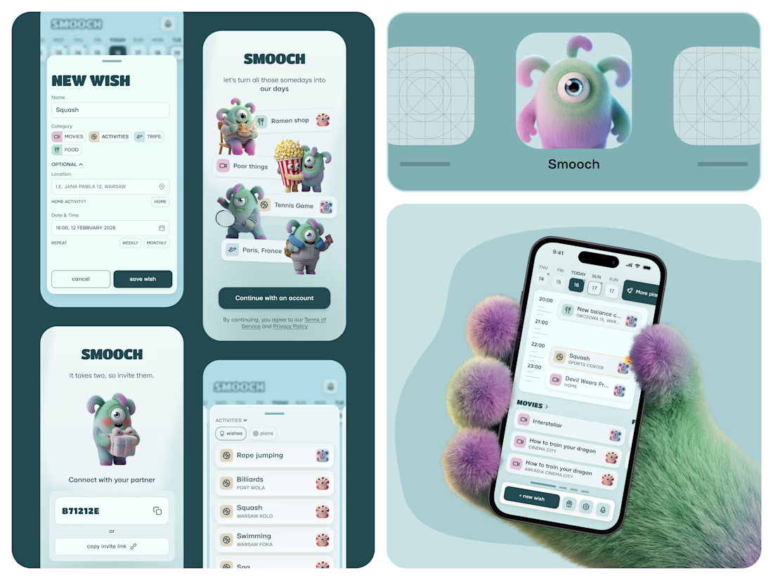
Smooch is live on the App Store 🥹
It started in January. My partner and I were planning trips for March and May, and suddenly realised we’d forgotten a movie we wanted to watch and a new Korean place we wanted to try. Big plans: fine. Small ones: gone.
So I built us a shared space for all those “we should try this someday” ideas. You save them together, drag one onto a day, and it becomes an actual plan.
I made it on my own: product, design, the build with Lovable, the website and the blog - Framer. 60 builds, a few App Store rejections, and one timezone bug that sent us to squash at 2am instead of 2pm xD
And there are no photos inside, just Smooches characters. Because who calls their person by their actual name anyway? (or it's just me there, huh)
The whole story is in the case study 🦄

That furry hand holding the phone is a scroll-stopper. These characters would be so fun animated, even just a little wiggle when a wish turns into a plan. Huge congrats on the launch.