The network for creativity
Join 1.25M professional creatives like you
Connect with clients, get discovered, and run your business 100% commission-free
Creatives on Contra have earned over $150M and we are just getting started
Back to feedPost

A premium automotive website concept designed to bring innovation, performance, and digital storytelling together.
The goal was to create an immersive browsing experience that captures attention from the first interaction and makes exploring vehicles feel effortless.
The experience features:
𝐂𝐢𝐧𝐞𝐦𝐚𝐭𝐢𝐜 𝐕𝐢𝐬𝐮𝐚𝐥𝐬: High-impact automotive imagery with a bold, futuristic aesthetic.
𝐒𝐦𝐨𝐨𝐭𝐡 𝐀𝐧𝐢𝐦𝐚𝐭𝐢𝐨𝐧𝐬: Seamless scrolling and engaging transitions between sections.
𝐈𝐧𝐭𝐞𝐫𝐚𝐜𝐭𝐢𝐯𝐞 𝐔𝐈: Dynamic performance cards, vehicle specifications, and intuitive navigation.
𝐌𝐨𝐝𝐞𝐫𝐧 𝐃𝐞𝐬𝐢𝐠𝐧: Strong typography, refined layouts, and a striking black-and-orange color palette.
𝐂𝐥𝐞𝐚𝐫 𝐔𝐬𝐞𝐫 𝐉𝐨𝐮𝐫𝐧𝐞𝐲: Strategically placed calls to action that encourage visitors to explore further.
Every element is designed to balance visual appeal with functionality, turning complex automotive information into an engaging digital experience.
This project showcases how thoughtful UI/UX and motion design can transform a traditional automotive website into a memorable, premium digital experience.

Bold direction!
Thanks 🙌
The network for creativity
Join 1.25M professional creatives like you
Connect with clients, get discovered, and run your business 100% commission-free
Creatives on Contra have earned over $150M and we are just getting started



Related posts

Live on Play Store. We made the launch video.
Motion design to show the screens, plus a short explainer so you get what the app does in a few seconds.
Kept it simple on purpose. Screens only move where it helps you follow the product.
Watch it with zero context and tell me what you'd cut.

Amazing


We are testing two ways to browse a large template library.
Load More
Users initially see 9 cards. After clicking the button, 9 more are added while the previous results remain visible. Browsing feels continuous, but the page gradually becomes longer.
Pagination
The catalog is divided into numbered groups. When users select the next page, the current 9 cards are replaced with a new set. They can jump to a specific part of the catalog and easily return to where they were.
Load More creates a smoother browsing experience, while pagination offers greater control.
Which option would you choose for a template library?

17 voted
68%
8 voted
32%
25 votes
Closed

Load more

've reviewed 50+ startup websites, and I noticed a pattern.
Their hero sections are often simple. They tell you who the product is for and what it does.
While working on this redesign concept for
@Alloovium, I wanted to explore a different direction.
Their original website already explained the product and its audience.
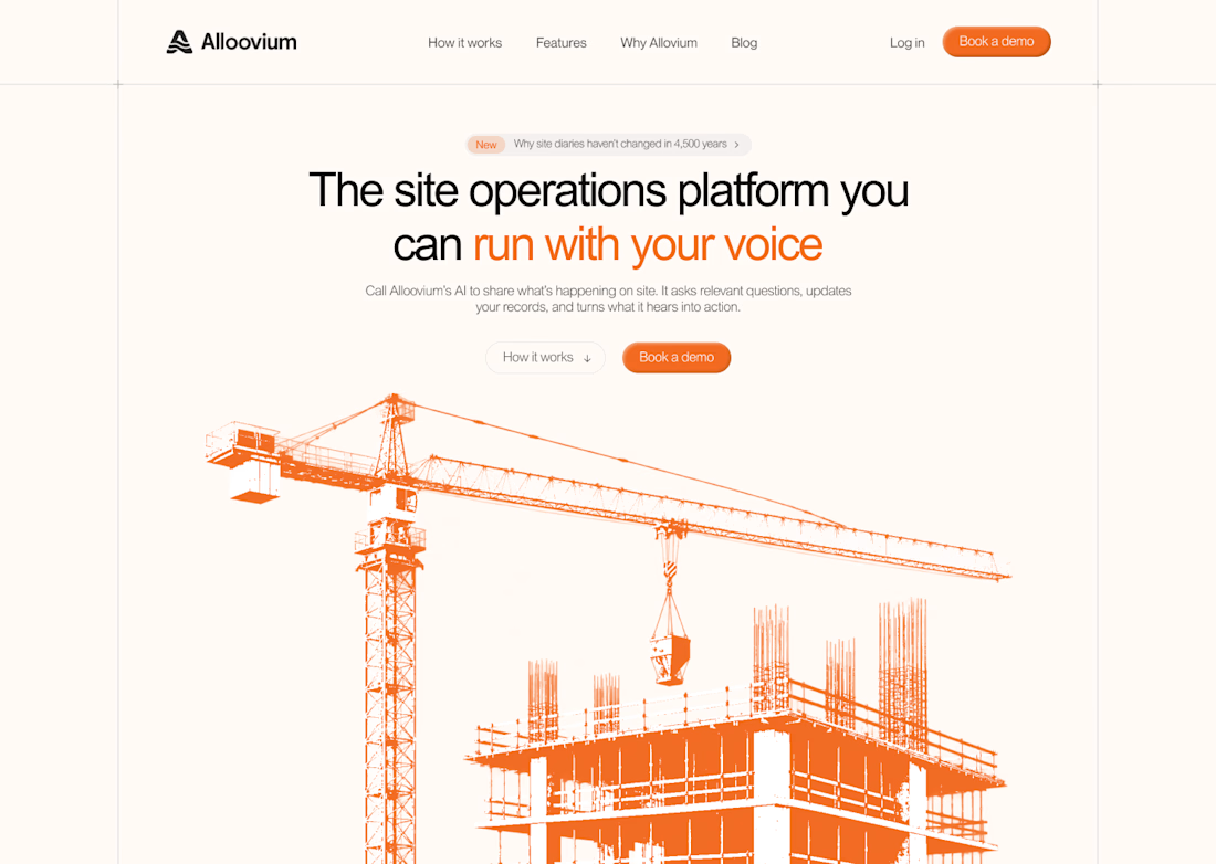
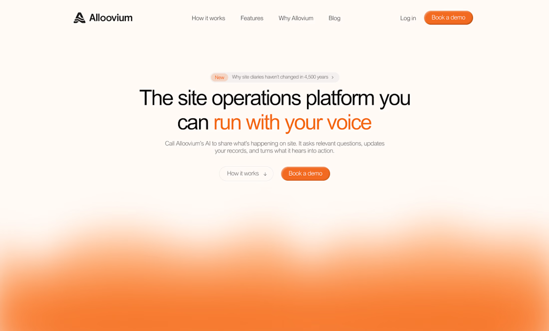
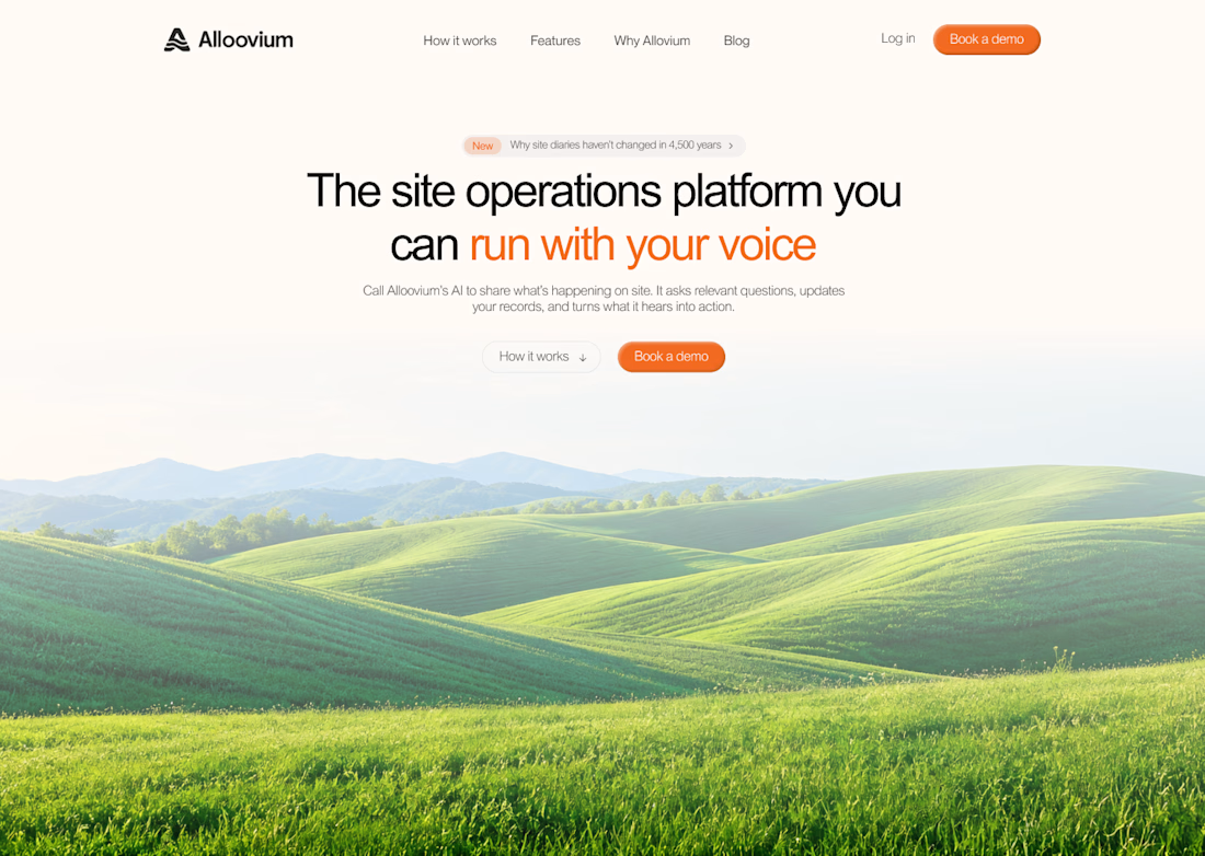
But what if the hero also used visuals that reflected the world their customers work in?
People often scan websites before deciding what to pay attention to.
Relevant visuals can catch their attention and create a connection with the audience before they start reading.
So I explored a few visual directions inspired by the construction industry.
Building a startup? I'd love to help you explore a new direction for your website.

The construction visuals work well.