The network for creativity
Join 1.25M professional creatives like you
Connect with clients, get discovered, and run your business 100% commission-free
Creatives on Contra have earned over $150M and we are just getting started
Back to feedPost

A pitch deck can look beautiful and still fail.
One of the biggest mistakes I see in pitch decks is trying to make every slide look impressive.
Big headlines.
Too many graphics.
Too many colours.
Too much information.
The goal of a pitch deck isn't to impress someone with the design.
It’s to make the story easy to understand.
A good slide should answer one simple question:
“What do I want the audience to understand from this slide?”
Once that is clear, the design becomes much easier.
The layout, typography, visuals, charts and spacing should all support that one message.
Good presentation design isn't about adding more. It's about knowing what to remove.
#PresentationDesign #PitchDeck #PowerPoint #InvestorDeck #PresentationDesigner #Contra


The network for creativity
Join 1.25M professional creatives like you
Connect with clients, get discovered, and run your business 100% commission-free
Creatives on Contra have earned over $150M and we are just getting started





Related posts


The thing I keep relearning: a design is never finished because someone ran out of ideas. It's finished because someone decided to stop. Knowing when to stop is the hardest part.


Damn.... Crazy colors 👏😍

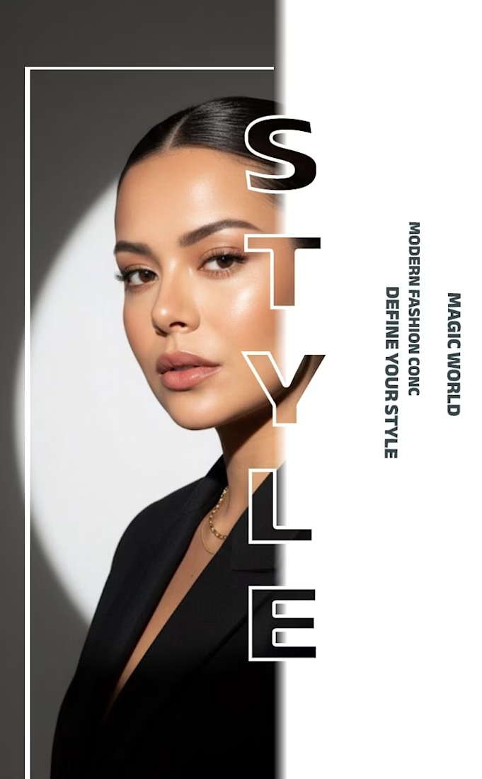
✨ Modern Fashion Poster Design - STYLE ✨
Designed a clean, high-fashion poster concept focusing on bold typography and minimalist aesthetics.
Concept: Modern Fashion | Define Your Style
Tool: Canva / Photoshop
Style: Luxury, Minimal, Editorial
Open to feedback and freelance work!
#GraphicDesign #PosterDesign #FashionDesign #Canva #ContraCommunity

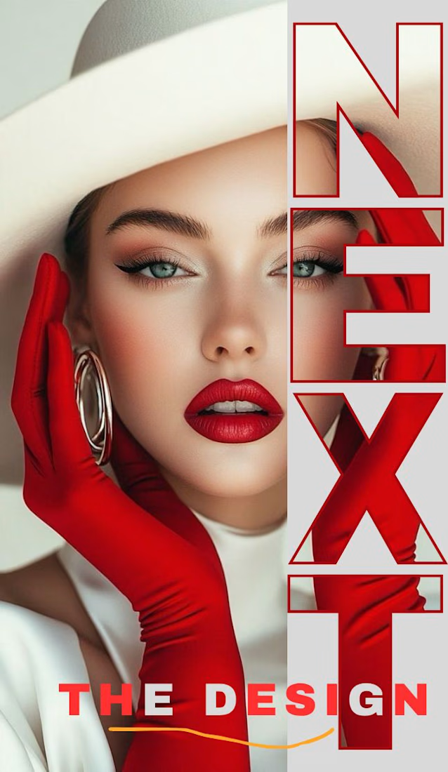
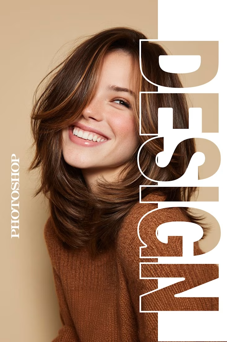
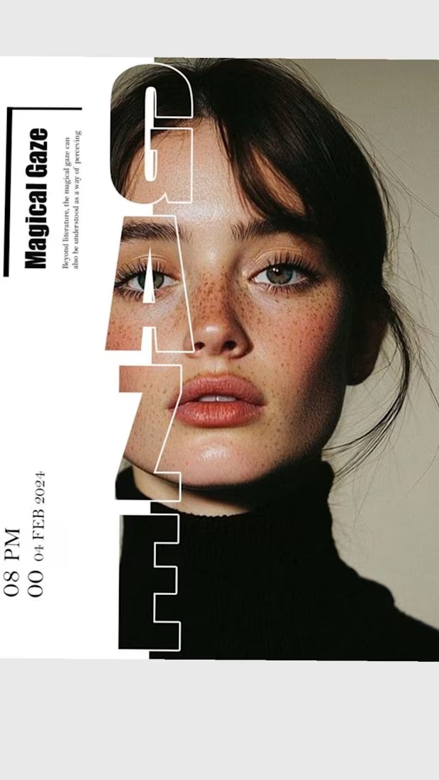

The way you let the bold type dominate the empty space really drives the luxury feel.

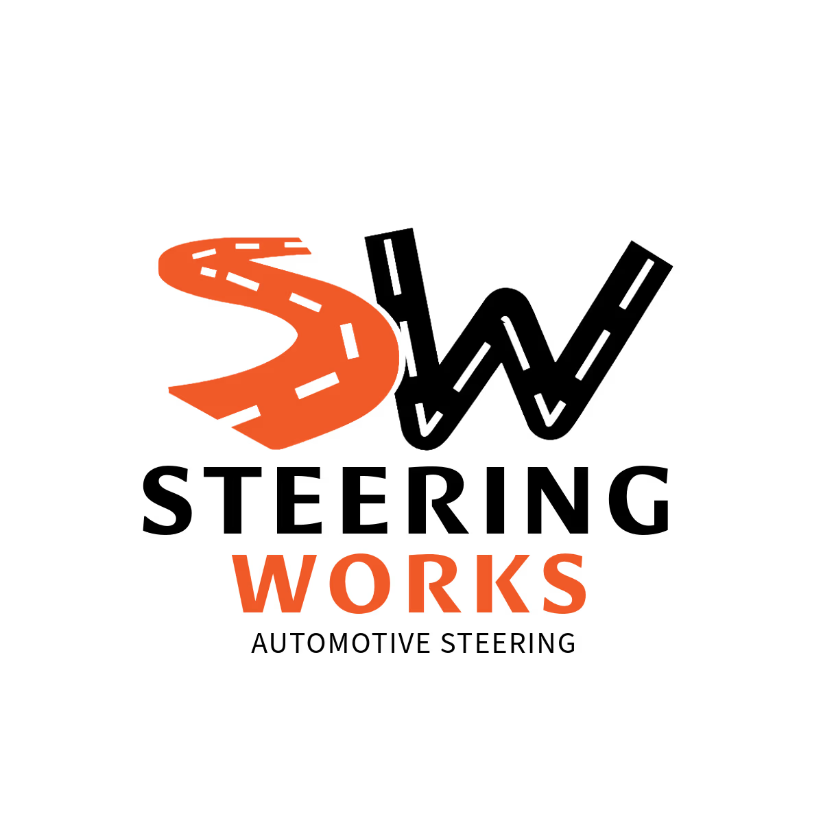
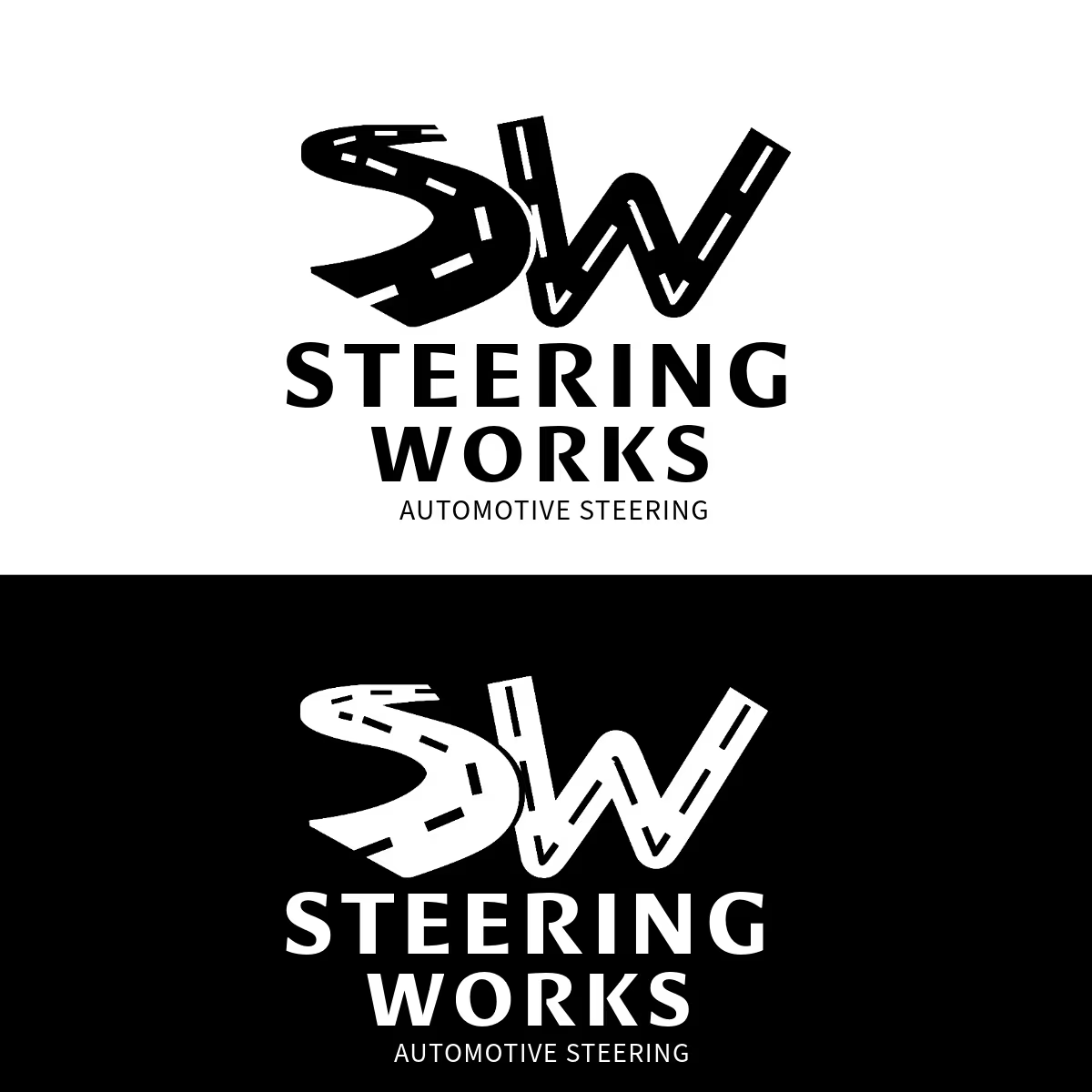
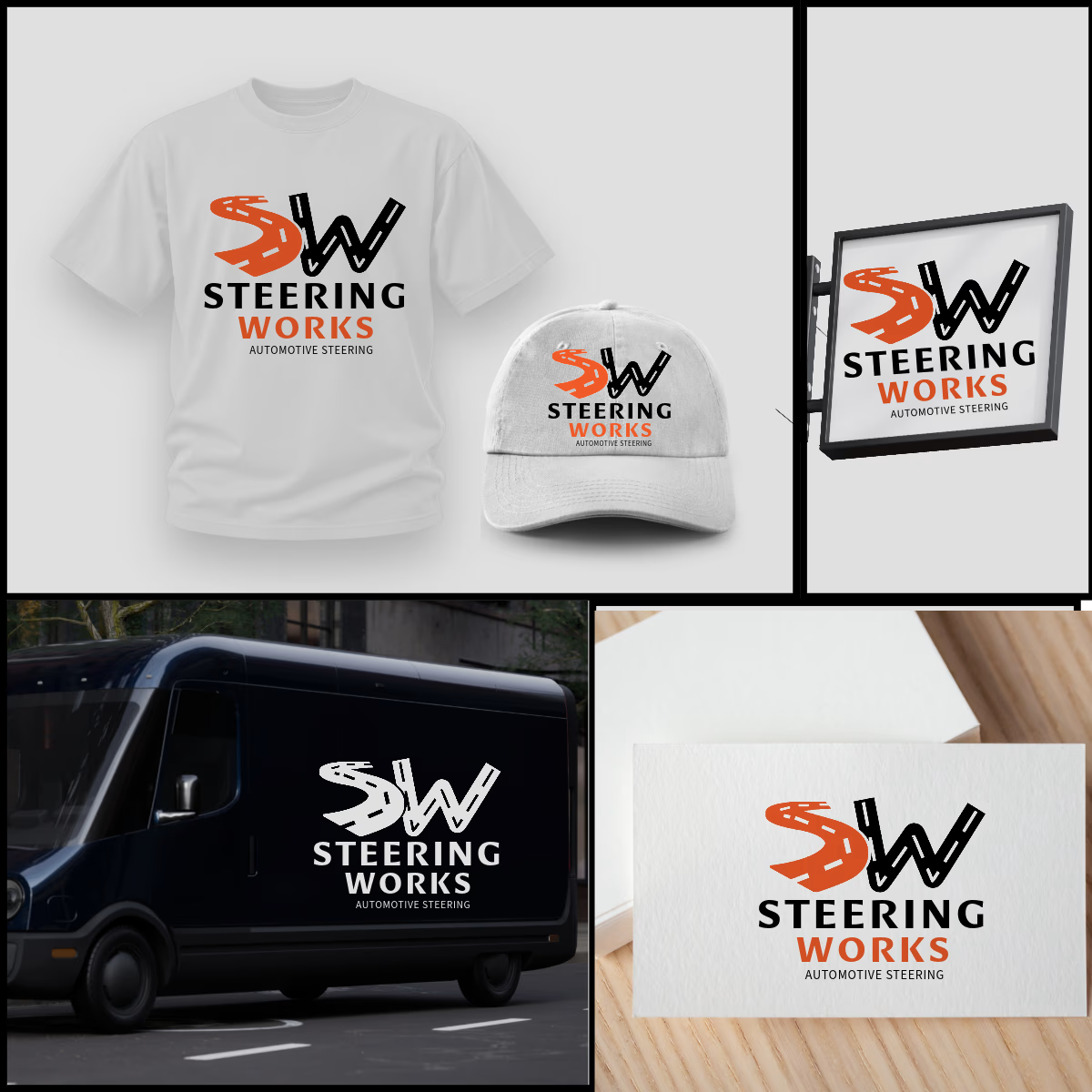
SW logo where S and W are winding roads, inspired by windy road sign idea. The orange S adds energy, black W adds strength. As shown, the design is highly adaptable and works perfectly on t-shirts, caps, van graphics, shop signage, and business cards in both color and single-color white. Strong, memorable, and built for automotive enthusiasts.


That's very attractive great job bro 🎉🎉🔥🔥