The network for creativity
Join 1.25M professional creatives like you
Connect with clients, get discovered, and run your business 100% commission-free
Creatives on Contra have earned over $150M and we are just getting started
Back to feedPost


The network for creativity
Join 1.25M professional creatives like you
Connect with clients, get discovered, and run your business 100% commission-free
Creatives on Contra have earned over $150M and we are just getting started











Related posts

Built this in Framer as a concept project. Goal was to make it feel run by ex-journalists. Choices: editorial serif (Libre Baskerville), a dark photo with one color accent, and copy that positions against blast-style PR.
Where I’m unsure: text legibility over the photo and whether the two CTAs compete. What would you change?

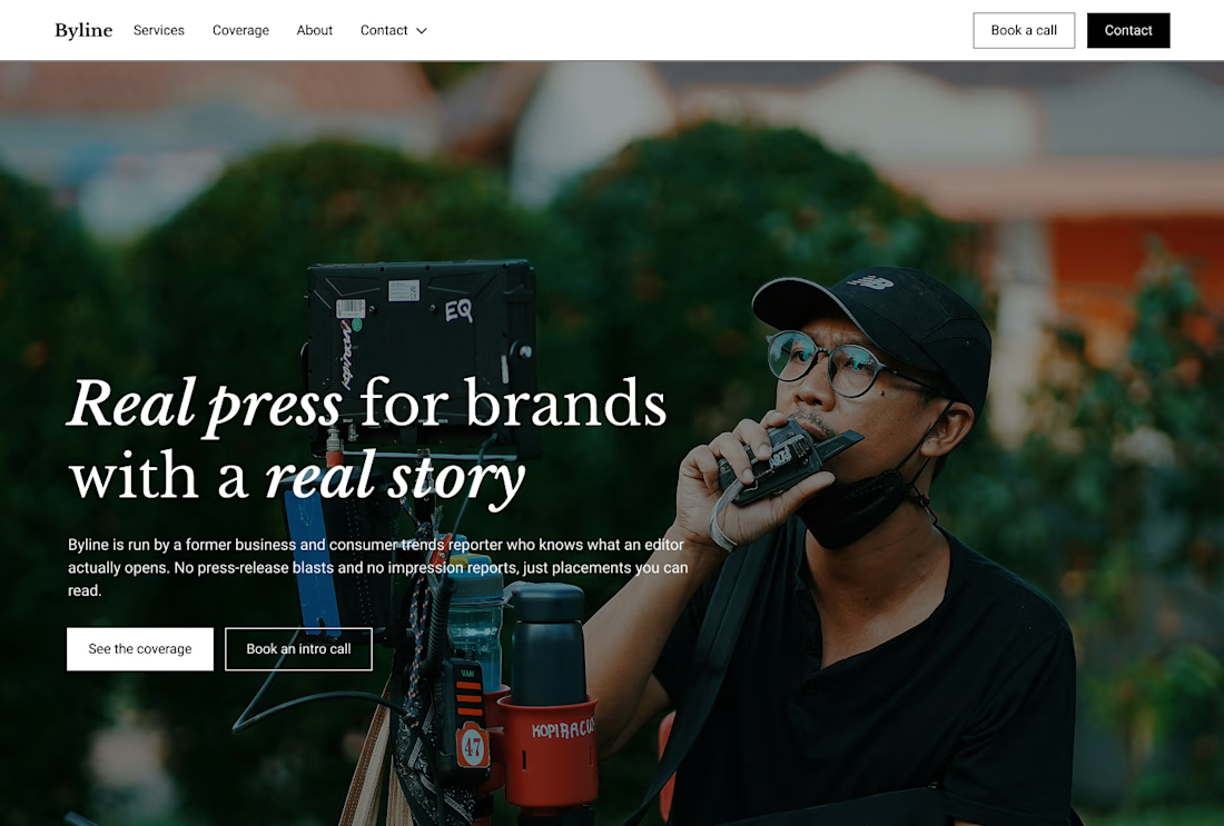

That's great design it feels professional I like how the background mixed with interface ❤️❤️
Great job Cheree🎉🎉


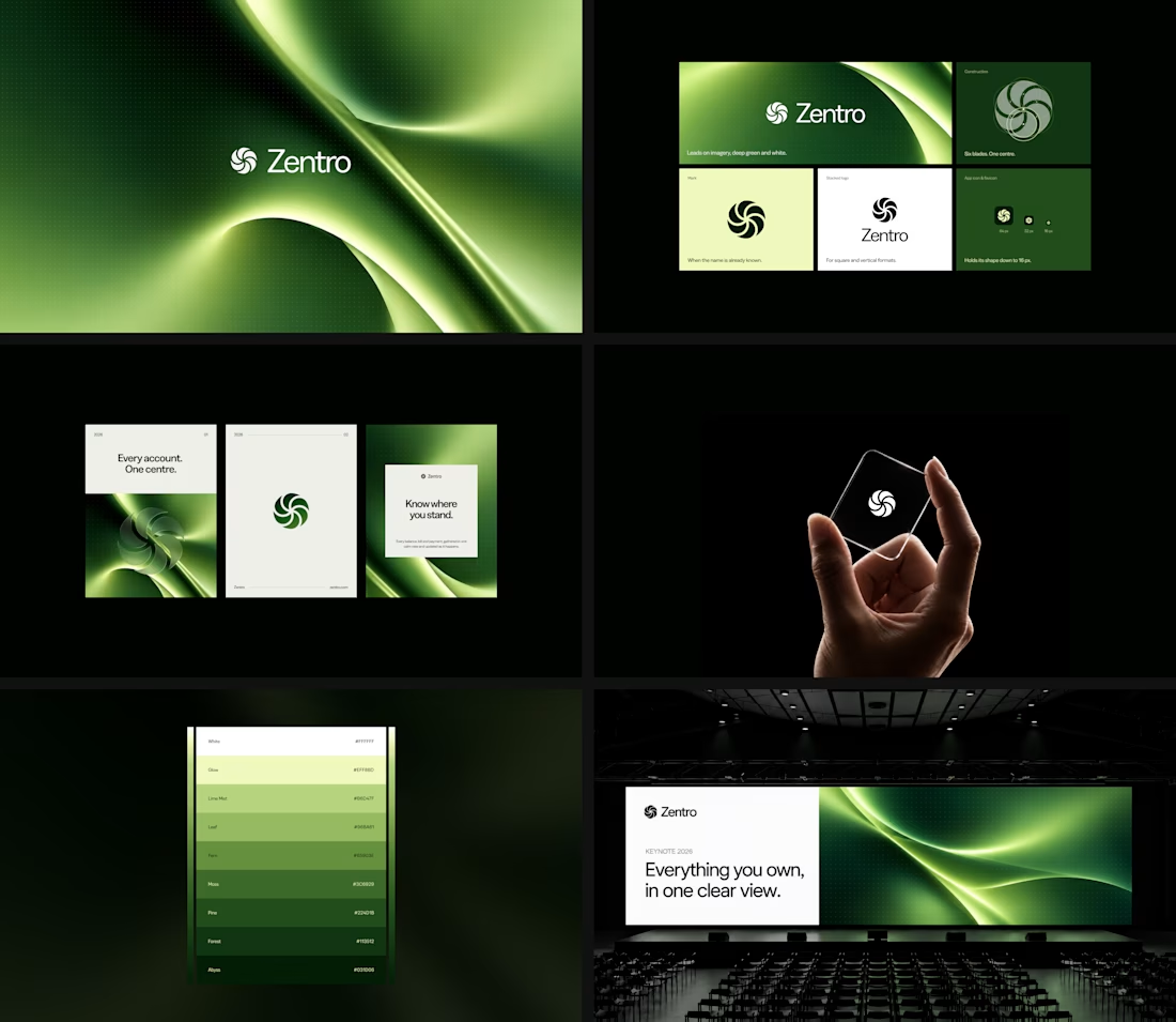

Clean and confident work! The green gradient with the mark feels very modern for fintech - trustworthy but not boring. The app screens look really polished. Curious how you landed on this mark, does it represent growth / movement?


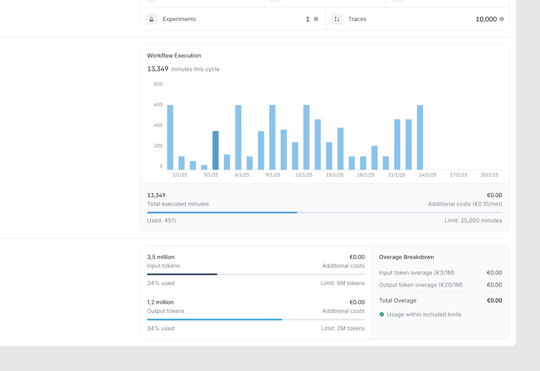
showing tonight as a dashed bar is such a good call. you see the plan before you've done it.