The network for creativity
Join 1.25M professional creatives like you
Connect with clients, get discovered, and run your business 100% commission-free
Creatives on Contra have earned over $150M and we are just getting started
Back to feedPost

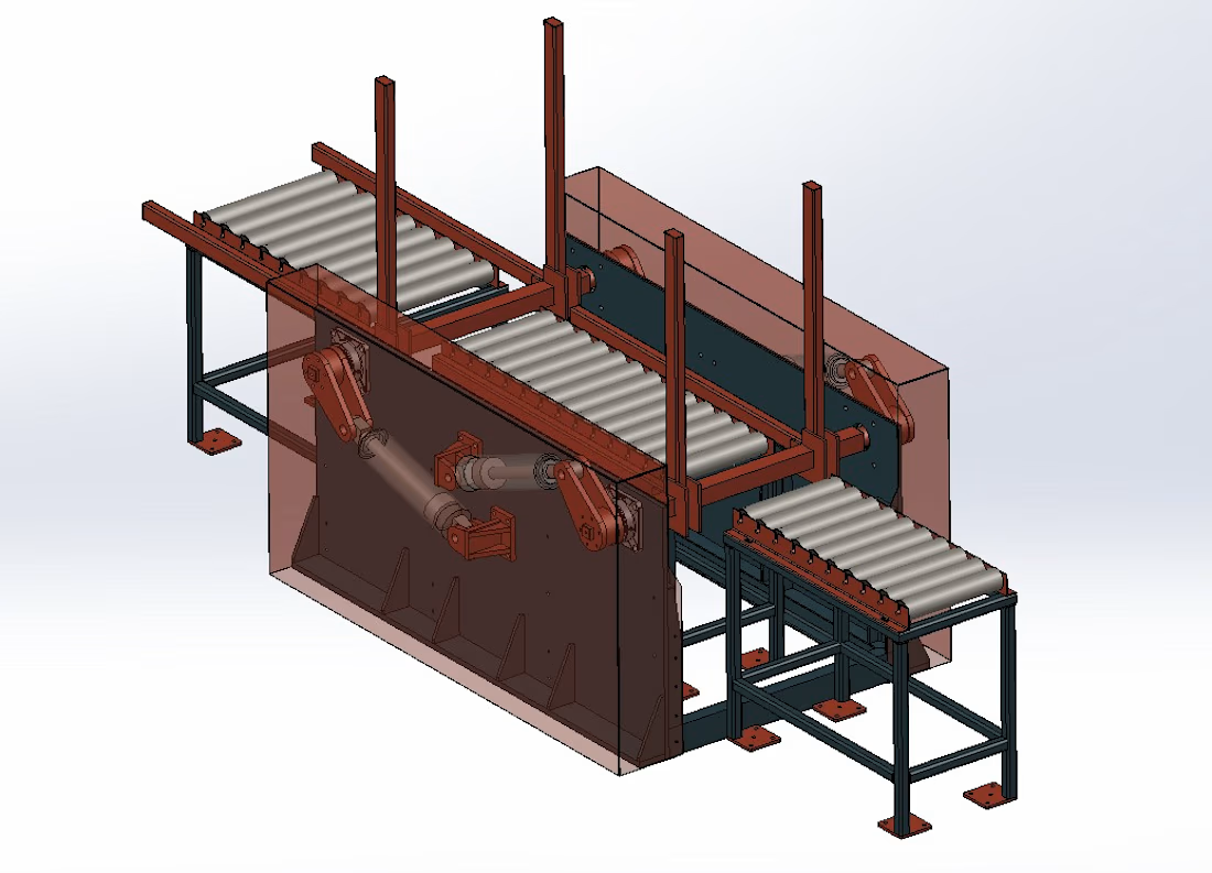
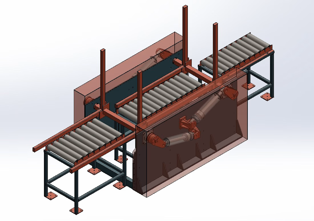
A welding automation fixture table for sheet metal components.

The network for creativity
Join 1.25M professional creatives like you
Connect with clients, get discovered, and run your business 100% commission-free
Creatives on Contra have earned over $150M and we are just getting started







Related posts




Super clean work!

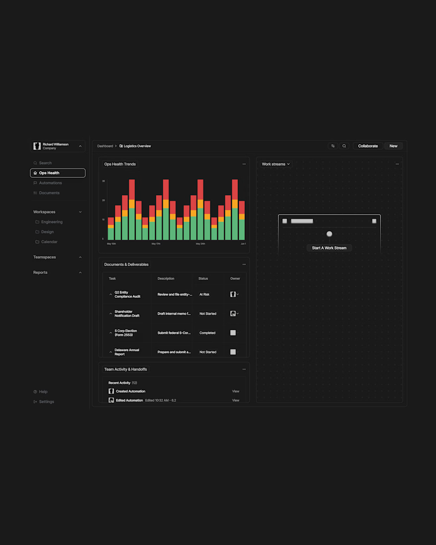
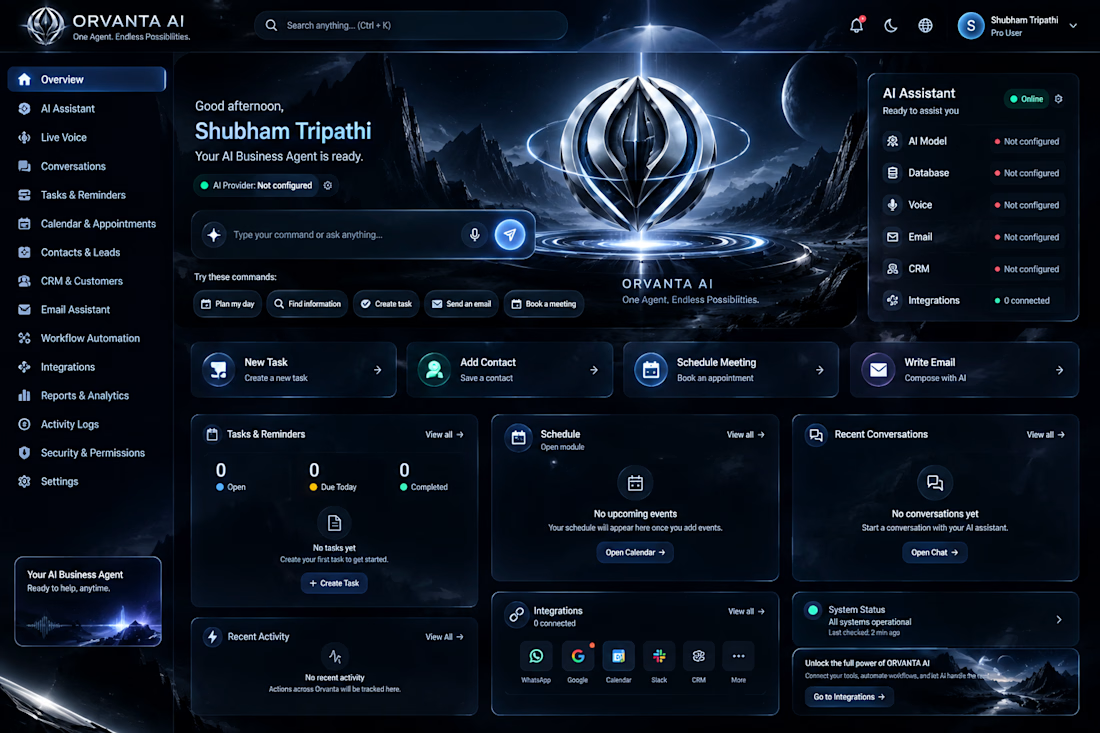
AI Agent Automation & Intelligent Workflow System
Building a smart AI agent powered by advanced AI models and workflow automation.
Integrating webhooks, AI memory, conditional routing, and automated responses.
Designed for customer support, product recommendations, and intelligent task handling.
Creating scalable, efficient, and business-focused AI automation solutions.
Designed & Developed by Shubham Tripathi.



I really found this so amazing personally