The network for creativity
Join 1.25M professional creatives like you
Connect with clients, get discovered, and run your business 100% commission-free
Creatives on Contra have earned over $150M and we are just getting started
Back to feedPost

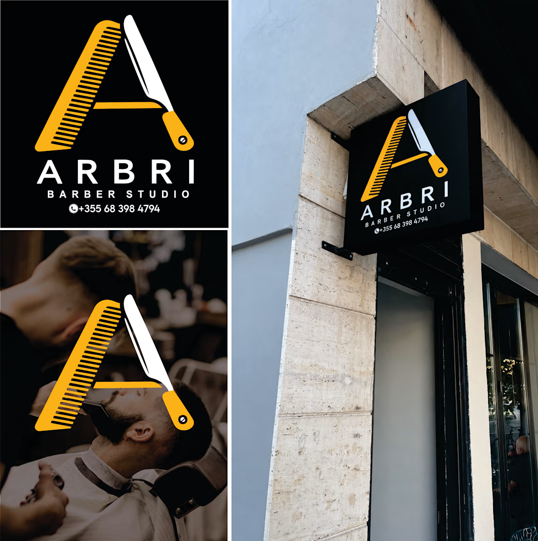
Arbri Barber Studio
From logo to storefront.
A comb and a straight razor come together to form the letter “A,” connecting the name Arbri with the barber’s craft. Yellow, black, and white create a strong contrast, making the identity stand out both on screen and on the exterior sign.
What did you notice first: the letter “A” or the barber tools?
The network for creativity
Join 1.25M professional creatives like you
Connect with clients, get discovered, and run your business 100% commission-free
Creatives on Contra have earned over $150M and we are just getting started
Related posts



New on Contra, not new to design.
I draw logos by hand, then build everything around them: the brand, the website, the store. Lately I also make product films and ads with AI.
Recent work: an RY monogram and site for a Koreatown law firm, a winged W for a defense firm, and my family's golf eyewear brand, from the mascot to Shopify.
Starting a brand, or have one that doesn't feel like you yet? Show me what you're building.

The logo-led system reads tight because the wordmark sits clean in the negative space instead of fighting the emblem — when a brand has that kind of restraint, the Shopify store usually carries the same hierarchy into the product grid and checkout without inventing new rules....

What if your biggest streaming platform got a Halloween makeover? 🕸️
As Halloween is closing by, I decided to do a short campaign teaser for one of the biggest streaming platforms.
I redesigned their logo and played with the wording as part of their brand messaging in a spooky theme for the upcoming Halloween event.
I retained the brand consistency across the typography and overall logo shape and changed few details within.
Any twitch streamers, viewers or halloween celebrants here?


Fun concept and perfect timing. The spooky wordmark twist still feels on brand, nice one.