The network for creativity
Join 1.25M professional creatives like you
Connect with clients, get discovered, and run your business 100% commission-free
Creatives on Contra have earned over $150M and we are just getting started
Back to feedPost

One of my recent projects is finally ready to share.
I had the opportunity to work on the brand identity for Civiclens, an independent civic accountability organisation focused on making public spending easier to see, understand, and question.
The goal was to build an identity that communicates trust, authority, and transparency while making civic accountability feel more accessible to everyday citizens.
Take a look at the project here:
Civiclens Branding
The network for creativity
Join 1.25M professional creatives like you
Connect with clients, get discovered, and run your business 100% commission-free
Creatives on Contra have earned over $150M and we are just getting started





Related posts

What should a beekeeping website explain before asking someone to choose a hive?
For Bee Girl, I designed and built a complete Shopify website around a clear journey: meet the colony, understand what’s inside a nucleus hive, compare the options, and connect with the beekeeper.
Honey yellow, hive black, warm cream, and bold typography bring the same visual language across desktop and mobile layouts.
One design decision that ties it together: the page explains the colony and its five frames before introducing the hive-quantity choices. Education gives the product selection context.
I handled the complete website project for the client through Fiverr, using Shopify. This video walks through the homepage.
Which would you explore first—the hive options, field classes, or the beekeeper’s story?
Explore the full Bee Girl case study: https://contra.com/p/WqNFR67b-bee-girl-shopify-website-design-for-beekeeping
If you’re building a Shopify website for a specialist business, I’m available for website design and development projects.


I'd open the hive options first, but only because the colony section already told me what I'm buying. Explaining the five frames before the quantity choice is a smart order. Teaching before asking someone to choose is so underrated in Shopify stores.

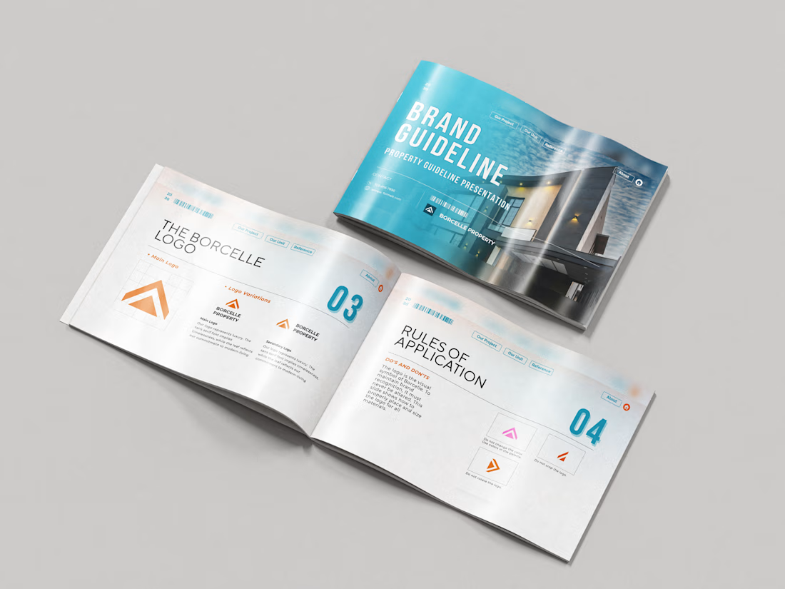
Just wrapped a brand identity concept for Haven Ridge Properties, a real estate developer selling to first-time buyers and investors.
The challenge: feel premium without feeling cold.
The answer was two ideas shelter and growth.
The mark is a roofline that doubles as an upward arrow: home and long term value in one symbol.
What's inside the guidelines:
• Primary and secondary logo lockups
• Logo usage rules
• Typography system
• Colour palette with clear roles
• Imagery direction
• Digital and print applications
Which detail stands out most to you?
#branding #brandidentity #logodesign #brandguidelines #realestate

For Ranch University, I designed and built a custom Kajabi website and course platform + community around ranch ownership and life on the land.
Earthy colors, ranch photography, and spacious layouts carry through the site, membership pages, and course presentation. I also handled the course structure and offer setup behind the scenes.