The network for creativity
Join 1.25M professional creatives like you
Connect with clients, get discovered, and run your business 100% commission-free
Creatives on Contra have earned over $150M and we are just getting started
Back to feedPost

Many fintech forms try to be "complete" instead of being easy to complete.
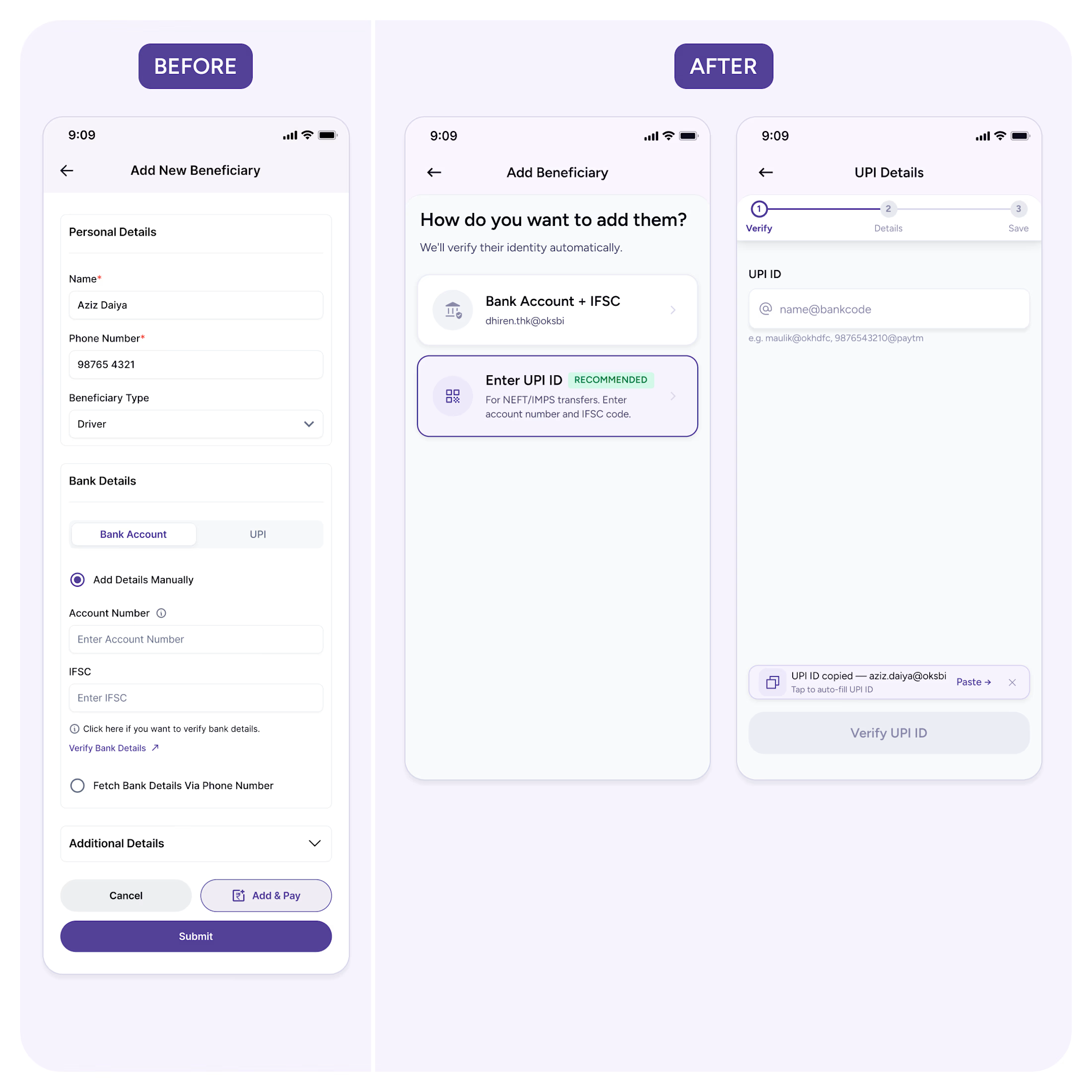
Here's a flow I redesigned for a payments SaaS — the Add Beneficiary screen.
The original put everything on one screen: personal details, bank or UPI selection, verification, additional fields, two CTAs. Nothing was broken. But users had to process the entire workflow before taking the first step.
The fix wasn't fewer fields. It was fewer decisions at once.
New flow starts with one question: "How do you want to add them?" From verification first, details next, save at the end.
The principle: don't make users think about the whole task. Just the next step.
That's the difference between a form that feels long and a flow that feels effortless.

The network for creativity
Join 1.25M professional creatives like you
Connect with clients, get discovered, and run your business 100% commission-free
Creatives on Contra have earned over $150M and we are just getting started






Related posts

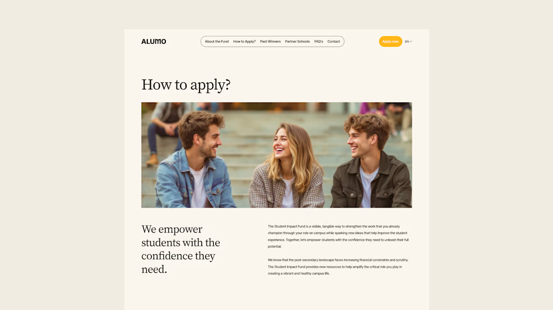
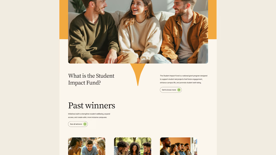
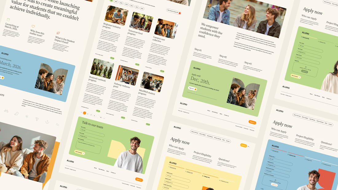
The Client: Alumo is a student impact fund that pools collective influence from influencers and partner schools to deliver a $250,000 annual grant program for student-led projects across Canada.
The Issue: The fund needed a website that could communicate trust and purpose to two very different audiences — students applying for grants and partner schools or influencers considering joining — while also showcasing past winners and guiding applicants through the process clearly.
The Solution: A multi-page website was designed with a warm, approachable visual identity using earthy tones, generous imagery, and clear information hierarchy. Each section — About, Past Winners, and How to Apply — was structured to reduce friction and build confidence, making it easy for students to understand eligibility and take action before the deadline.



Love how you're tackling trust + purpose for a $250K fund - that's a tough balance with two audiences. Communicating credibility for a student-led initiative across Canada is huge. Would love to see how you solved it!

Streamlining Store Operations with Relivo ⚡️☕️
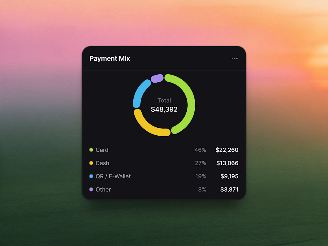
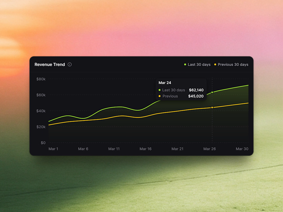
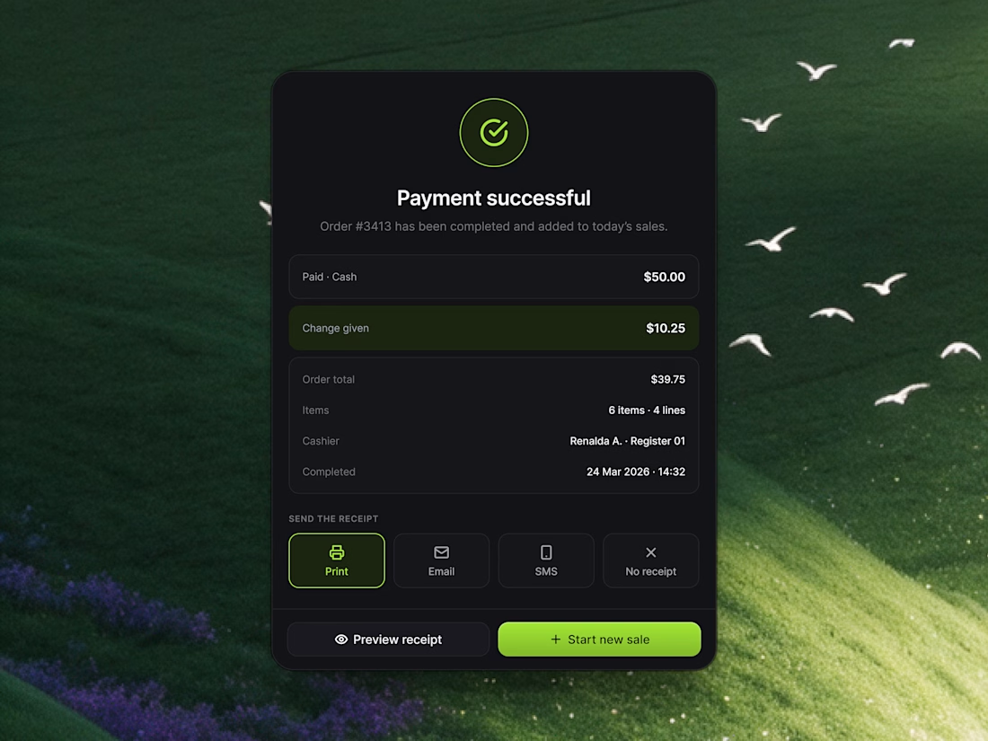
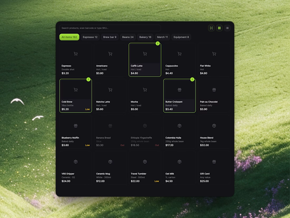
Managing a busy cafe or retail store shouldn't mean drowning in chaotic order tickets or guessing daily profit margins. With Relivo, we engineered modular UI cards that turn sales analytics, checkout confirmation, and inventory tracking into a seamless visual experience.
Highlights of the UI snippet components:
• POS Item Grid: Categorized menu tabs (Espresso, Brew Bar, Bakery) with active item badges and real-time stock alerts.
• Sales Analytics: Segmented payment mix distribution and 30-day comparative revenue trendlines.
• Payment Successful Modal: Instant receipt options (Print, Email, SMS) and one-click "Start new sale" action buttons.
Take a look at the attached 4 snippet cards to explore the layout and typography details!
Would love to hear your thoughts in the comments! 👇

Worked on two hero directions for Arvana. Both show the same dashboard UI but the background treatment changes everything.
Which one do you click? 👇
6 voted
18%
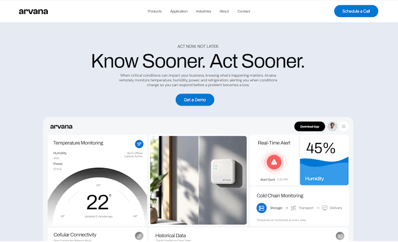
27 voted
82%
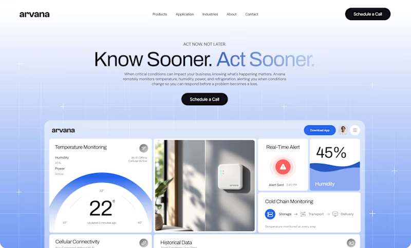
33 votes
Closed

🔥