The network for creativity
Join 1.25M professional creatives like you
Connect with clients, get discovered, and run your business 100% commission-free
Creatives on Contra have earned over $150M and we are just getting started
Back to feedPost
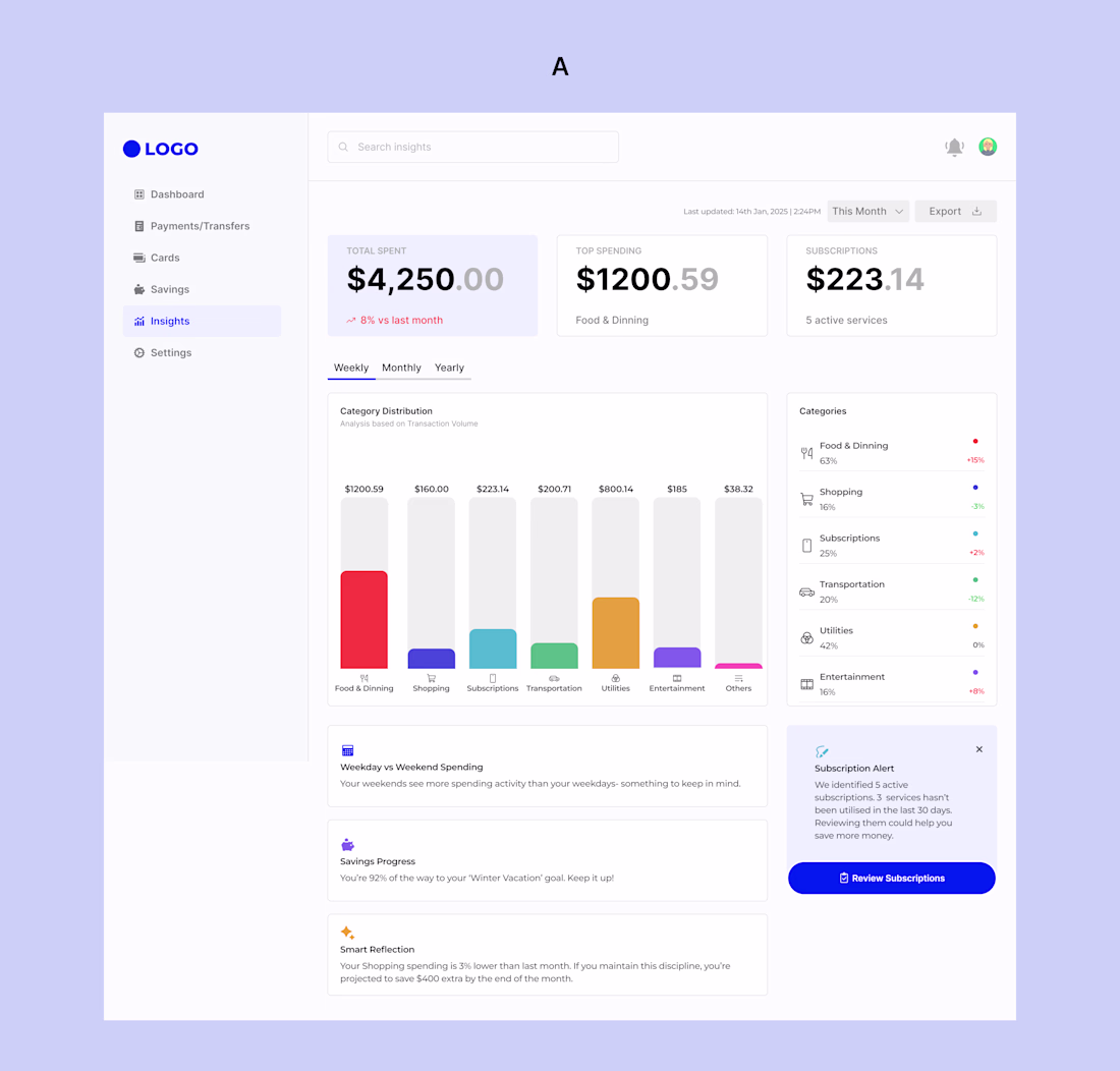
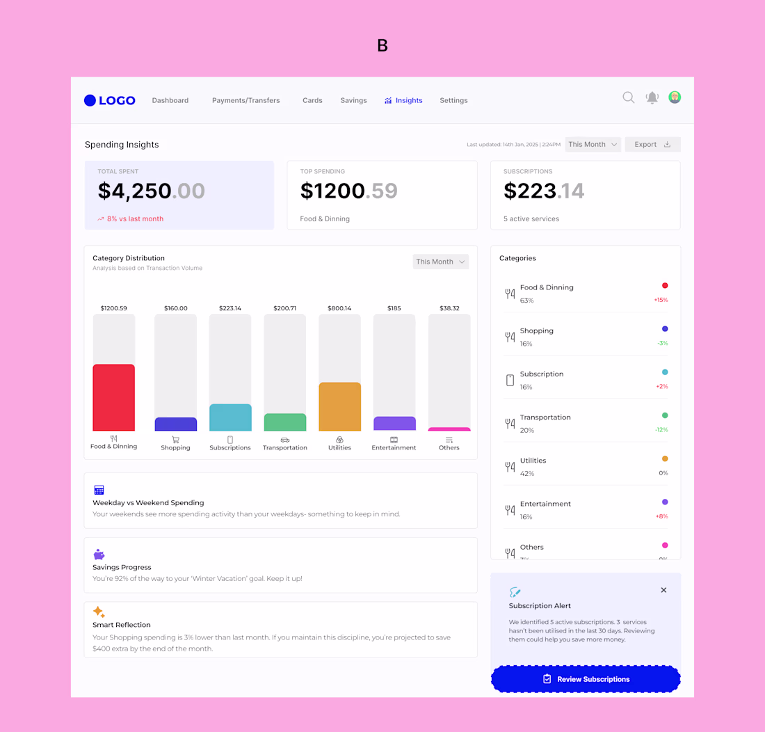
Practice makes perfect.
I say that because comparing how I used to design dashboards then and the way I design dashboards now, I see is growth.
I’ve always been one to run away from designing dashboards. They felt intimidating. I’ll say to myself, “too much data”, “too many decisions”, “too many ways to get it wrong”. But I’ve learned that growth doesn’t happen where we’re comfortable. So today, I decided to face that fear.
This wasn’t just about visuals, it was about designing understanding, not just data. I explored two different dashboard approaches, each solving the same problem in a slightly different way, because good UX isn’t always about one “perfect” solution, but about thoughtful trade-offs.
Which of the dashboards do you think has a better UX, A or B?
Thank you so much sir🙏🏾
The network for creativity
Join 1.25M professional creatives like you
Connect with clients, get discovered, and run your business 100% commission-free
Creatives on Contra have earned over $150M and we are just getting started
Related posts
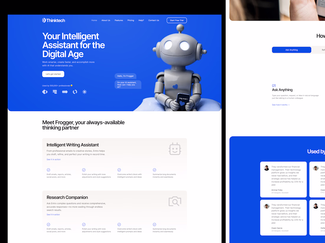
Zero experience in the UI design industry.
But creativity, imagination, AI, and @Wonder made it possible.
🔥 Introducing "TourMe"
🧠 The idea:
A website for people who love to travel, explore, and discover different countries.
🙌 Problem:
People often have to jump between multiple websites to find travel information about a country they want to visit.
😊 Solution:
A website with multiple features for different countries:
• Weather
• Currency
• Best places to visit
• Popular restaurants
• Traditional foods
• Hotels and places to stay
• Activities
• sim cards
• and many more
💯 WORKFLOW:
• Explained my idea in ChatGPT and generated a prompt
• Used Wonder Chat to create UI concepts and website designs
• Refined everything manually using Wonder's tools and AI features
• Used Shader, Wonder Chat, Properties, and other tools
• Used Figma templates as references
• Explored different Wonder features and workflows
• Generated images using Wonder Chat
• Used Opus and Fable for generation
🙌 Others:
• Uploaded webpage screenshots and used Wonder Chat to recreate similar layouts
• Used Pinterest for inspiration and images
🎉 Wonder MCP:
• Connected Wonder MCP with Claude
• Claude helped create parts of the website
• Used GitHub to publish the website
TourMe Website:
https://aymdaking.github.io/TourMe1122/
Wonder File (Check page 1 and Page 2):
https://app.wonder.so/angelo-pacaanas/files/019f21e1-b614-7ae0-96ce-16e3fb4f1b80
🧠 UNEXPECTED:
• I didn't expect copying designs from Figma to Wonder to be so easy
• There are many Shader modes to choose from
• Prompt-to-UI worked even without UI design experience
• Wonder MCP worked smoothly with Claude
• Wonder Chat is more than a UI generator—it also helps answer questions and guide ideas
• Multiple image generation models are available (my favorite is Nano Banana)
• Easy to move, edit, and rearrange elements
• Lots of useful tools that are simple to learn and use
Recently I developed this UI, which is a gamified dashboard for students and teachers with neurodiversity accessibility, especially for ADHD users.
The teacher dashboard has more options than the student dashboard, but I think both are neat.
Which one do you like more?
4 voted
67%
2 voted
33%
6 votes
Closed
Really love how you contained the gamified visual elements into that distinct isometric corner widget on the student side. Keeping it completely separate from the core tracking layout is a great way to offer that sense of reward and ownership without adding constant visual noise to the main focus areas.
Great Work
Challenges
View allTrending
Claude
Claude has entered the design space. How are you using Claude Design?
Contra University
Learn from expert creatives how to earn more using next-gen AI tools.
fifaworldcup2026
The World Cup is here and the whole world's watching. How are you designing for the world stage?
creativeaiflow
Creative AI workflows are evolving. What tools do you use, and what are their strengths and weaknesses?
freelancerlife
Freelancer life is wins, pivots, and everything in between. What’s yours right now?