The network for creativity
Join 1.25M professional creatives like you
Connect with clients, get discovered, and run your business 100% commission-free
Creatives on Contra have earned over $150M and we are just getting started
Back to feedPost
Taste Test

The devil is in the details.
Panels in the animation or no panels?
My goal is to minimize the number of elements as much as possible.


8 voted
89%
1 voted
11%
9 votes
Closed

option 1 wins for me! the panels only show your keen eye for the little things & exhibits that you can make them feel magical.


Animations looks good

Minimizing elements until only the essential ones survive is a good instinct, but I'd guess the panels version reads faster on a quick scroll even with more visual weight. Did you land on that hunch through testing with actual users, or is it more of a gut call at this stage?
If possible an A/B test would be great for this!

Love it


no panels, keeps it breathing
The network for creativity
Join 1.25M professional creatives like you
Connect with clients, get discovered, and run your business 100% commission-free
Creatives on Contra have earned over $150M and we are just getting started











Related posts

WIP - Brand Identity
Which one?
9 voted
47%
10 voted
53%
19 votes
Closed

B is more suitable for these textures ❤️❤️
Great job Gaber🎉🎉🔥🔥

Two page transitions, one site. Which one feels better to you?

5 voted
83%
1 voted
17%
6 votes
Closed
Kinetic Reveal feels more natural ❤️❤️
great job Dayyan🎉🎉

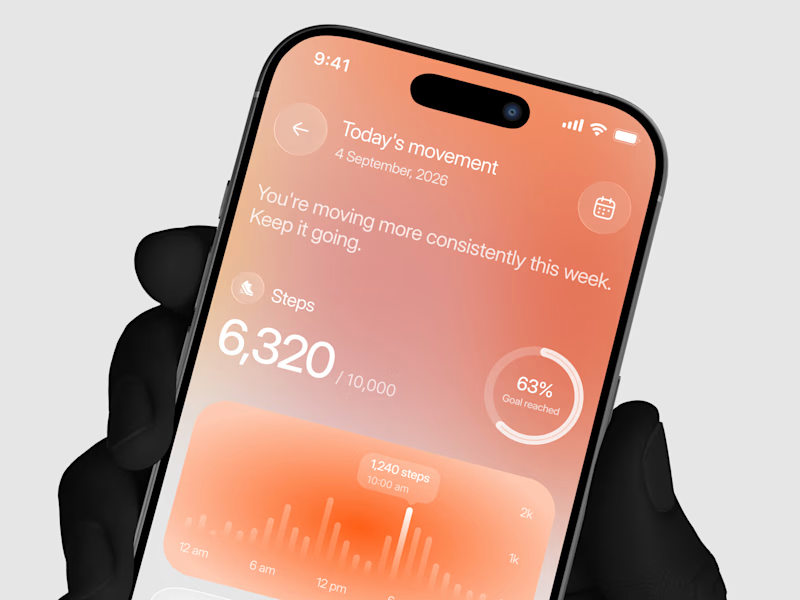
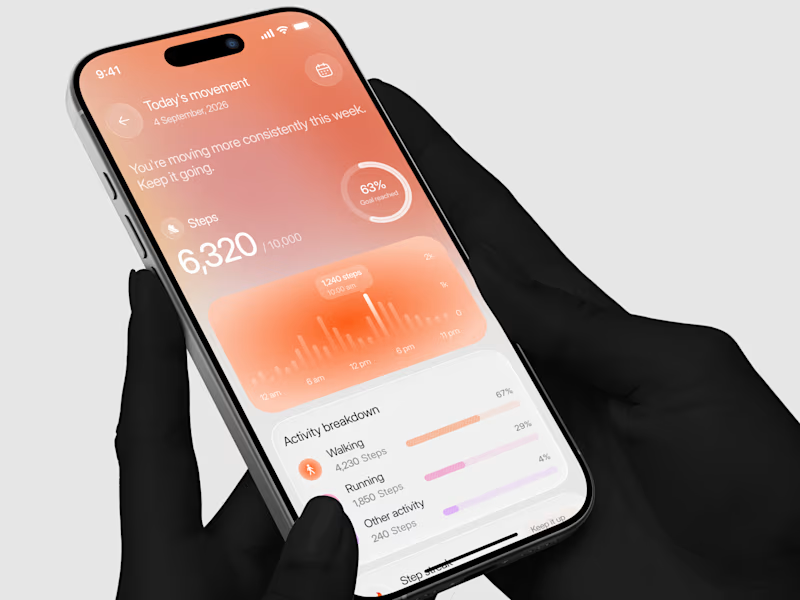
Designed a step tracking screen where you can see your daily progress and weekly trend in one glance.
Same screen, two shots. Which one would stop your scroll? 👀


11 voted
73%
4 voted
27%
15 votes
Closed
