The network for creativity
Join 1.25M professional creatives like you
Connect with clients, get discovered, and run your business 100% commission-free
Creatives on Contra have earned over $150M and we are just getting started
Back to feedPost
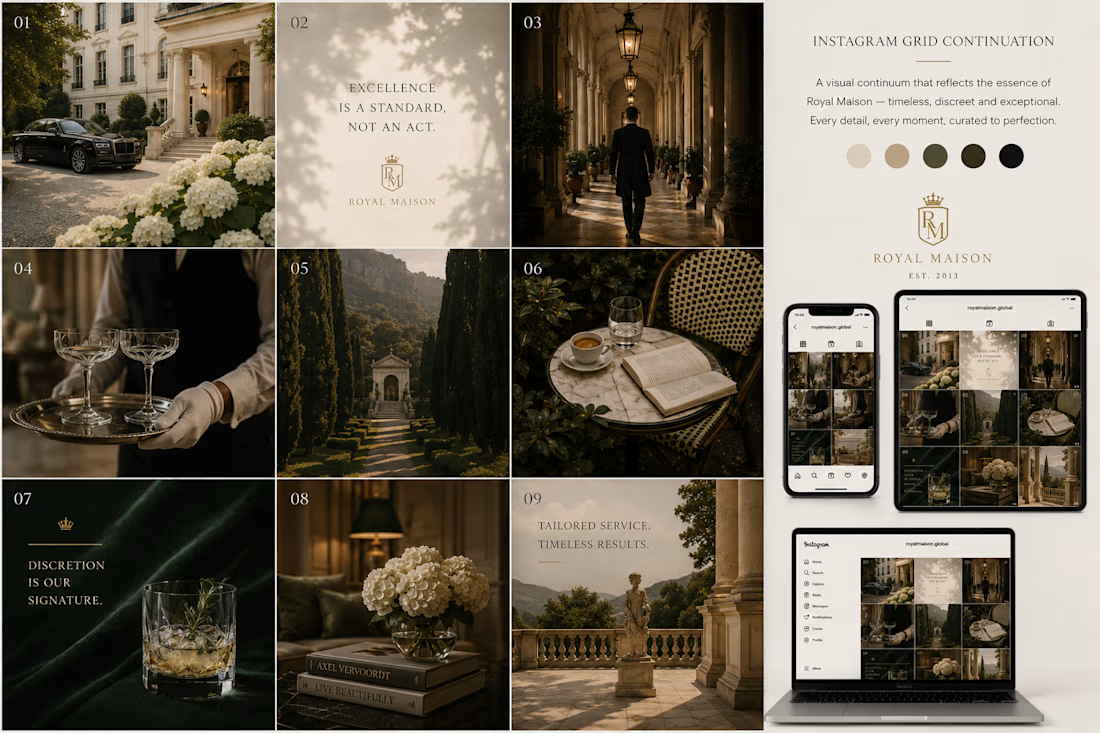
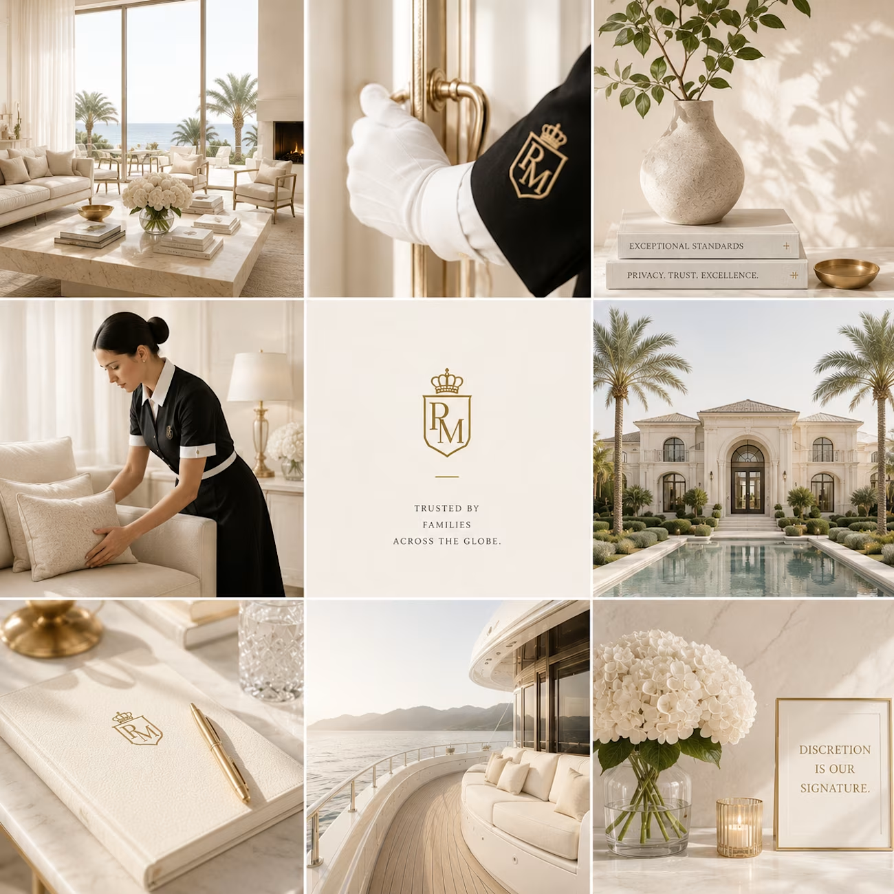
I've been exploring two creative directions for a luxury brand's Instagram presence, one with a darker editorial aesthetic and the other with a softer, light luxury approach.
The client preferred the lighter direction, and after refining the concept, I can see why. It feels more timeless, elegant, and aligned with the brand's identity.
Design isn't just about making something look beautiful—it's about finding the visual language that truly represents the brand.
Which theme would you choose for a luxury brand: Dark or Light?

Every detail looks well thought out

Thankyou Faraz
The network for creativity
Join 1.25M professional creatives like you
Connect with clients, get discovered, and run your business 100% commission-free
Creatives on Contra have earned over $150M and we are just getting started
Related posts


Just created a small logo animation in Rive. Made two versions: dark and light. Which one do you like better?

34 voted
65%
18 voted
35%
52 votes
Closed


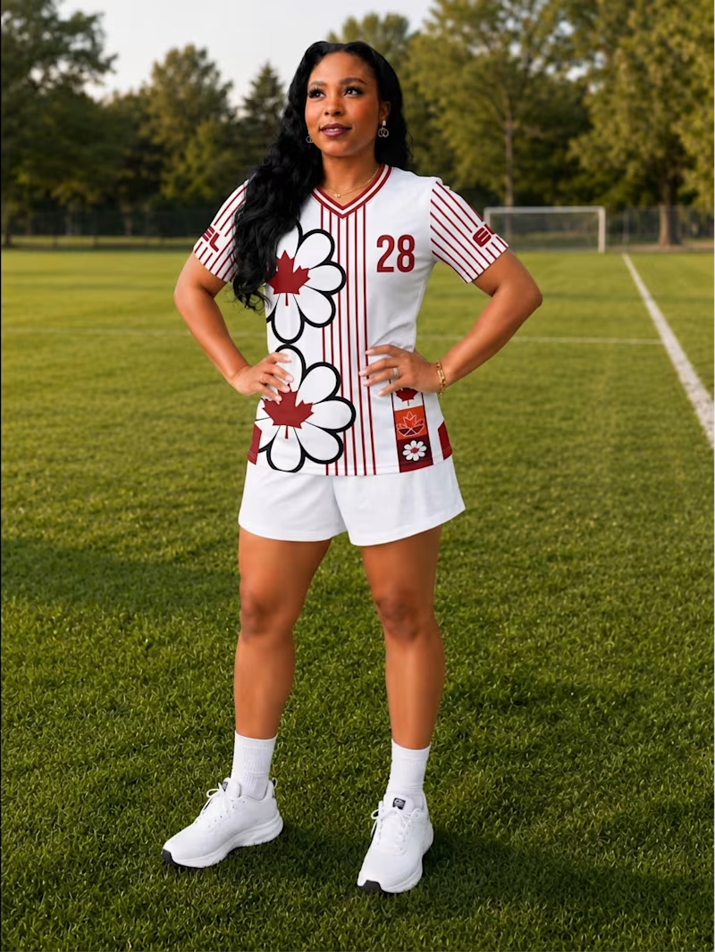
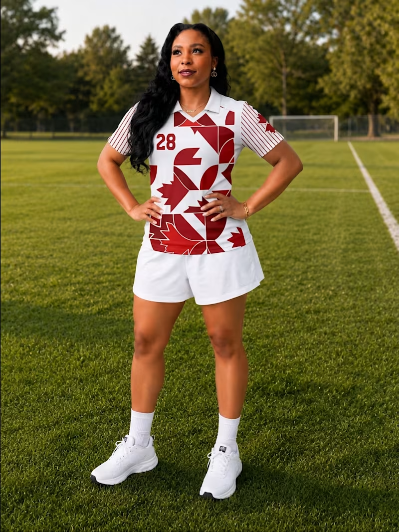
Which jersey design is your favourite? 👀
A or B?
I first designed in Adobe Illustrator and then created the mockups using Adobe Firefly, exploring different layouts, patterns, and details inspired by Canada and my own creative style.
If you're curious about the process, you can watch the full walkthrough here: Designing my own Jerseys 🇨🇦⚽


12 voted
30%
28 voted
70%
40 votes
Closed

B

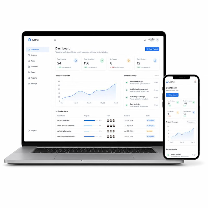
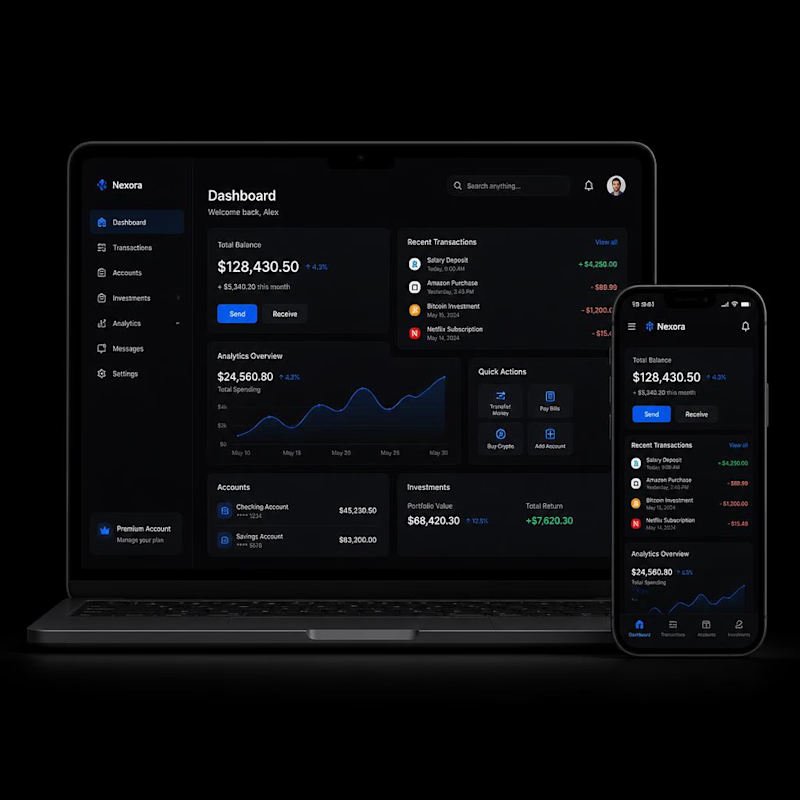
Quick design question for fellow designers and founders.
Which dashboard feels more premium to you?
☀️ A = Light Mode
🌙 B = Dark Mode
Let me know your choice.

5 voted
56%
4 voted
44%
9 votes
Closed
I choose dark mode








Trending

Claude
Claude has entered the design space. How are you using Claude Design?

Contra University
Learn from expert creatives how to earn more using next-gen AI tools.
fifaworldcup2026
The World Cup is here and the whole world's watching. How are you designing for the world stage?
creativeaiflow
Creative AI workflows are evolving. What tools do you use, and what are their strengths and weaknesses?
freelancerlife
Freelancer life is wins, pivots, and everything in between. What’s yours right now?