The network for creativity
Join 1.25M professional creatives like you
Connect with clients, get discovered, and run your business 100% commission-free
Creatives on Contra have earned over $150M and we are just getting started
Back to feedPost

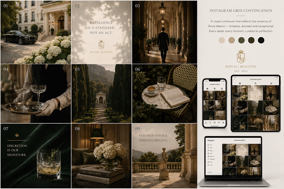
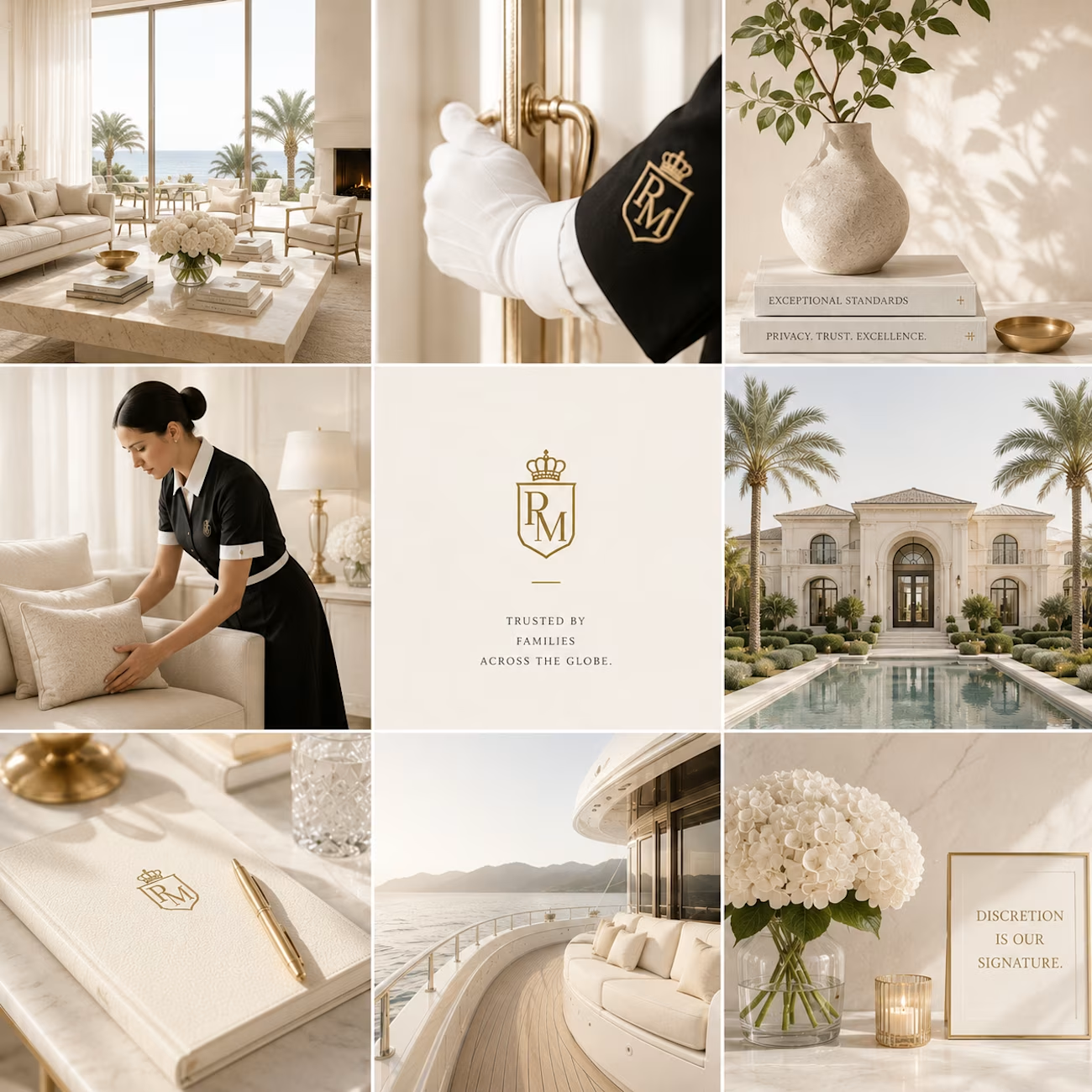
I've been exploring two creative directions for a luxury brand's Instagram presence, one with a darker editorial aesthetic and the other with a softer, light luxury approach.
The client preferred the lighter direction, and after refining the concept, I can see why. It feels more timeless, elegant, and aligned with the brand's identity.
Design isn't just about making something look beautiful—it's about finding the visual language that truly represents the brand.
Which theme would you choose for a luxury brand: Dark or Light?
The network for creativity
Join 1.25M professional creatives like you
Connect with clients, get discovered, and run your business 100% commission-free
Creatives on Contra have earned over $150M and we are just getting started
Related posts

In response to the aesthetic homogenization brought about by AI, brands like Prada remind us that the human touch is the ultimate luxury.


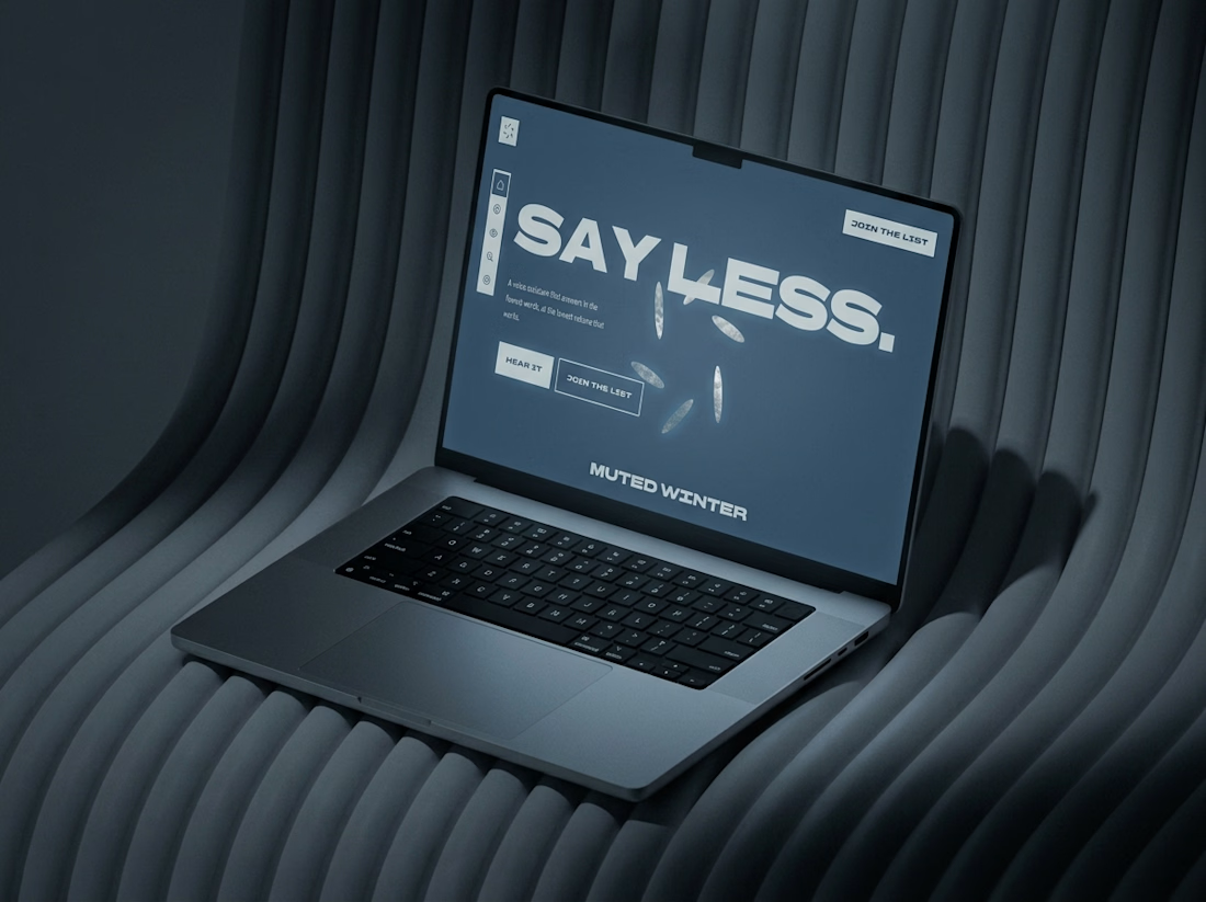
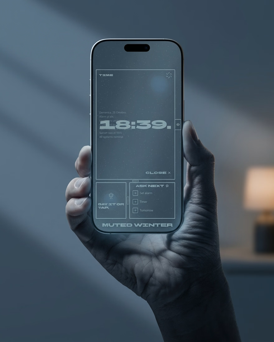
Friday app: Muted Winter
Six petals do the talking.
They scatter when it listens, drift inward when it works, and line up when it answers.

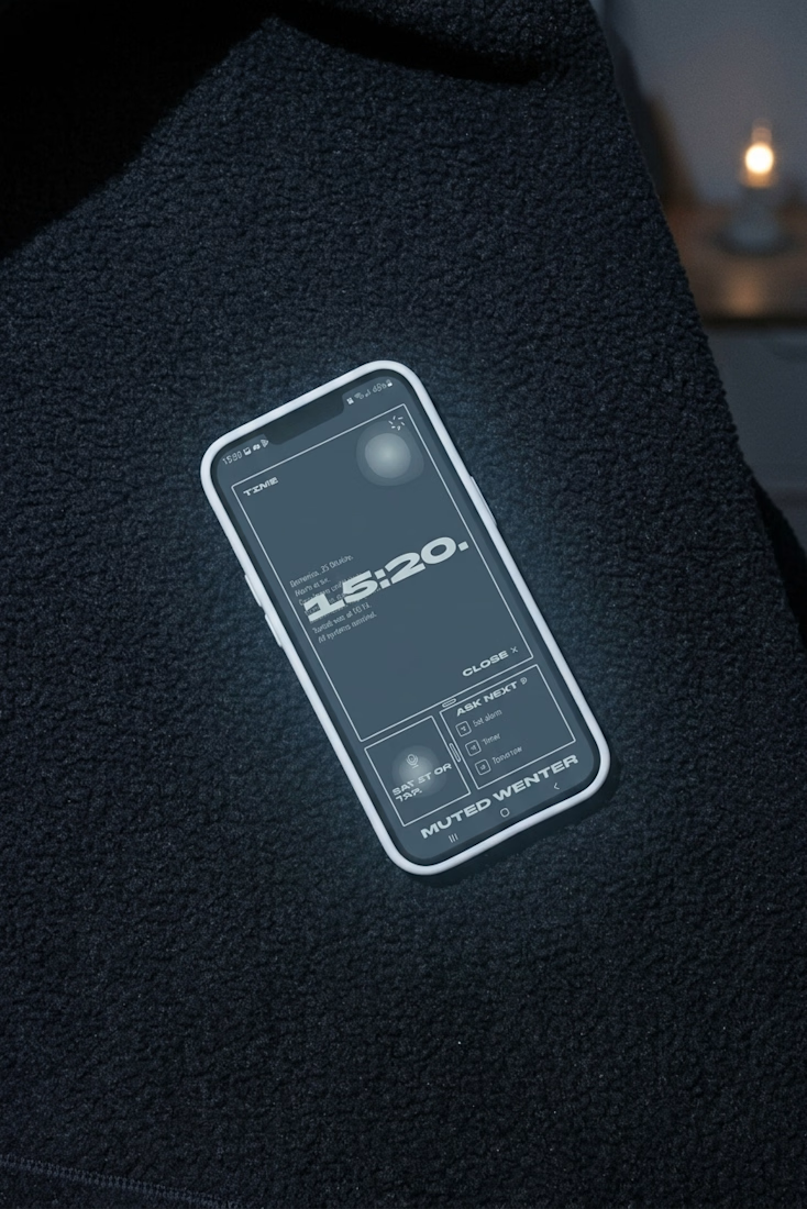
What if a website went quiet as you scrolled?
The Muted Winter site starts on bright snow and ends after midnight. Six petals open like windows, the page dims, and no line runs longer than a breath.
Live here