The network for creativity
Join 1.25M professional creatives like you
Connect with clients, get discovered, and run your business 100% commission-free
Creatives on Contra have earned over $150M and we are just getting started
Back to feedPost

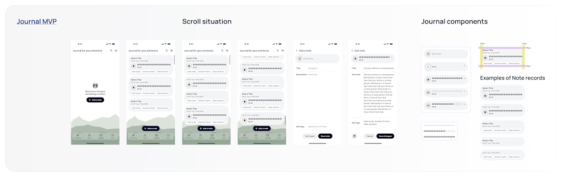
Branding, ideation and design directory for lifestyle wellness iOS app.
In store soon.

The network for creativity
Join 1.25M professional creatives like you
Connect with clients, get discovered, and run your business 100% commission-free
Creatives on Contra have earned over $150M and we are just getting started





Related posts


One of our favorite & most challenging parts of product video is figuring out how much someone actually needs to see to understand the product
That’s where motion and pacing do a lot of the work: guiding your attention and giving each step enough room to make sense.
Here’s our latest video for evolv, made by the VAAS team.


The glow on the Vee button draws the eye before the UI even appears. Nice pacing for a 1 minute product video.

Wrapped September, a month that felt like three...
We launched Grind, a sport nutrition brand designed like a coffee brand, briefing to shelf in 4 weeks. Workshop's new website went live after 8 weeks of work, and we officially joined the Webflow Partner Program.
Behind all that: 90 videos, 29 design projects, 5 development builds, and 224 hours of work.
As we always say, the best is yet to come.


Great marketing video great work 🎉🎉🔥🔥