The network for creativity
Join 1.25M professional creatives like you
Connect with clients, get discovered, and run your business 100% commission-free
Creatives on Contra have earned over $150M and we are just getting started
Back to feedPost

𝟮𝟬𝟮𝟱 𝗔𝘂𝗱𝗶𝗲𝗻𝗰𝗲 𝗦𝘂𝗿𝘃𝗲𝘆 𝗥𝗲𝗽𝗼𝗿𝘁 𝗣𝗿𝗲𝘀𝗲𝗻𝘁𝗮𝘁𝗶𝗼𝗻 𝗗𝗲𝘀𝗶𝗴𝗻
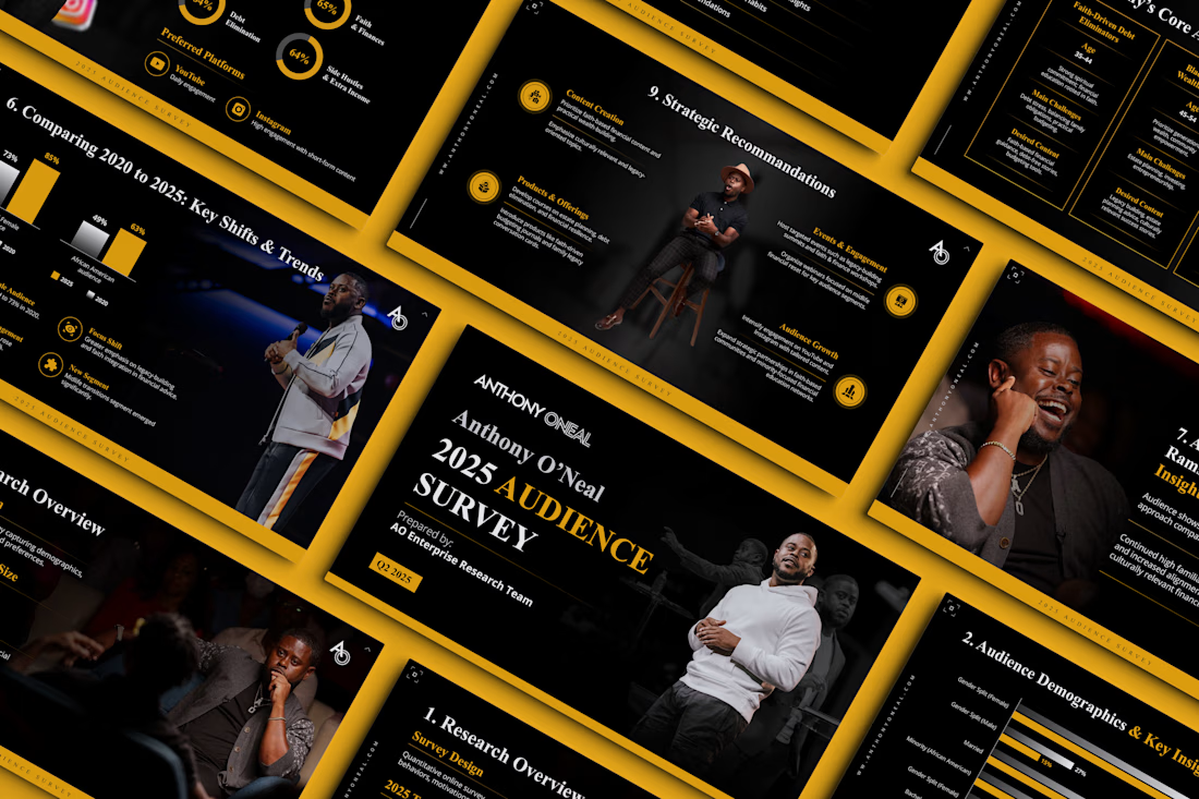
I designed the 2025 Audience Survey presentation for Anthony O’Neal, a personal finance author and speaker, turning in-depth audience research into a clear, visual report for his team.
The challenge was making a data-heavy survey easy to scan while keeping the bold, premium feel of his personal brand. I built a black and gold visual system with editorial serif headlines, paired dramatic event photography with clean charts, and organized the findings into a story that moves from research to insights to action.
𝗪𝗵𝗮𝘁 𝗜 𝗱𝗲𝗹𝗶𝘃𝗲𝗿𝗲𝗱
✅Full research report deck design (cover, research overview, audience demographics, audience personas, platform preferences, 2020 vs 2025 trends, key insights, strategic recommendations)
✅Custom bar charts, donut charts, and data visualizations styled to the brand
✅Audience persona slides summarizing age, challenges, and content needs
✅Strategic recommendation layouts with a custom gold icon set
𝗥𝗲𝘀𝘂𝗹𝘁
A polished, easy-to-follow report that helps the team quickly understand their audience and act on the findings across content, products, and events.
Presentation DesignGraphic DesignPitch Deck DesignerAdobe IllustratorAdobe InDesignMicrosoft PowerPoint


The network for creativity
Join 1.25M professional creatives like you
Connect with clients, get discovered, and run your business 100% commission-free
Creatives on Contra have earned over $150M and we are just getting started



Related posts

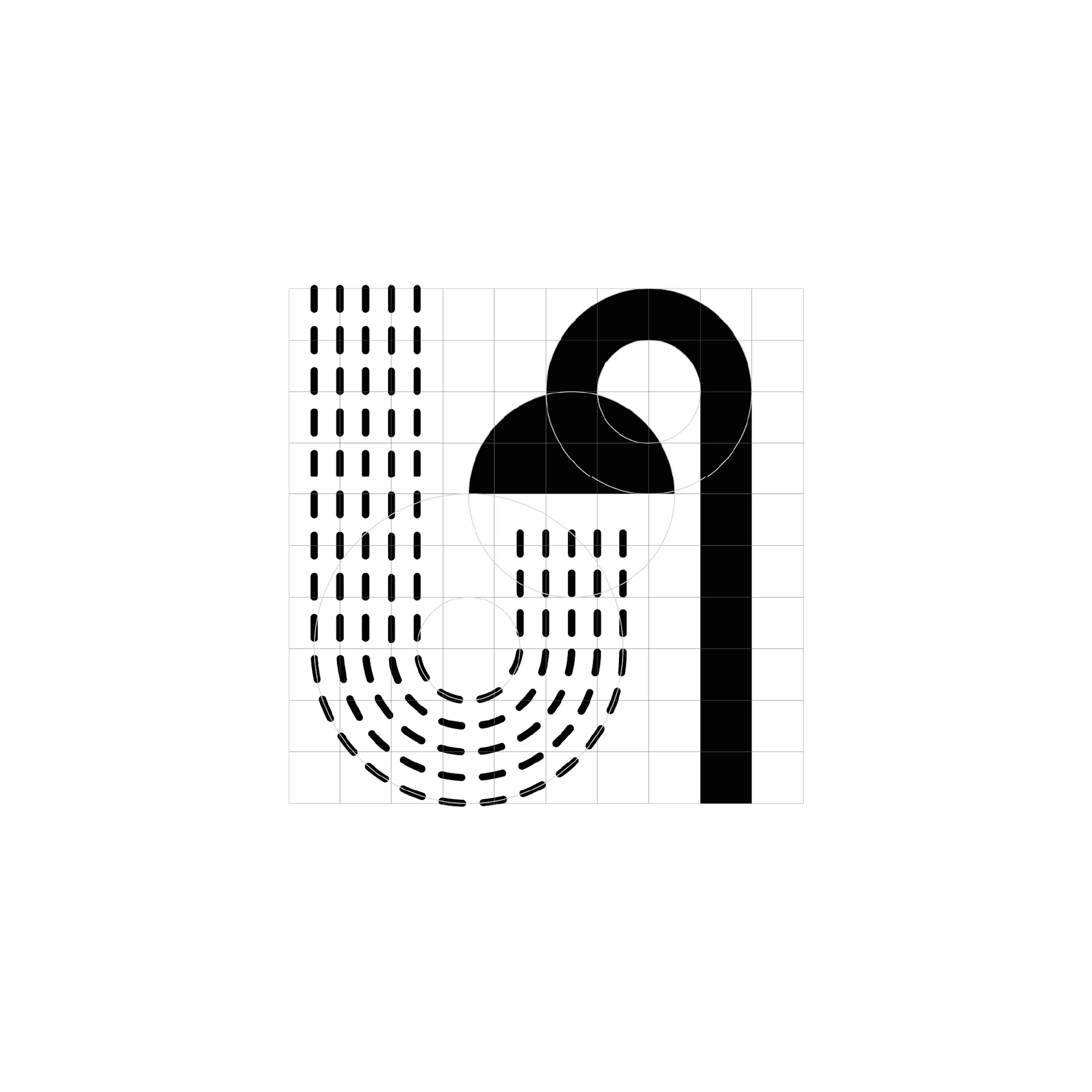
One Logo a Day | Exploring Geometric Expression
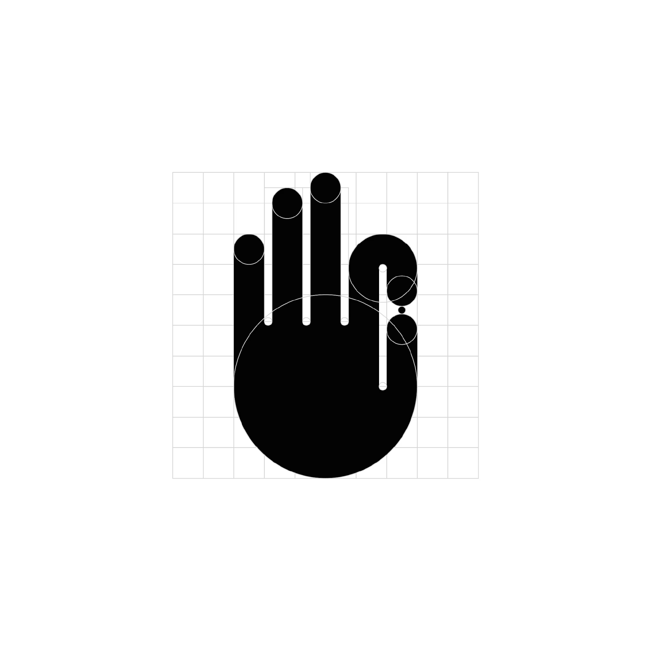
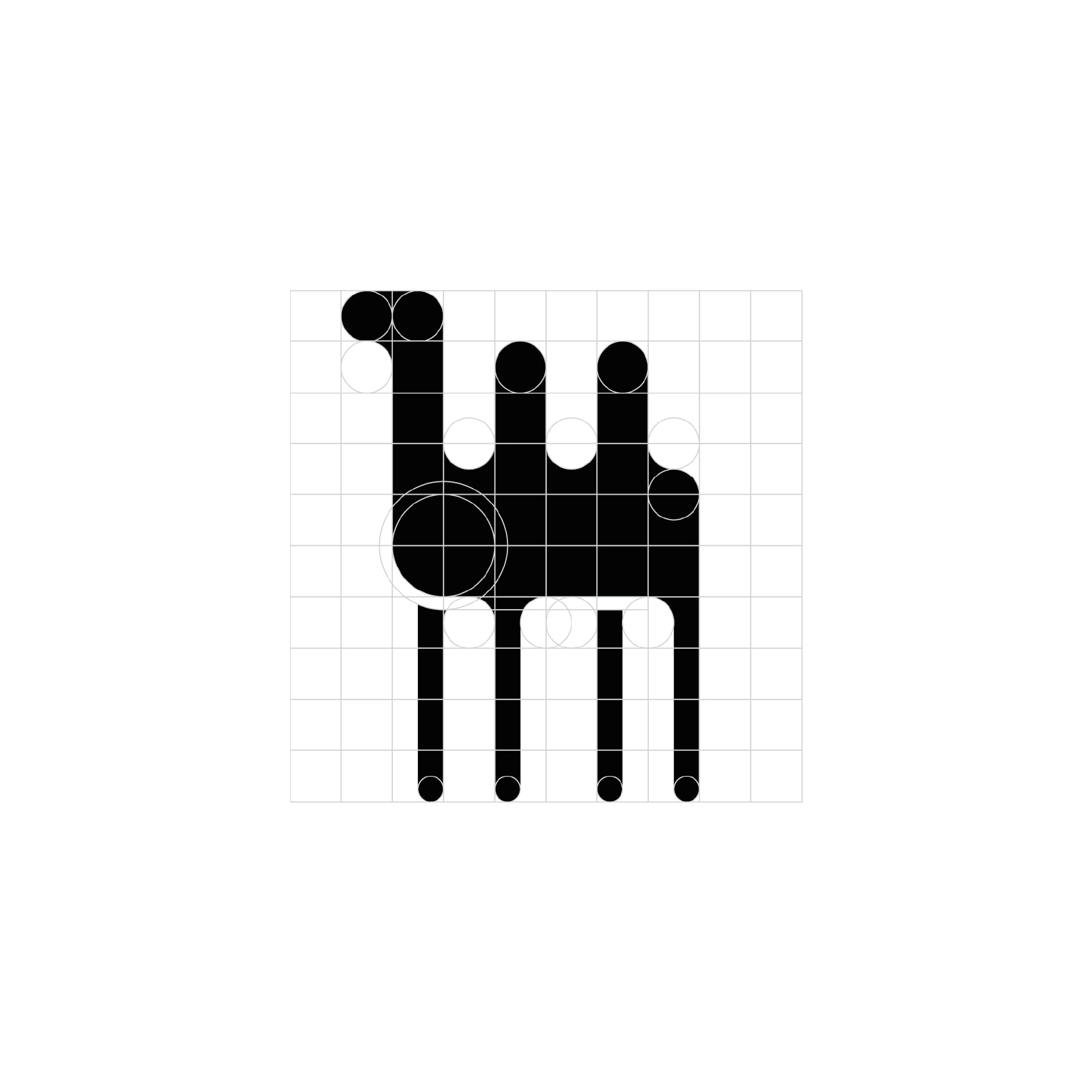
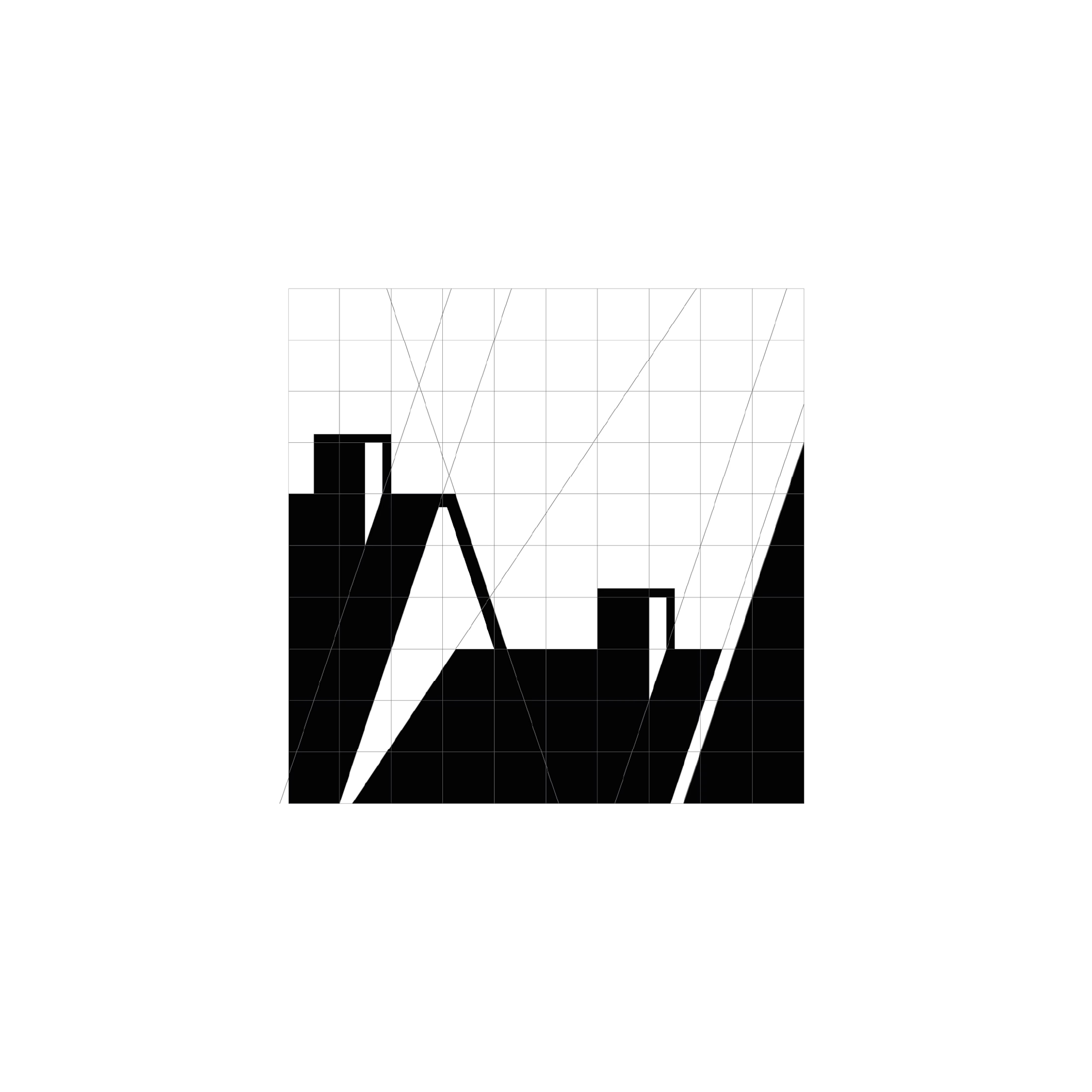
For one month, I challenged myself to design a logo every day. These four favourites share a distinct visual language: bold monochrome shapes, precise geometric construction, and playful use of negative space.
Circles, semicircles, and elongated verticals become the building blocks for expressive symbols. Rounded forms soften the heavy black silhouettes, while repetition creates rhythm and movement. Elsewhere, sharp diagonals and dramatic shifts in thickness introduce a more angular, architectural character.
The series explores the boundary between abstraction and recognition, suggesting familiar objects and gestures through a small number of carefully arranged shapes. Visible construction grids reveal the relationships behind each mark, showing how proportions, alignments, and curves hold the compositions together.
Working entirely in black and white places the focus on form. Each design becomes an exercise in creating personality and visual impact through silhouette, contrast, and space.

Pauli | Fashion with a Personal Touch
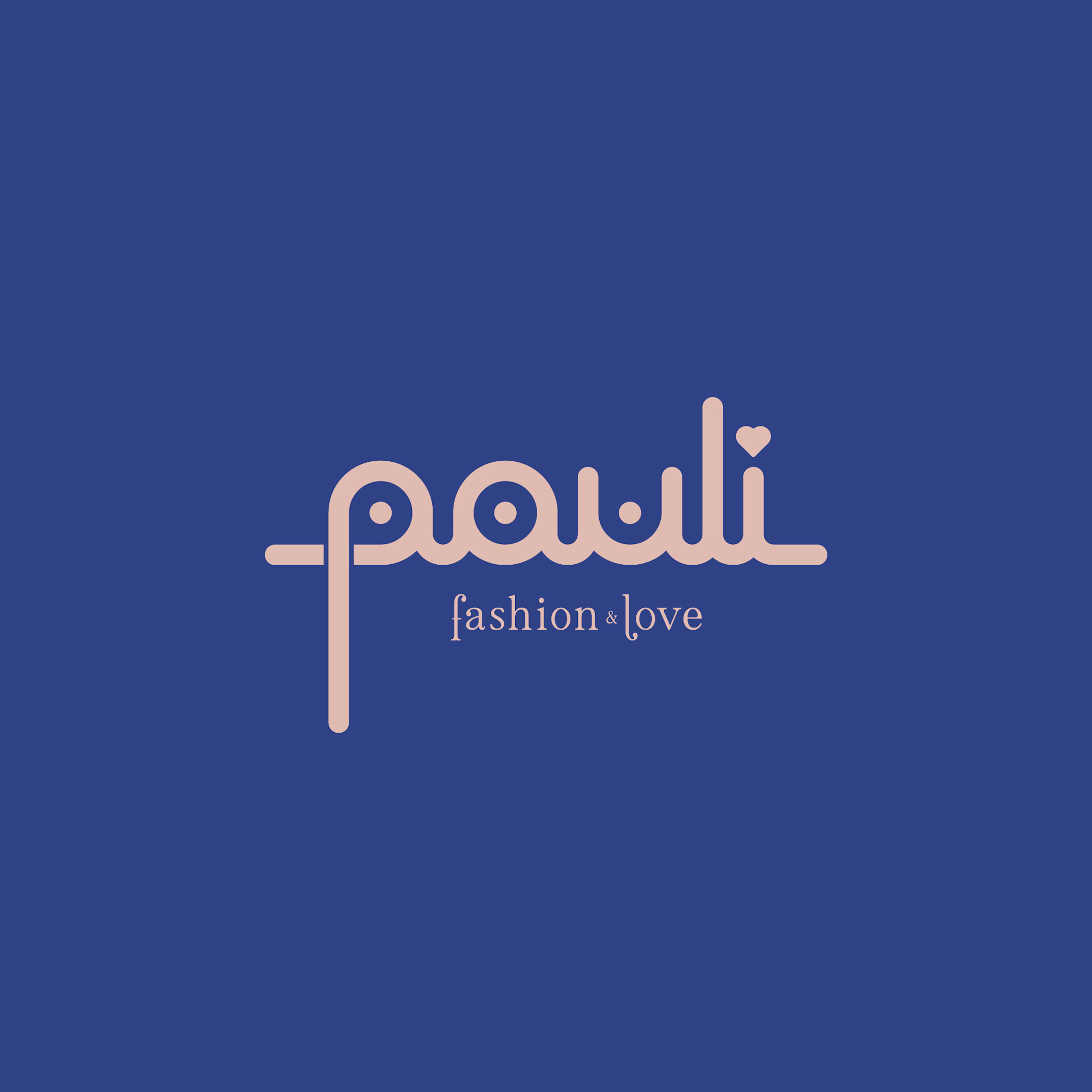
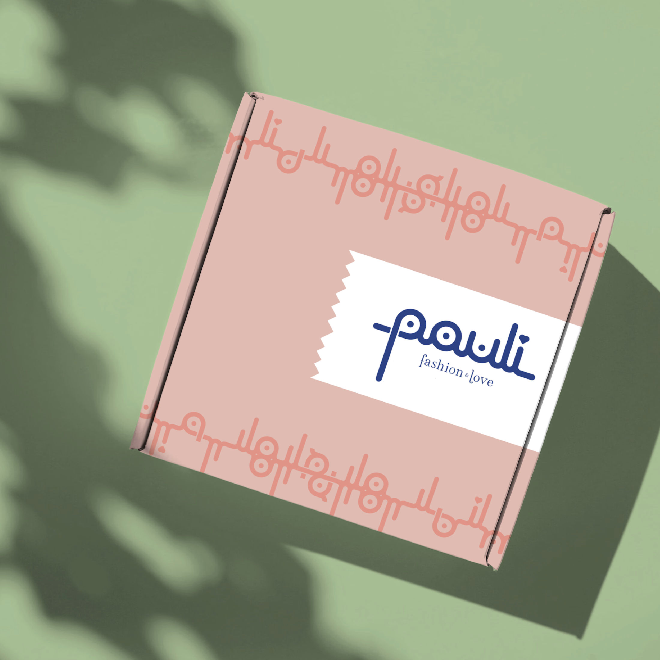
For Pauli, a fashion boutique with a warm, caring personality, I designed a logo that brings its “fashion & love” philosophy to life through playful, distinctive lettering.
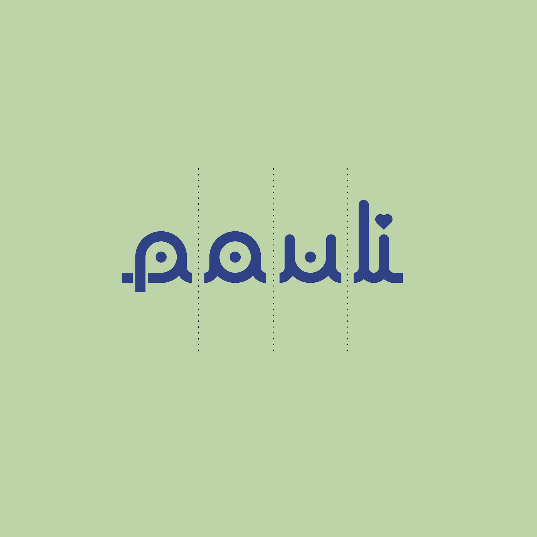
The connected lowercase wordmark combines rounded strokes, circular details, and flowing curves. Its consistent line weight creates visual harmony, while the elongated “p” and tall “l” give the silhouette rhythm and individuality. A small heart replaces the dot above the “i,” weaving the boutique’s affectionate character directly into its name.
A delicate serif tagline adds elegance beneath the expressive lettering. Deep blue anchors the identity, balanced by soft blush pink and fresh pastel green for a welcoming, uplifting palette.
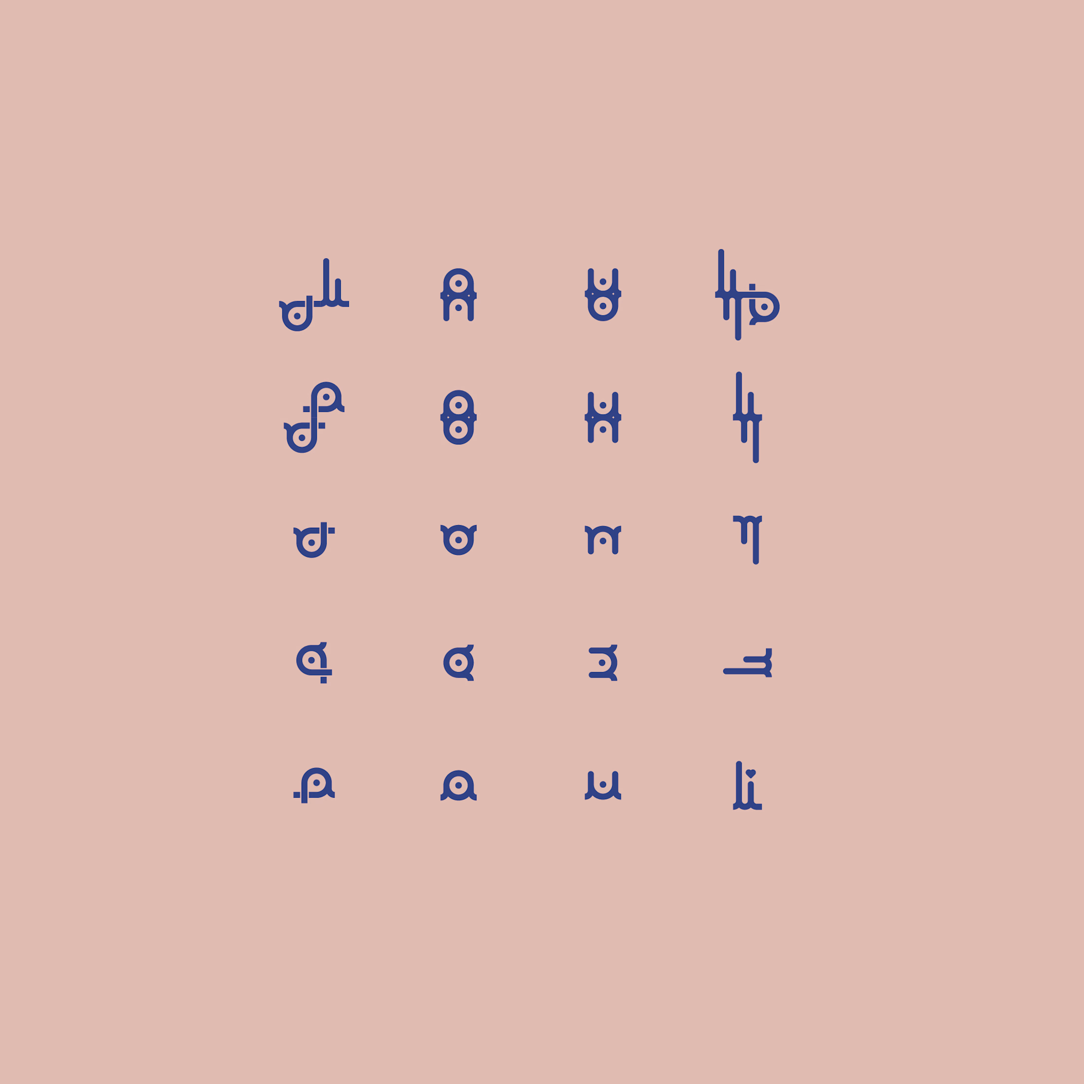
The letterforms also become a flexible graphic toolkit: separated, mirrored, and repeated, they create decorative motifs and packaging patterns. This extends the logo into a cohesive identity, giving every detail the same personal, lovingly considered feel.

Lovely design
German Archaeologists Association | Connecting Heritage and Identity
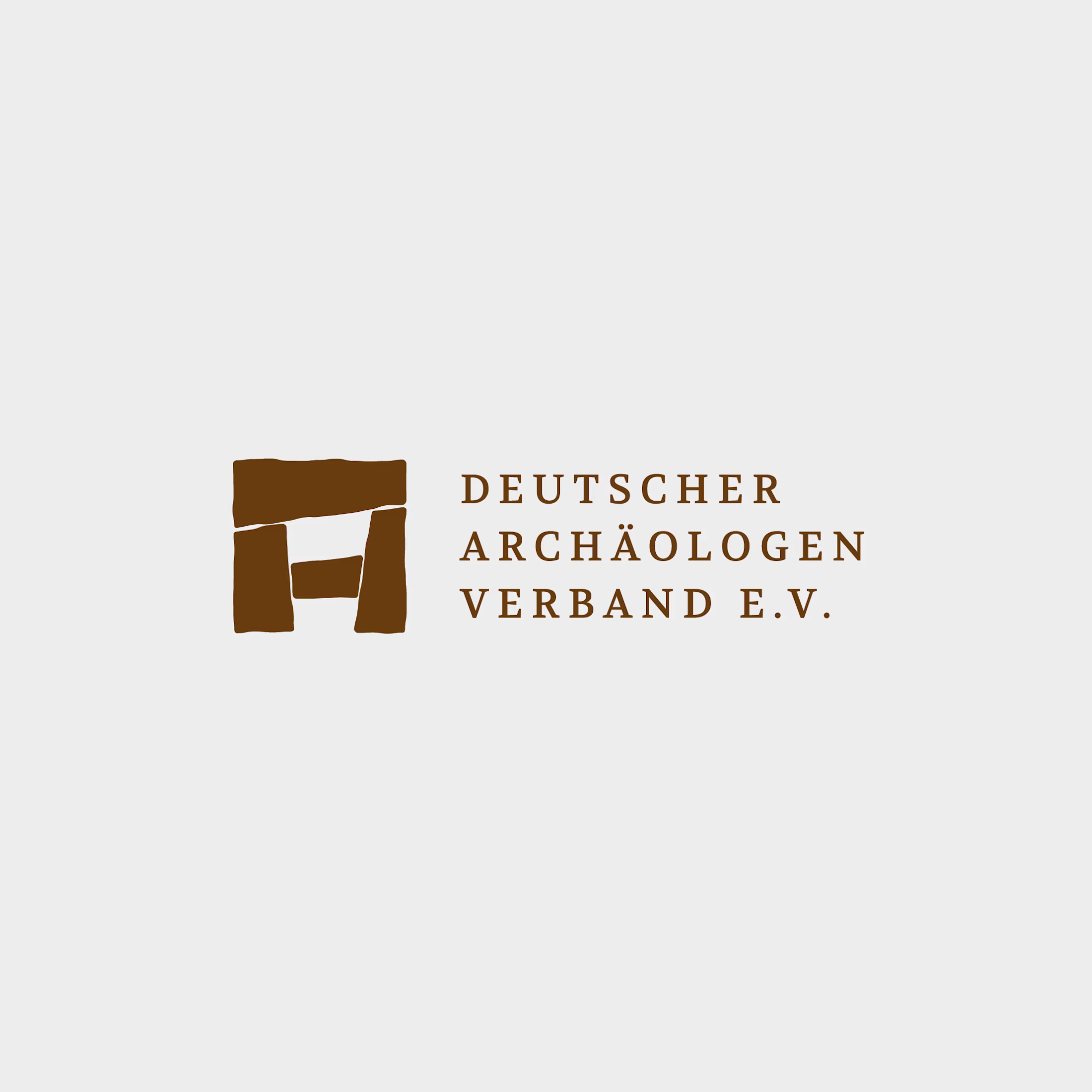
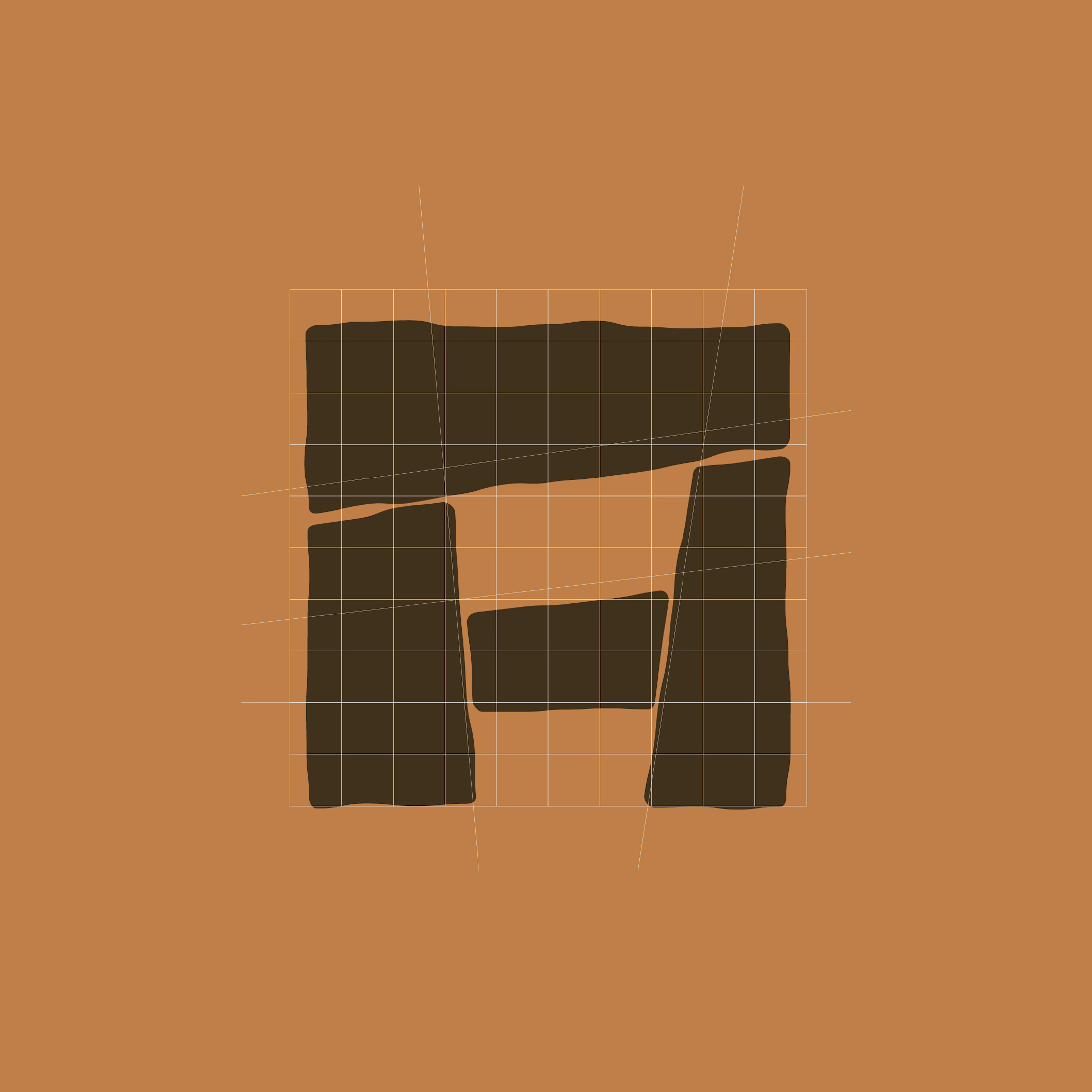
For the German Archaeologists Association, I redesigned the logo to translate the physical character of archaeology into a clear, contemporary visual identity.
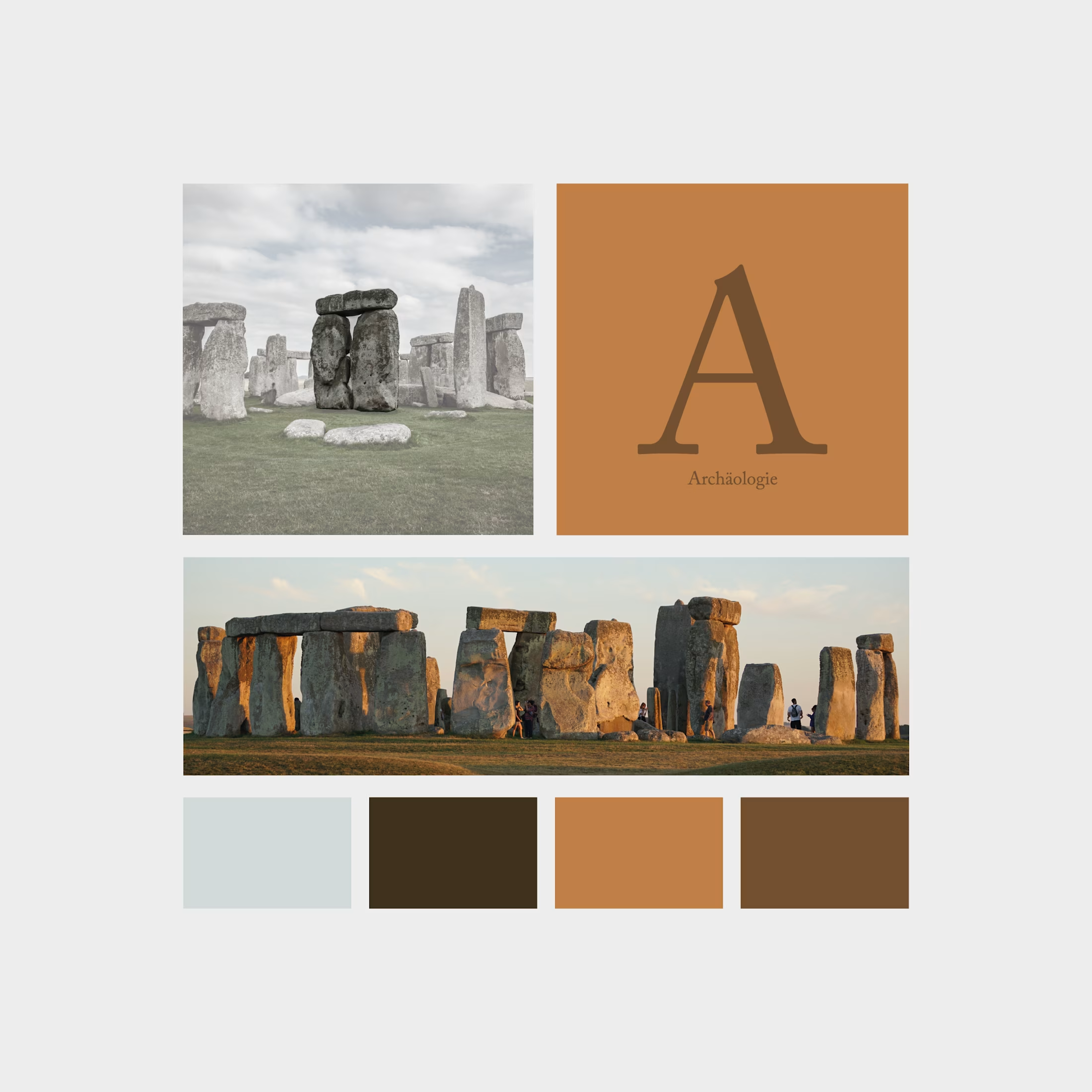
The symbol combines a Stonehenge-inspired structure with an abstract “A” for archaeology. Four stone-like shapes form a compact emblem, with subtly irregular edges that evoke weathered surfaces and ancient construction. Balanced proportions bring structure to these organic contours, connecting historical references with precise graphic design.
Uppercase serif typography adds a scholarly, authoritative character. Generous letter spacing and a structured three-line arrangement give the association’s name clarity and presence.
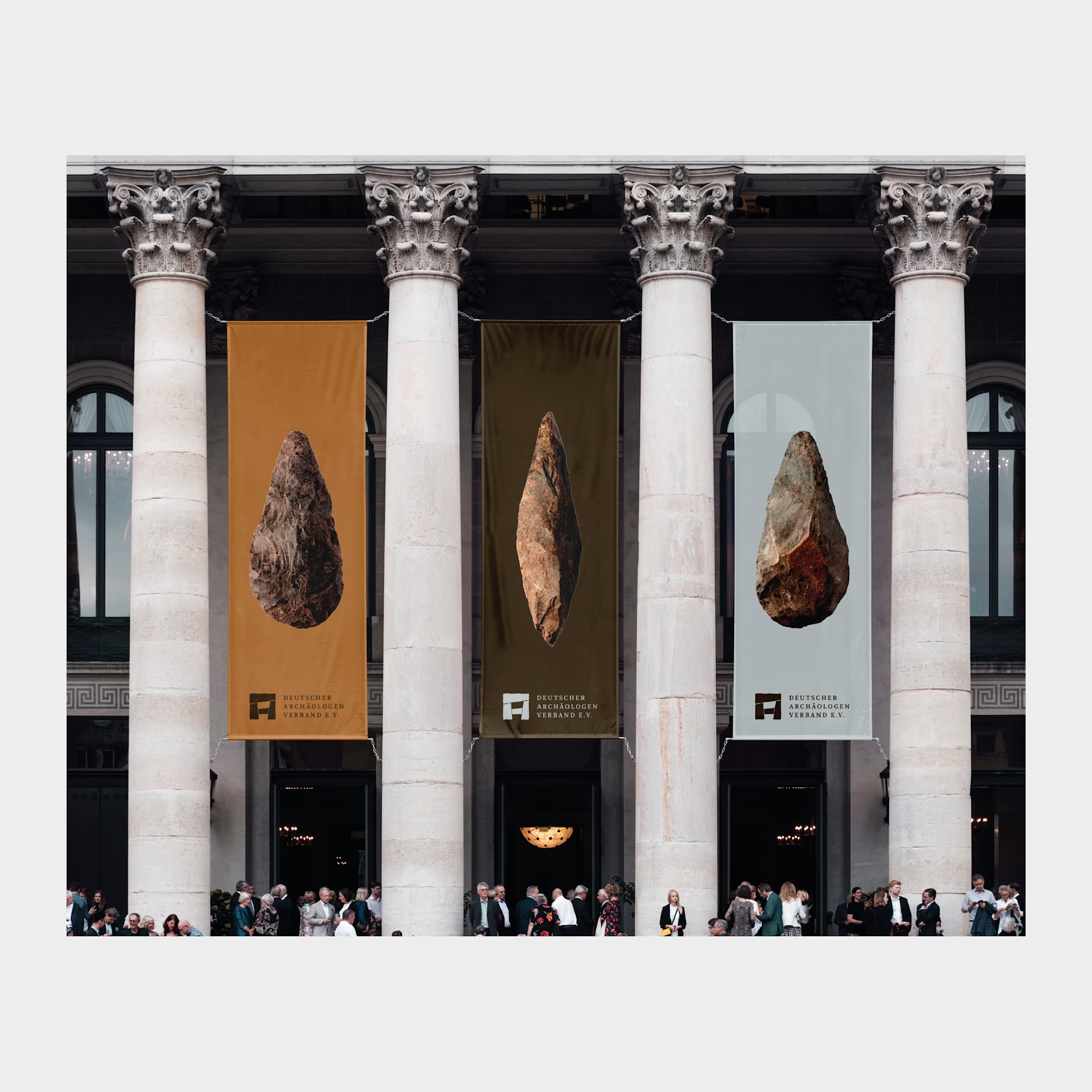
The palette draws on earth, stone, and excavation: warm ochre, deep brown, and cool mineral grey. The emblem also retains its distinctive character in simple black-and-white applications.
The result is an identity rooted in the material traces of the past, giving the association a confident contemporary presence.

love this visual design