The network for creativity
Join 1.25M professional creatives like you
Connect with clients, get discovered, and run your business 100% commission-free
Creatives on Contra have earned over $150M and we are just getting started
Back to feedPost

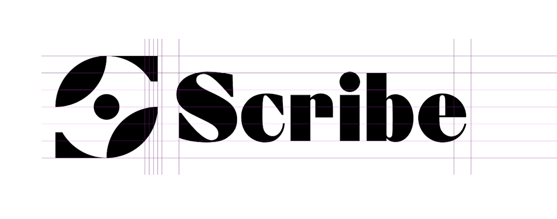
most startup marks and wordmarks never get designed together
founders pick them randomly, then bolt them together and call it a day
here's how i built scribe's instead
the mark is thick black shapes against thin negative space
i picked a serif that does the same thing in the letterforms, thick strokes against thin hairlines
that's what makes a lockup look intentional instead of thrown together.
The network for creativity
Join 1.25M professional creatives like you
Connect with clients, get discovered, and run your business 100% commission-free
Creatives on Contra have earned over $150M and we are just getting started





Related posts


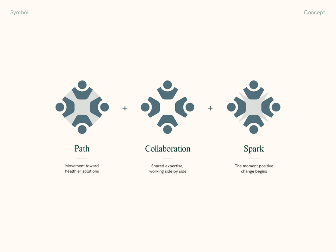
Mockups are great, but when presenting a visual identity to clients, we always include a slide explaining the thinking behind the logomark and connecting it back to the strategy.
It makes feedback and further revisions so much smoother too

We built InkNeedle Studio for a solo tattoo artist who can't answer 40+ daily DMs with gloves on. It turns a vague inquiry into a deposit-secured booking and automates reminders, no-show recovery and aftercare, so Ramesh only taps Approve between sessions.


Mira and Kabir are tattoo artists who run a small studio from their home in Indiranagar, Bengaluru. They call it Plus One.
They post their work on Instagram, and when a piece gets attention, the DMs start coming in. How much? What size? Is Saturday free? Can you draw something like this?
That’s the business I built for.
Website - https://plusone-studio.lovable.app/
Admin - https://plusone-studio.lovable.app/office
I picked tattoos because booking one involves quite a few decisions before anyone opens a calendar. The size and placement affect the time needed. Some designs are repeatable, others can only be claimed once. Custom ideas need an artist’s judgment first. A scheduling link on its own doesn’t really deal with all that.
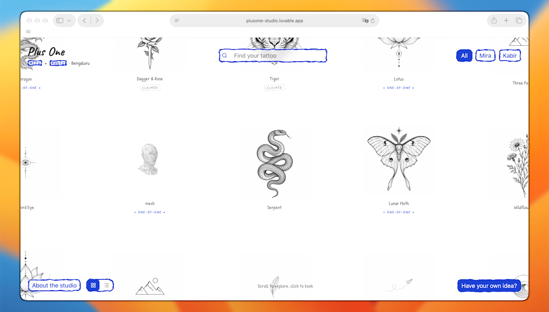
Plus One starts as their artwork library. Mira and Kabir can add pieces, keep them in draft, and publish them with prices, sizes and session details. The same library becomes their public gallery, where customers can pick a piece and book a slot that has enough time for it.
In Plus One Office, they manage that library alongside their bookings, working hours and custom requests.
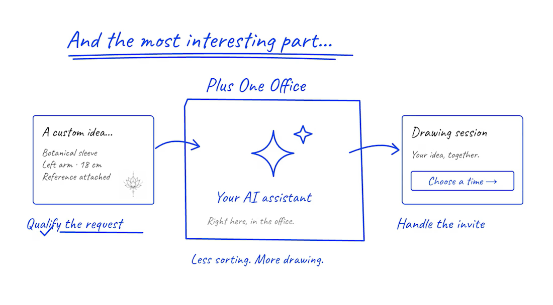
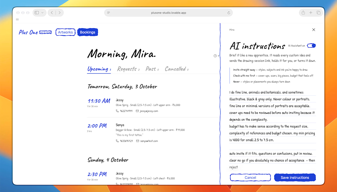
Custom requests were the part I found most interesting. Reading every brief and checking every reference takes time. So I used Lovable AI connector to build an assistant that follows each artist’s instructions: what they like doing, what they won’t take on, their pricing and when they want to review something themselves.
When enabled, it can send a drawing-session invite, leave a request for the artist to review, or reject it.
I wanted this to feel like something two creative people would actually enjoy using. Their art is already the centre of their business. It made sense for it to be the centre of their booking system too.
Less back-and-forth. More art 🙌
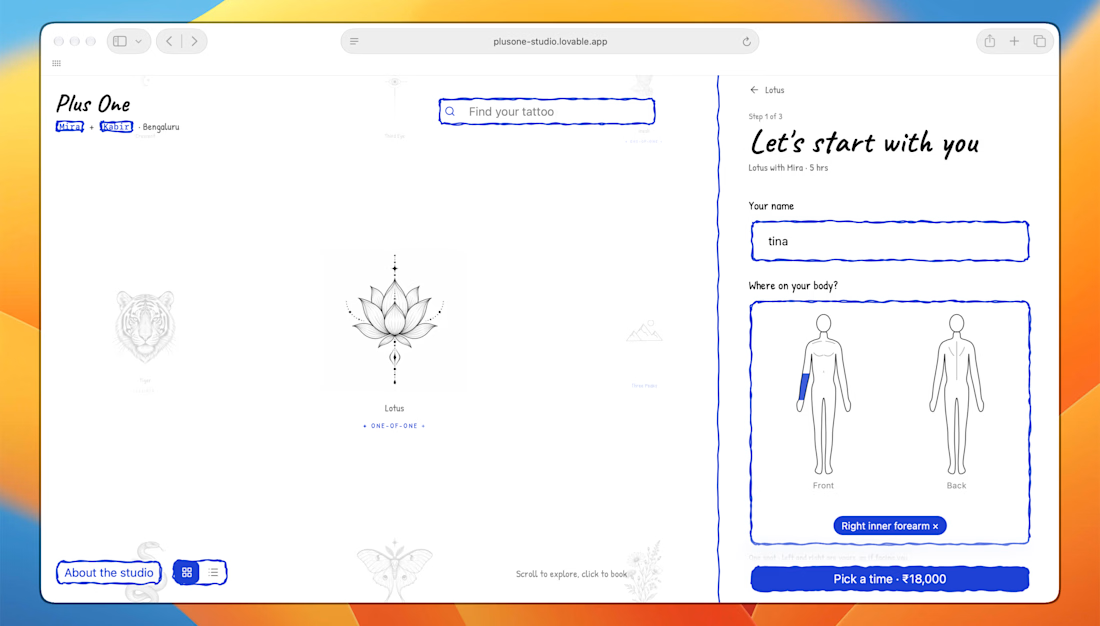

this one is Loki awesome, very few submissions have AI assistance or AI feature. I loved the website especially 'where on the body' feature.
dude, the admin side handling requests is automated? love it.
pls check ur dms.