The network for creativity
Join 1.25M professional creatives like you
Connect with clients, get discovered, and run your business 100% commission-free
Creatives on Contra have earned over $150M and we are just getting started
Back to feedPost

Unwrap The Joy — Brand Identity & Packaging System
I recently developed a comprehensive brand identity and packaging system for a chocolate and peanut-based product line, designed to create strong visual differentiation and a memorable consumer experience.
Project Objective
To establish a cohesive brand that enhances product appeal through clear positioning, consistent design language, and scalable packaging, aligned with modern D2C market expectations.
Scope of Work
Brand Identity Development
Defined a distinctive brand name and positioning: Unwrap The Joy
Designed a cohesive typography system for clarity and brand personality
Established a consistent color palette aligned with product category
Packaging Design System
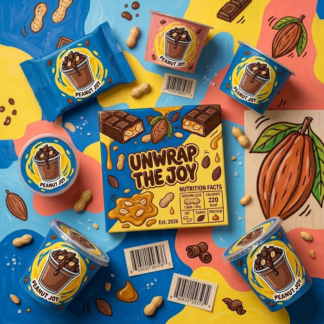
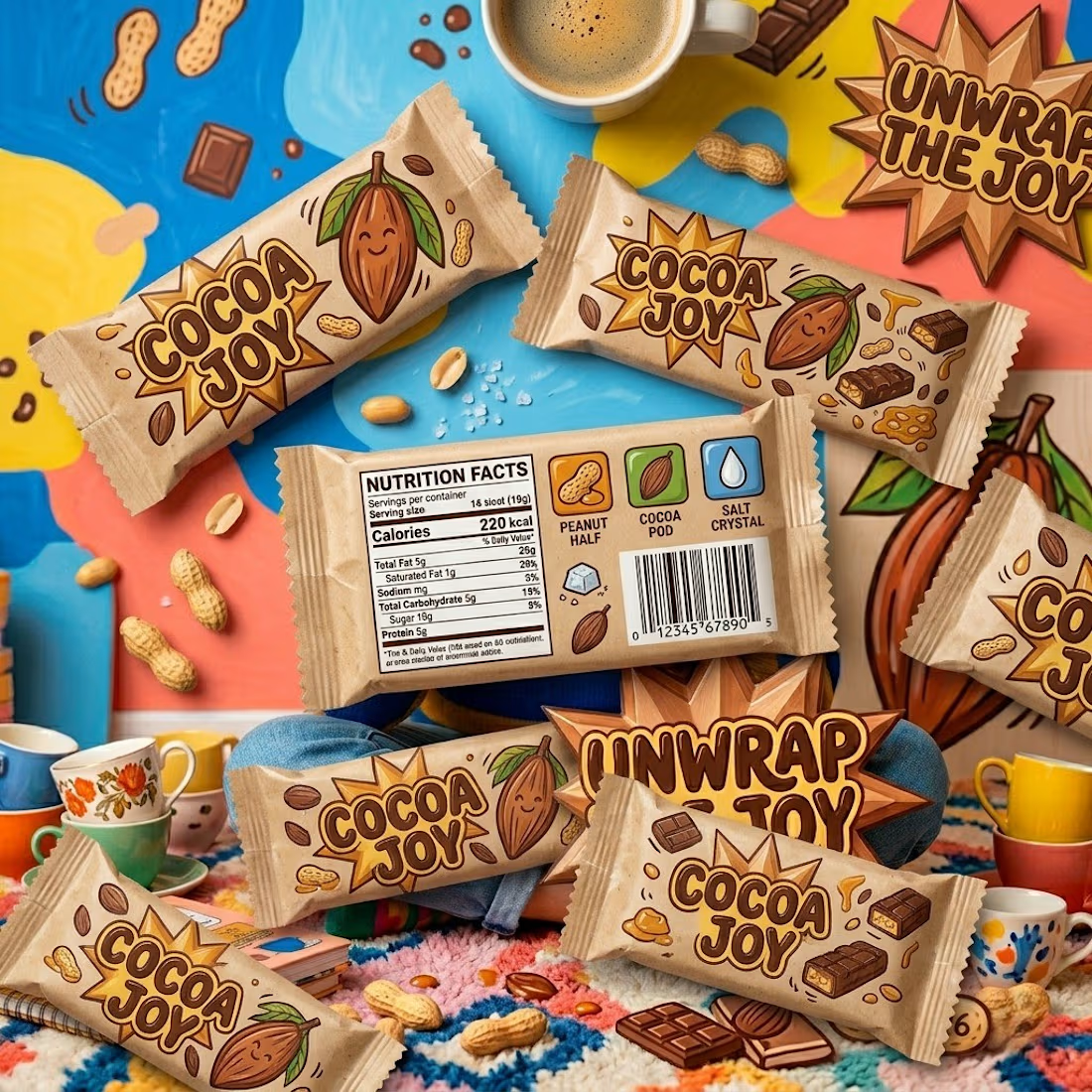
Developed packaging for multiple formats, including bars, cups, and wrappers
Incorporated ingredient-driven illustrations for intuitive visual communication
Structured layouts for clear branding, nutritional information, and product details
Product Visualization
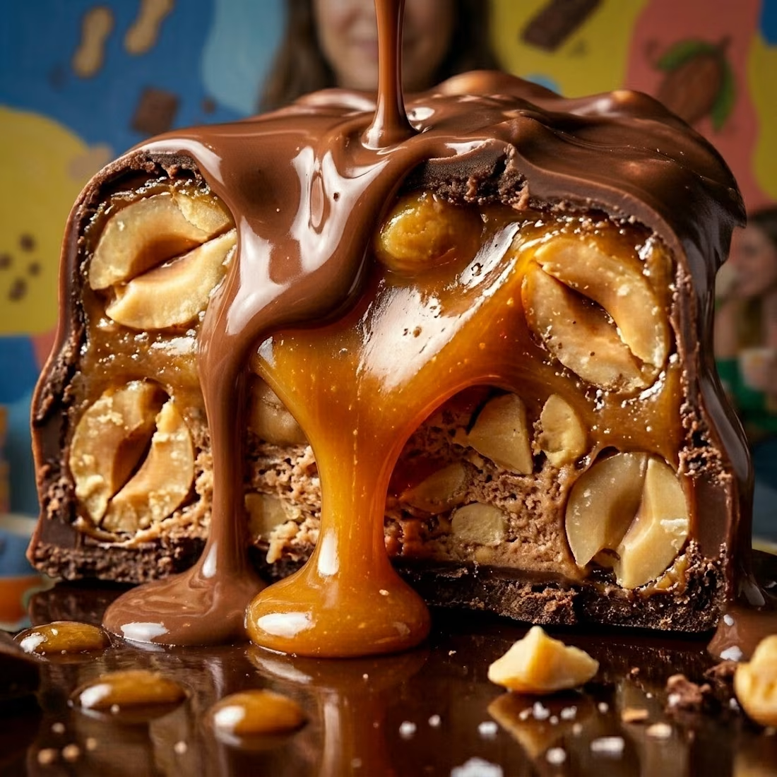
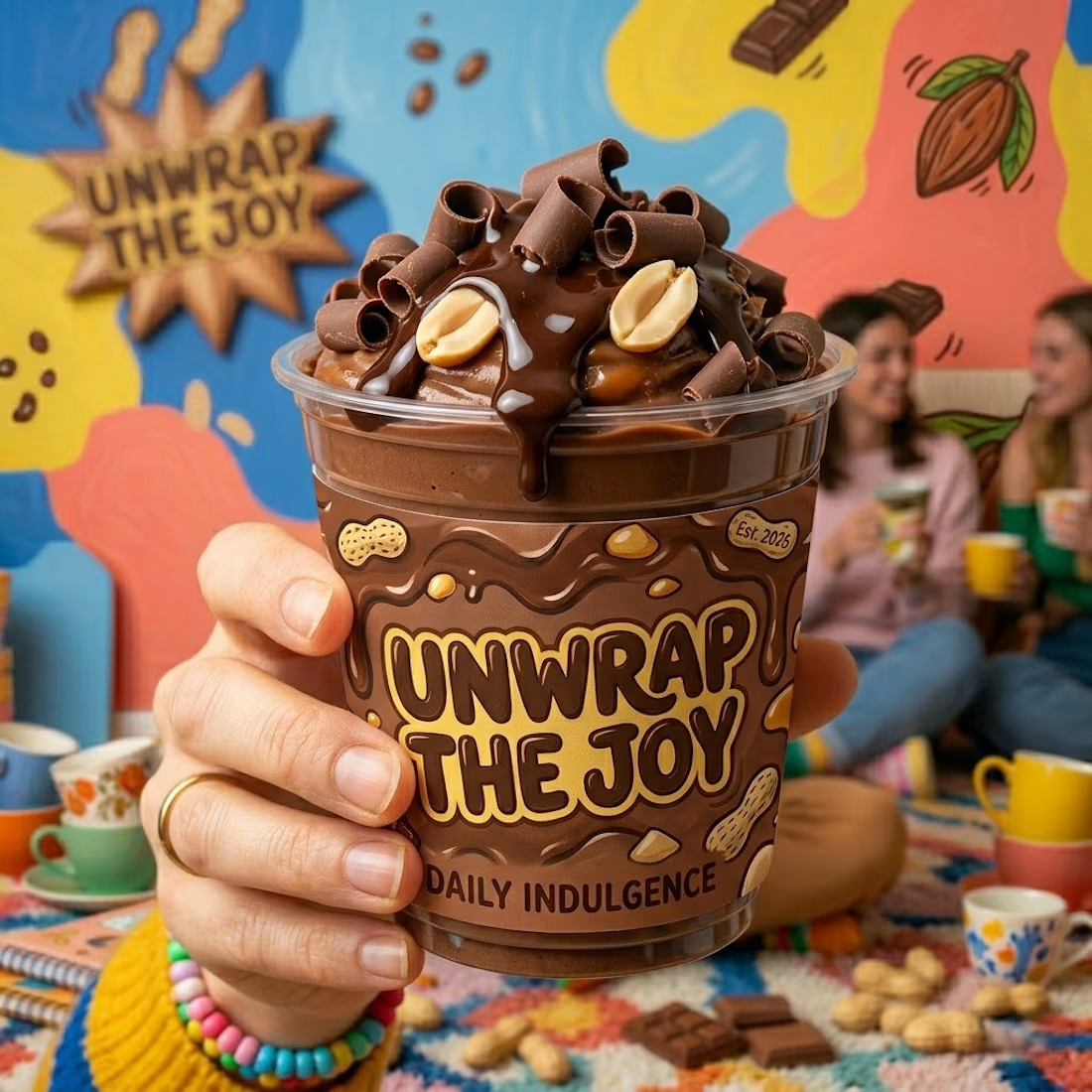
Created high-quality product mockups for marketing and presentation
Focused on realistic textures and material representation
Developed lifestyle-oriented visuals to strengthen brand storytelling
Design System & Scalability
Ensured consistency across all brand touchpoints
Built a scalable system for future product extensions
Optimized designs for both physical retail and digital platforms
Key Consideration
The design approach is based on the understanding that consumer products succeed not only through quality, but through visual identity, clarity, and brand recall.
Outcome
A structured and market-ready brand system that is:
Visually distinctive
Strategically aligned
Scalable and implementation-ready

The network for creativity
Join 1.25M professional creatives like you
Connect with clients, get discovered, and run your business 100% commission-free
Creatives on Contra have earned over $150M and we are just getting started





Related posts


Does an AI brand still need to look like an AI brand?
Lupr helps small and growing businesses adopt AI without the complexity, so the identity needed to do the same.
We built a clean, approachable system around movement, connection and continuous improvement, without leaning on the usual futuristic tech clichés.
The idea was simple: make AI feel like useful business infrastructure, not something you need to be an expert to understand.
As AI becomes part of everyday business, do you think brands still need to visibly signal “AI”?
Full case study below 👇


Great design it feels alive 🎉🎉❤️❤️

Next intelligence. A brand you can feel.
Ice blue, deep black and refracted glass bring texture, depth and a sense of touch to an invisible technology. An identity designed to be recognised. And felt.
Brand identity and visual direction for Niwos, a platform that brings AI agents together as a digital workforce.
Five modules. One W. A simple idea at the heart of the identity: working as one.
I’ve really enjoyed working on this project with Muhammed. His trust in my design judgement and openness to new ideas gave me the creative freedom to explore fully.
Here’s hoping this is just the first chapter of an exciting journey with him and his team.


👍 nicely done

Same prompt. Same concept. Two AI tools. 👀
I gave ChatGPT and Gemini the exact same prompt to create a luxury perfume ad creative.
No changes. No extra instructions.
Now I want to know what YOU think:
Which creative did it better?
🔵 A— Gemini
🟣 B— ChatGPT
Look at the overall concept, visual quality, composition, typography, and how “ad-ready” it feels.
Who wins this round? 👀
Vote below and tell me what made you choose your answer.
#AIContent #AIAdvertising #AdCreative #CreativeStrategy #ChatGPT #Gemini #SocialMediaManager #SocialMediaStrategy #SocialMediaMarketing #MarketingStrategy #DigitalMarketing #ContentCreation
11 voted
39%
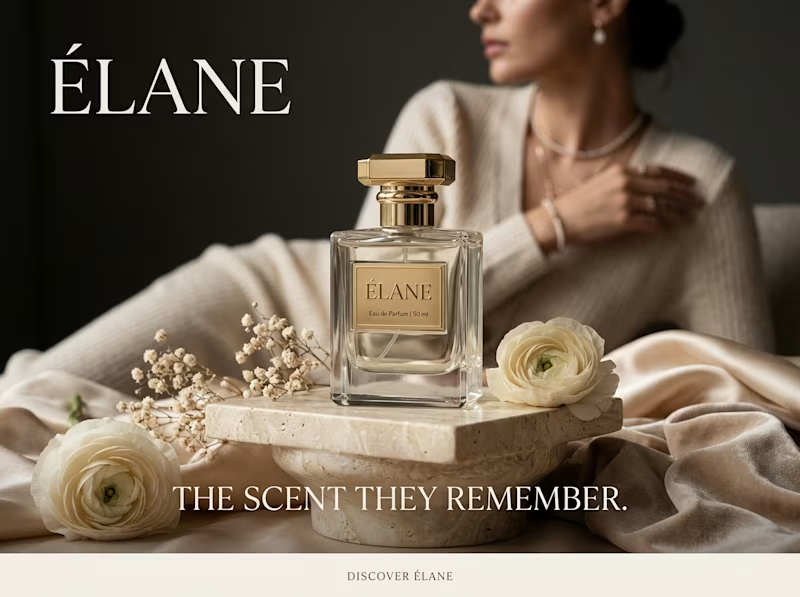
17 voted
61%
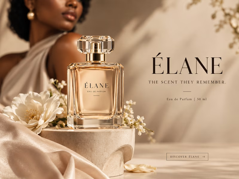
28 votes
Closed

I will go with Chatgpt on this.
It looks more luxurious and eye catching 🔥


