The network for creativity
Join 1.25M professional creatives like you
Connect with clients, get discovered, and run your business 100% commission-free
Creatives on Contra have earned over $150M and we are just getting started
Back to feedPost

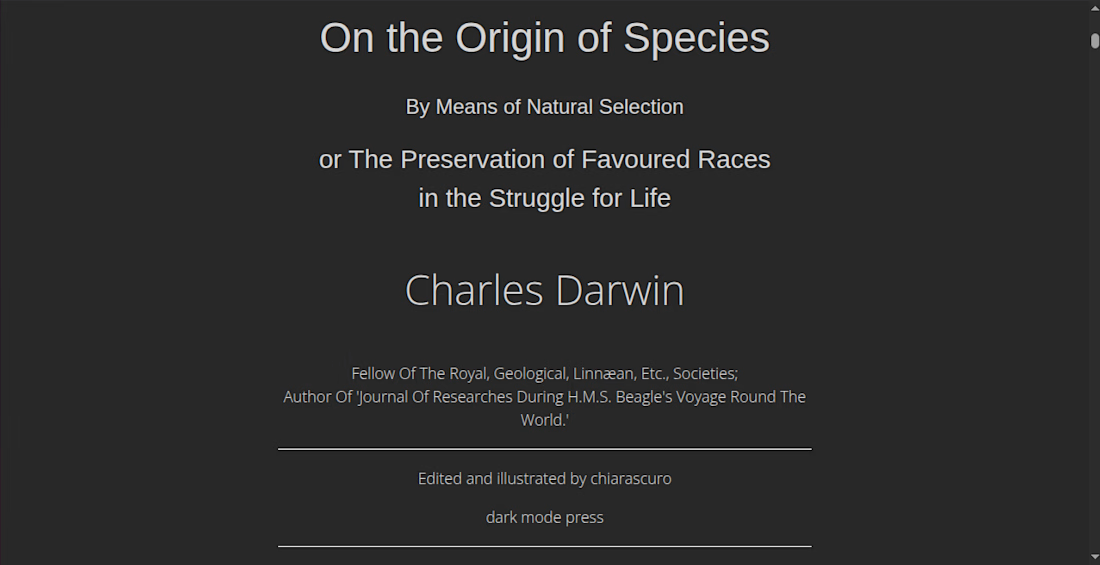
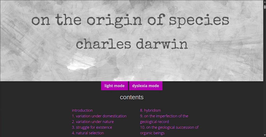
[HTML book] On the Origin of Species (Charles Darwin)
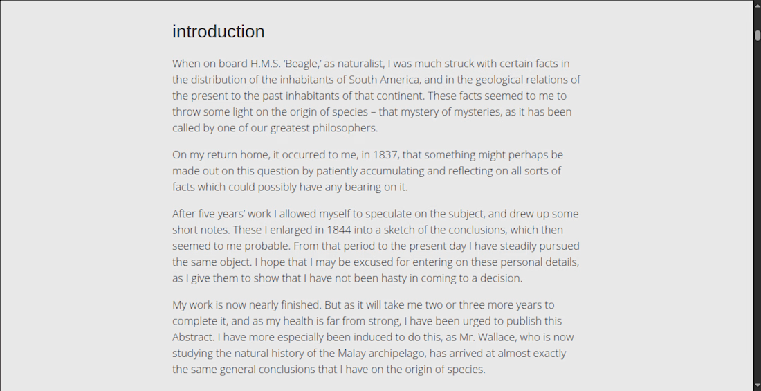
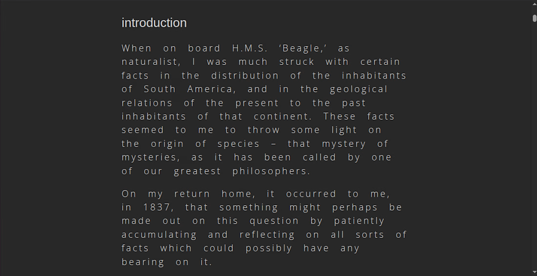
HTML books have light mode and dyslexia mode toggles. They work independently of each other to give the user greater control over text presentation.
Dyslexia mode increases the font size and spacing between letters and words to mitigate the river effect.
The text itself has been edited for accessibility for people with autism, ADHD, tangential and circumstantial thinking.


The network for creativity
Join 1.25M professional creatives like you
Connect with clients, get discovered, and run your business 100% commission-free
Creatives on Contra have earned over $150M and we are just getting started











Related posts


Which feels more established to you?
22 voted
30%

52 voted
70%

74 votes
Closed


Introducing AlignIQ — now live on Framer! 🚀
AlignIQ is an AI-powered planning workspace concept designed to help teams turn ideas into actionable plans, keep projects aligned, and make smarter decisions.
The product concept focuses on four core features:
• AI Planner — Turn goals into structured plans with clear milestones and next steps.
• Projects — Organize work, track progress, and keep everyone aligned.
• Roadmap — Visualize milestones, dependencies, and timelines with AI-powered suggestions.
• AI Insights — Identify risks, uncover blockers, and get recommendations before problems grow.
I turned this concept into a complete Framer website template, combining interactive mobile app showcases, editorial layouts, custom blue-duotone photography, and subtle animations.
Built for AI mobile apps, productivity platforms, planning tools, and startups looking to showcase their products through a modern, engaging website.
🎁 Free for a limited time, then $29.
Available on the Framer Marketplace!


The Framer execution looks butter smooth! Loving the deep blue palette and typography layout. AI planning tools often look cluttered, but this looks super clean and focused. Great launch, Ahmad!

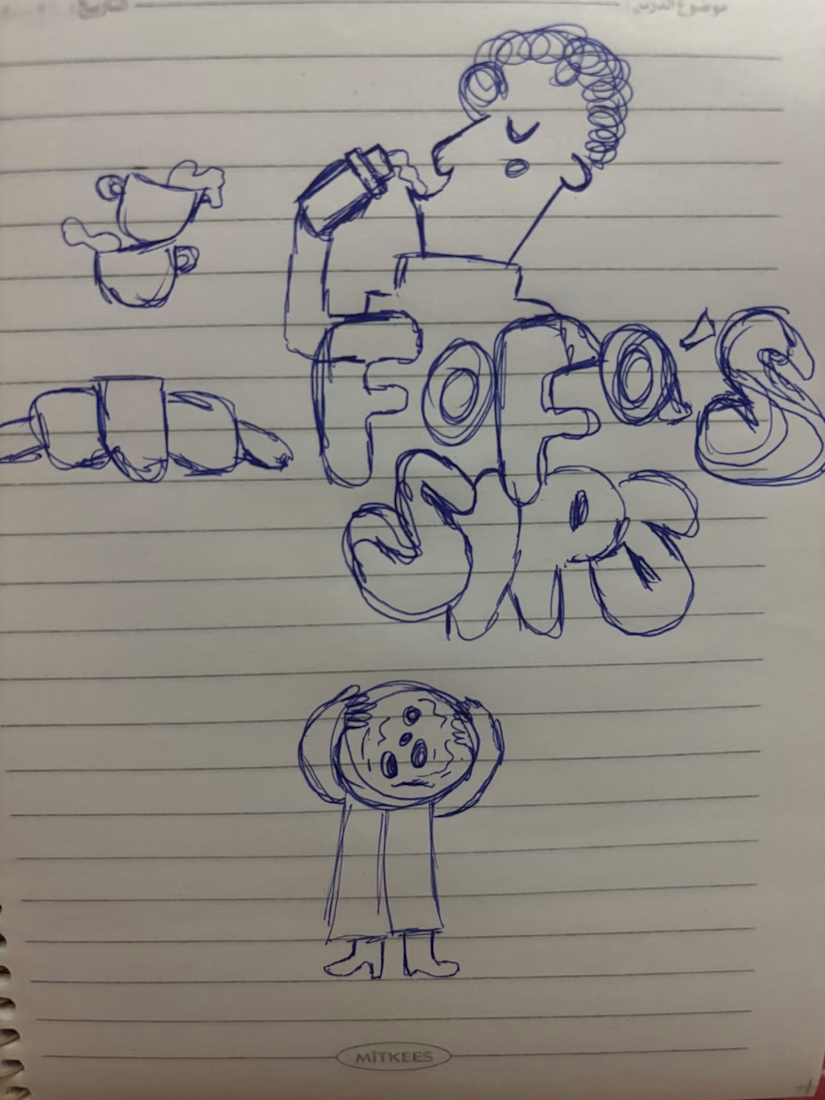
I turned one of my notebook doodles into a whole brand identity. And honestly this was way more fun than I expected I usually work on UI/UX and digital products so I wanted to take a step back from screens and explore something completely different: illustration-led branding.
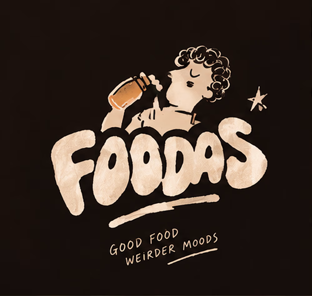
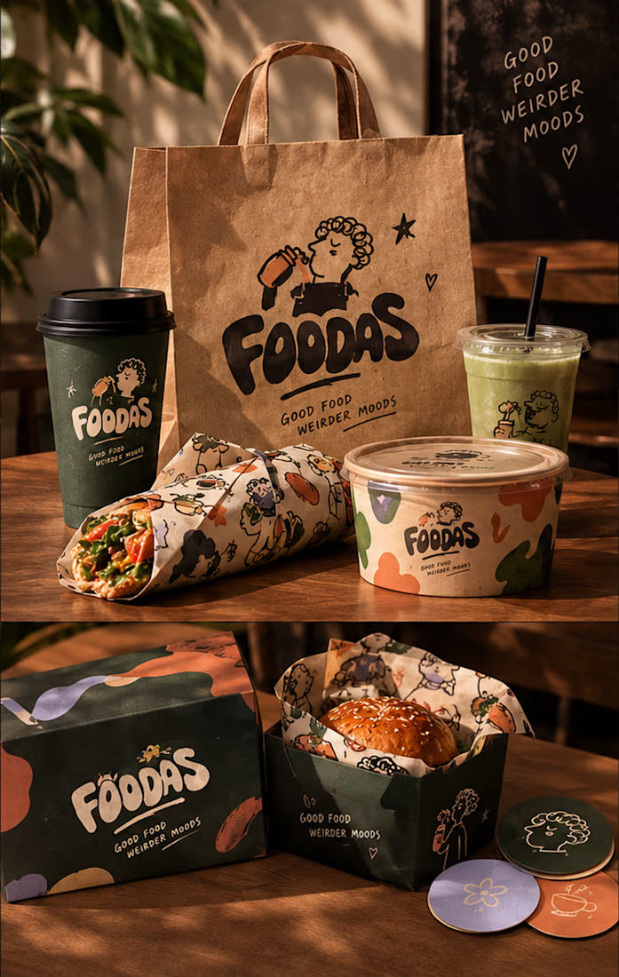
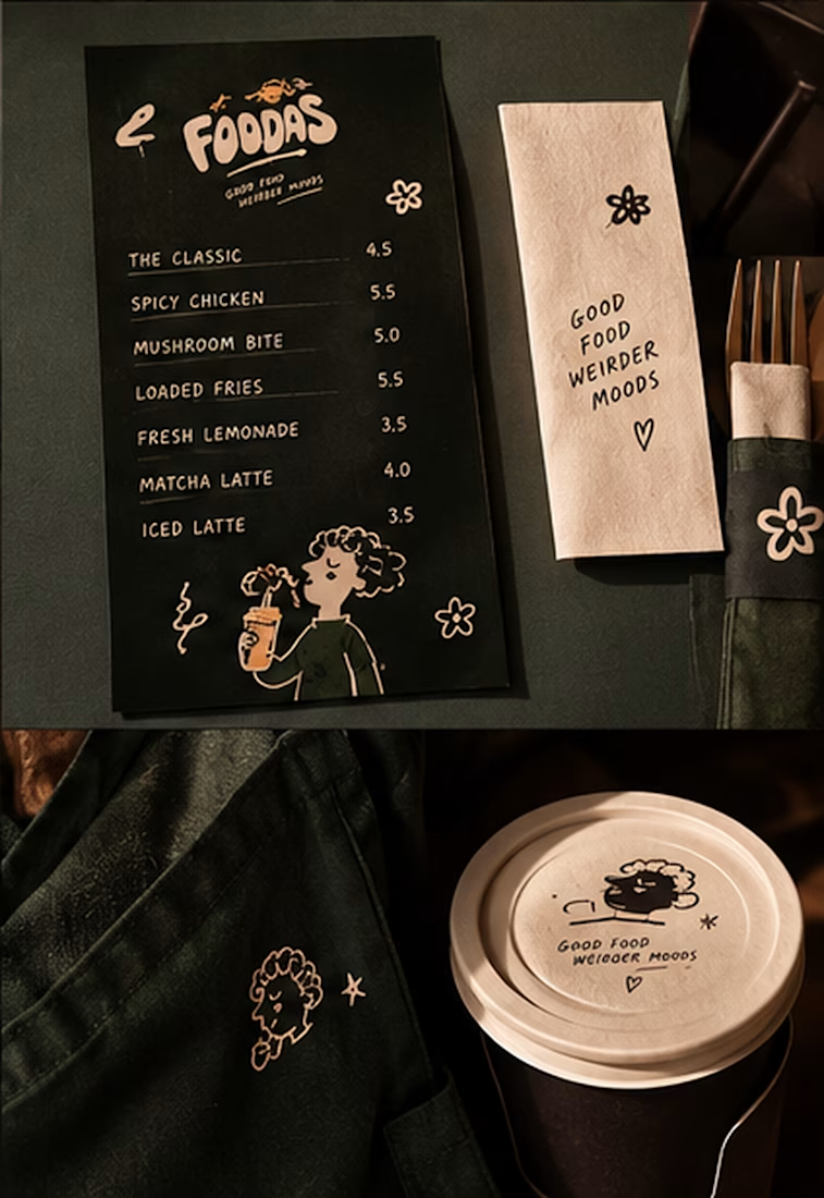
I took my original FOODAS sketch and built an entire visual world around it from the logo and mascot illustrations to the color palette packaging, cups, and menus
The goal wasn't to make it look perfectly polished and predictable I wanted it to feel playful, a little weird, and still premium.
Now I'm curious about one thing:
Can playful, imperfect illustrations make a brand feel more premium or do you think premium branding needs to be more minimal?
I have a feeling designers will disagree on this one