The network for creativity
Join 1.25M professional creatives like you
Connect with clients, get discovered, and run your business 100% commission-free
Creatives on Contra have earned over $150M and we are just getting started
Back to feedPost

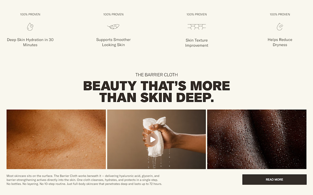
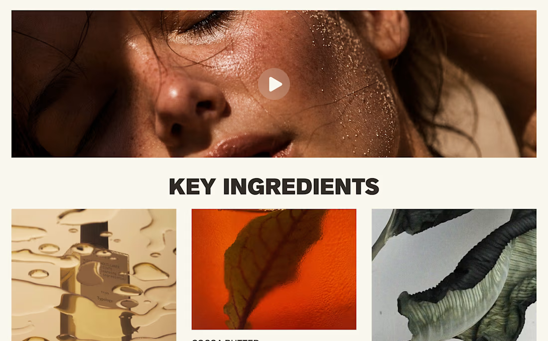
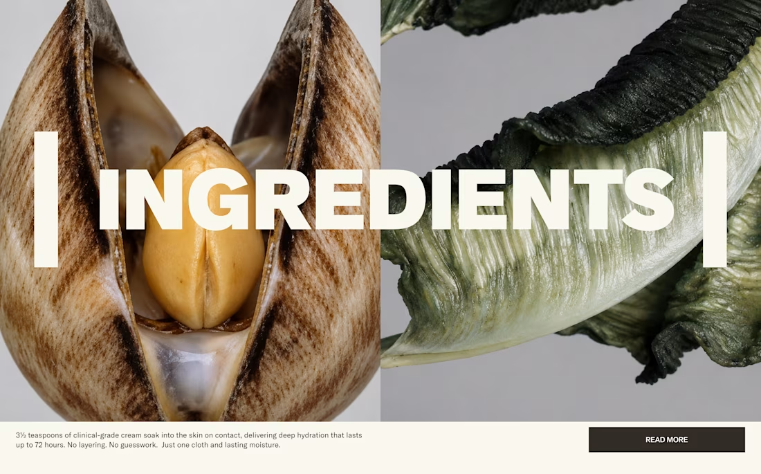
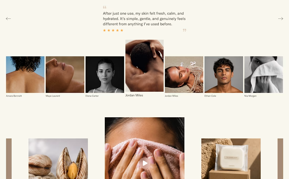
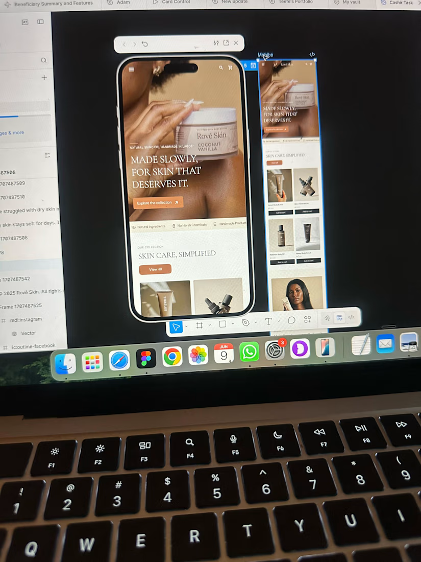
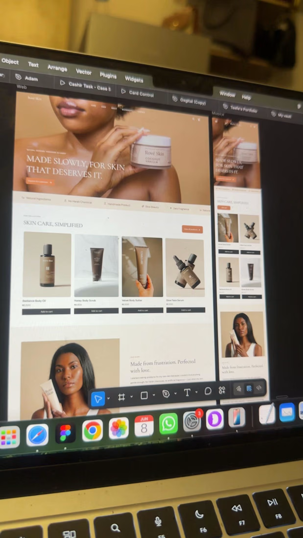
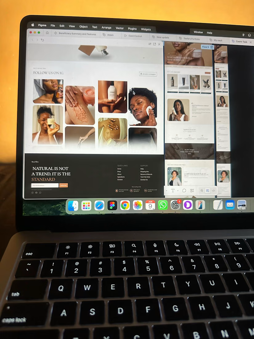
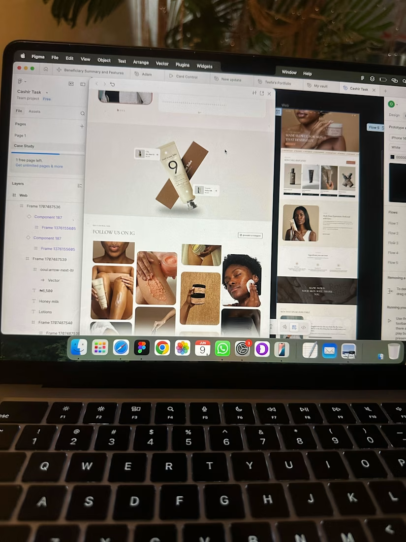
Skincare eCommerce website with a clean, modern, and premium look that puts the brand and its products front and center.
The network for creativity
Join 1.25M professional creatives like you
Connect with clients, get discovered, and run your business 100% commission-free
Creatives on Contra have earned over $150M and we are just getting started





Related posts

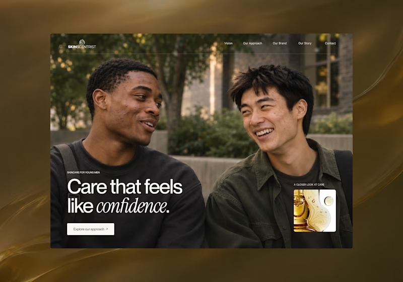
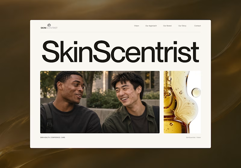
I’m exploring two homepage hero directions for SkinScentrist, a skincare brand focused on helping young men feel more confident in their skin.
Both concepts use the same imagery but take very different approaches to storytelling and visual hierarchy.
Direction 1 feels more emotional, immersive, and lifestyle-driven. The full-screen photography and bold messaging create a stronger connection to confidence and self-care.
Direction 2 feels more minimal, editorial, and brand-focused. The oversized typography, clean layout, and product imagery give it a more refined, contemporary skincare feel.
Direction 1: immersive, personal, emotional
Direction 2: minimal, editorial, premium
Which direction feels stronger for a modern skincare brand?

14 votes
Ends in 22h

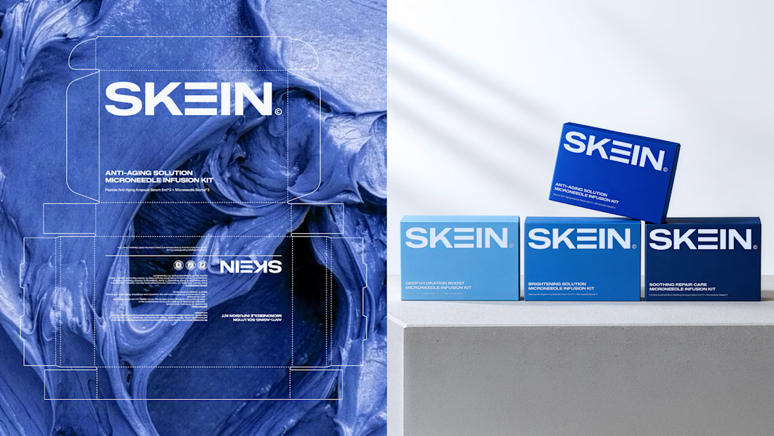
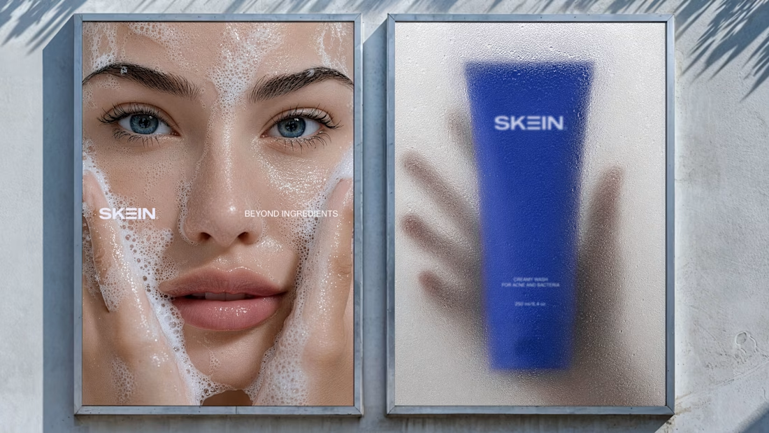
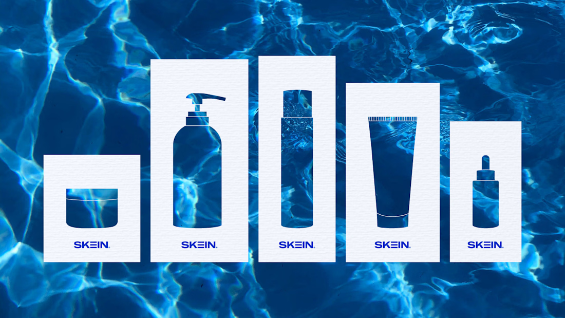
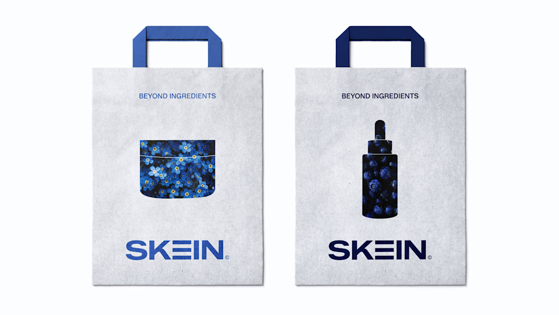
Brand Identity for SKEIN is an Australian skincare brand inspired by the intricate layers and interconnected structure of human skin, the brand combines advanced dermatological science with cutting-edge delivery technology to create formulas that work deeper, faster, and smarter.
The logo is rooted in the concept of skin layers, reflecting SKEIN belief that lasting skin health begins beneath the surface. The layered form symbolizes precision, renewal, and the seamless connection between science and skin biology.
Full project: https://contra.com/p/FcUq2obO-skein-or-skincare-brand-logo?r=sofyanariffandy

Barrier Co - Skincare E-commerce Website
A digital experience that brings simplicity, clarity, and confidence to everyday skincare.
Designed with a minimal visual language, refined typography, thoughtful product presentation, and an intuitive shopping experience.
The full case study is now live on Contra.
Let's build something great together: https://madebykiran.com