The network for creativity
Join 1.25M professional creatives like you
Connect with clients, get discovered, and run your business 100% commission-free
Creatives on Contra have earned over $150M and we are just getting started
Back to feedPost
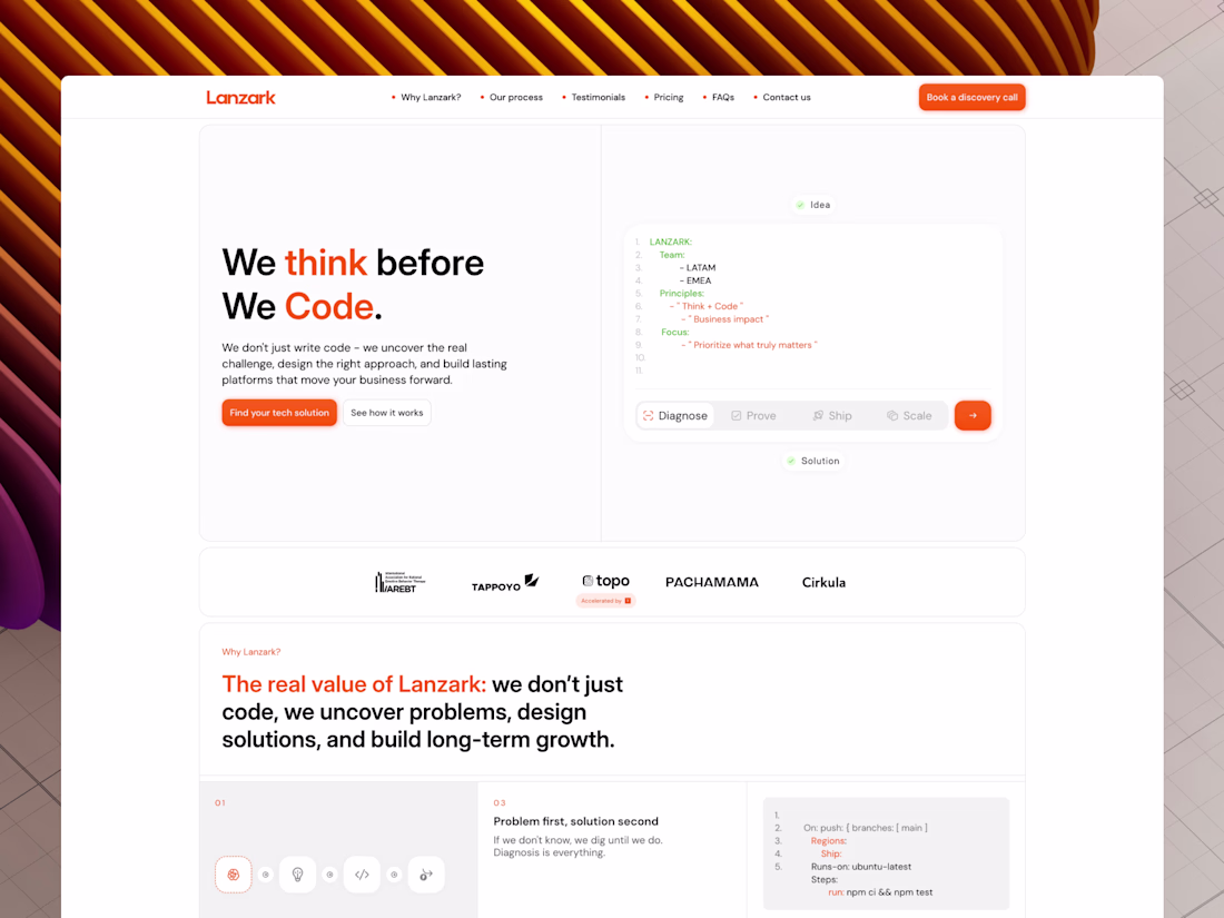
I redesigned Cloudflare's langing page
A quick overview of the things I did:
- Clearer headline, because you have to lead with a clear h1 that talks about the biggest value your product provides
- Added social proof (cause it helps conversions a lot)
- Removed horrible black text on orange buttons (sorry but this is just a complete lack of taste)
- Removed unnecessary information that overwhelms the user
- Improved the overall design to make the page more memorable and beautiful :)

The network for creativity
Join 1.25M professional creatives like you
Connect with clients, get discovered, and run your business 100% commission-free
Creatives on Contra have earned over $150M and we are just getting started
Related posts
Nice work !
Amazing!
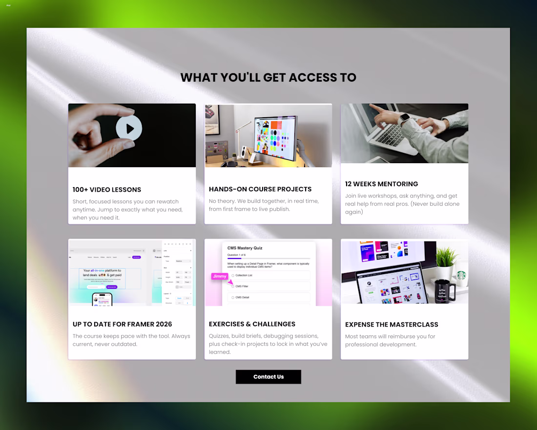
Been refining the visual direction for this features section.
Tried moving toward a softer and more minimal interface by simplifying the background, improving spacing, and letting the content breathe more naturally.
Trending
Claude
Claude has entered the design space. How are you using Claude Design?
Contra University
Learn from expert creatives how to earn more using next-gen AI tools.
creativeaiflow
Creative AI workflows are evolving. What tools do you use, and what are their strengths and weaknesses?
portfolioreview
The best portfolios tell a story, not just show a grid. Share yours for feedback.
freelancerlife
Freelancer life is wins, pivots, and everything in between. What’s yours right now?