
Artemy Medvedev
MVP developer & design engineer
Ready for work
Artemy is ready for their next project!
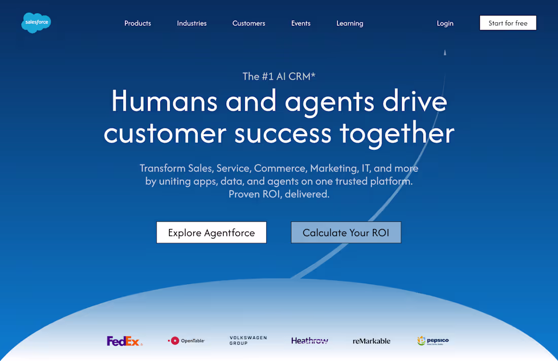
A Salesforce landing page redesign
Some of the things I improved:
- clearer description, less text
- clear social proof above the fold (2x)
- reduced the size of the navbar and removed the ai chat from the top of the page to focus the attention of the visitor on what matters
- doesn't look awful on 13" laptops ;)
(Not affiliated with or endorsed by Salesforce)
4
4
79
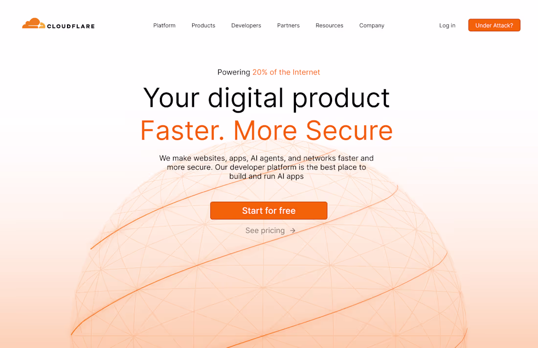
I redesigned Cloudflare's langing page
A quick overview of the things I did:
- Clearer headline, because you have to lead with a clear h1 that talks about the biggest value your product provides
- Added social proof (cause it helps conversions a lot)
- Removed horrible black text on orange buttons (sorry but this is just a complete lack of taste)
- Removed unnecessary information that overwhelms the user
- Improved the overall design to make the page more memorable and beautiful :)
1
4
140
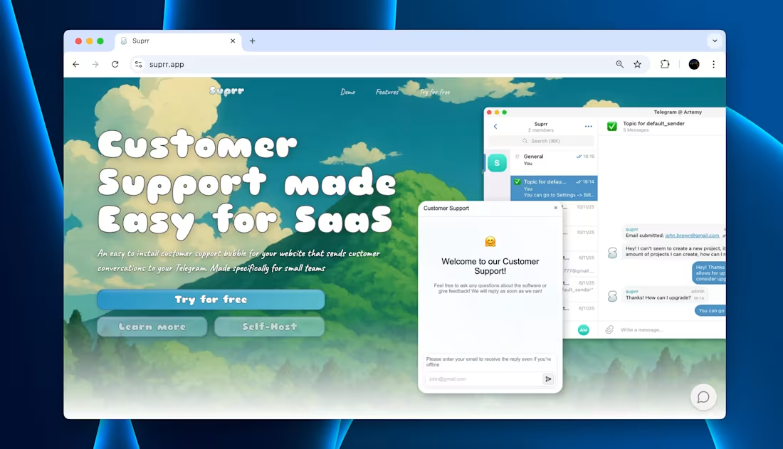
Suprr - a customer support tool with native Telegram integration built for small teams
4
203
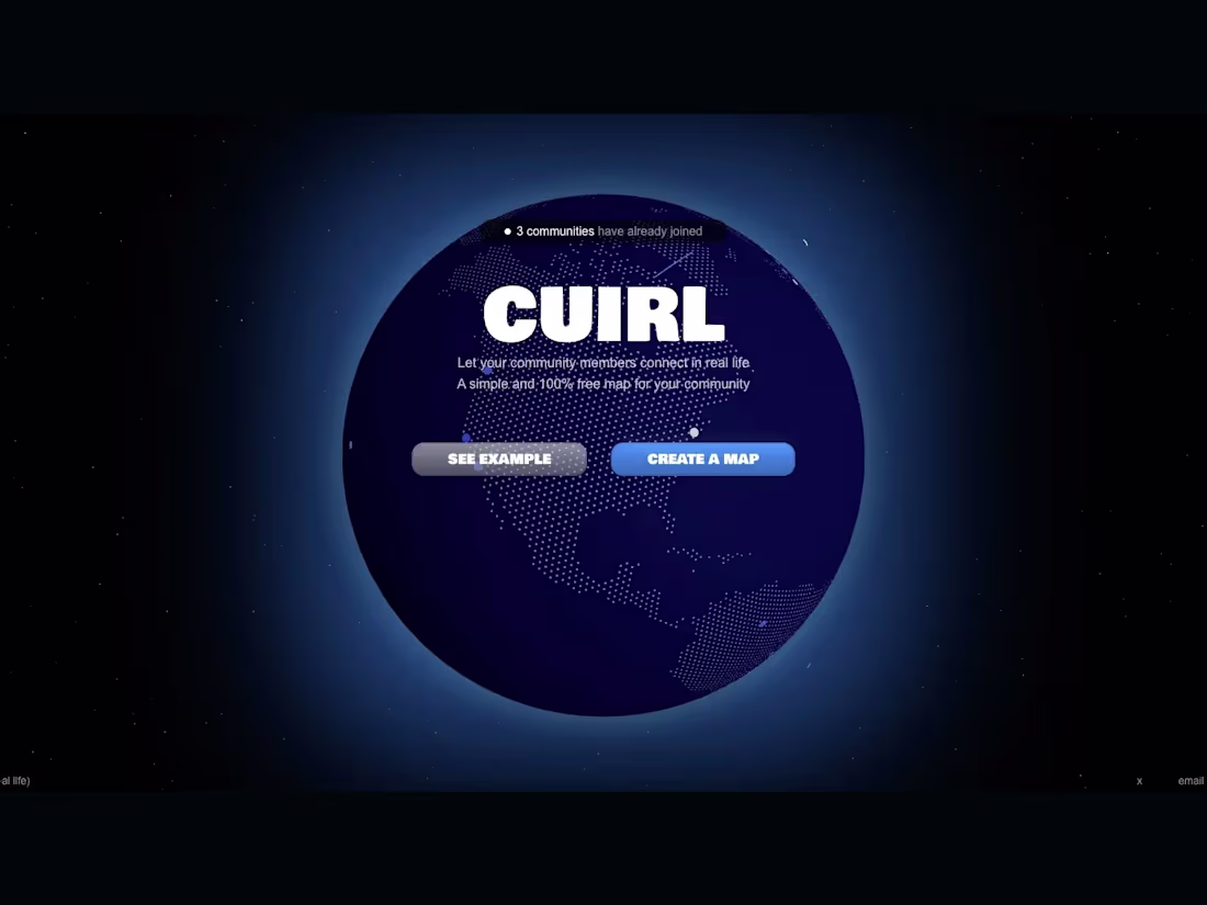
CUIRL - a map for communities
1
4
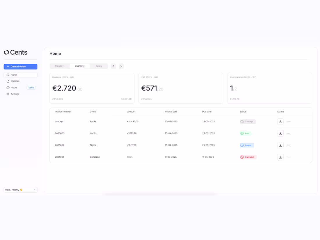
Cents - an invoicing app
1
2
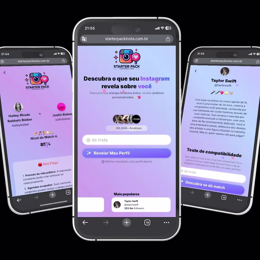
Built a web based ai consumer project last year, a month ago it reached 200k+ users
0
122