The network for creativity
Join 1.25M professional creatives like you
Connect with clients, get discovered, and run your business 100% commission-free
Creatives on Contra have earned over $150M and we are just getting started
Back to feedPost

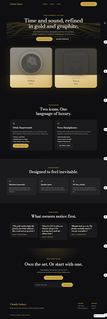
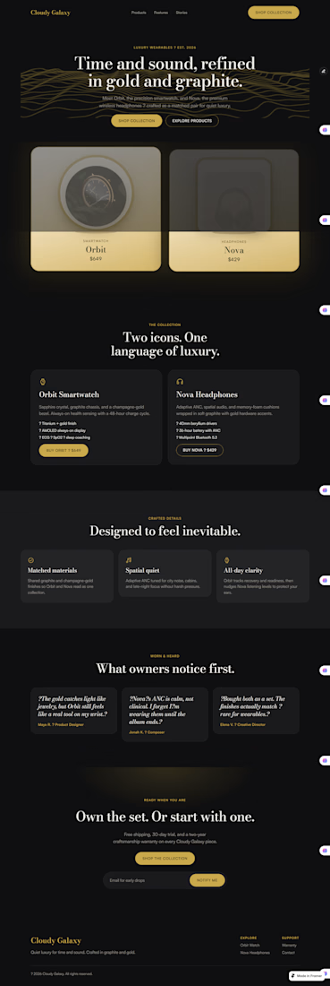
Cloudy Galaxy — luxury wearables landing page (Framer).
Design process — Cloudy Galaxy (Framer)
1. Brief
Luxury wearables brand. Two products: Orbit (smartwatch) and Nova (headphones). Palette locked early: gold + graphite. Goal was a product landing page that felt premium and still converted.
2. Direction
Dual-product hero (both SKUs visible up front). Standard page depth: hero → products → features → stories → CTA. Built reusable pieces first — buttons, nav/footer layout — so the page stayed consistent.
3. System
Set color tokens and type before layout. Bodoni Moda for headlines, Satoshi for UI/body. Gold for accents and CTAs, charcoal for the page, muted grey for secondary text.
4. Structure
Mapped the page as one scroll story:
Hero with both products
Collection detail cards
Three craft features
Testimonials
Final CTA + email capture
Nav links jump to each section so it feels usable, not just pretty.
5. Hero polish
First pass had black products disappearing into the dark background. Fixed that by putting products on light cream–gold stages, gold borders, and soft glow so the cards actually read on the page. Added float/tilt motion so they feel a bit more 3D without overdoing it.
6. Build in Framer
Designed and built directly in Framer: layout template for nav/footer, button components, desktop + tablet + phone breakpoints, form on the CTA. Kept client-safe editing in mind — layout locked, content editable later if needed.
7. Check
Reviewed contrast, mobile stacking, and scroll targets. Tweaked card elevation and product framing until the hero felt clear at a glance.




This is fantastic. Continue with the good work, one of the best have seen so far here😍 👍

This is awesome
The network for creativity
Join 1.25M professional creatives like you
Connect with clients, get discovered, and run your business 100% commission-free
Creatives on Contra have earned over $150M and we are just getting started





Related posts

Credit card landing page design for a fintech startup — an interactive 3D claw machine that turns the offer into the hero instead of another floating card at 15 degrees.
Every card brand ships the same hero: a card hovering over a gradient. Clawd sells one card, not a marketplace, and the entire pitch is "stop comparing — we already did the comparing". So the landing page had to make a single-product offer read as a win rather than a shortage of options, and pull early-access sign-ups from people who are deliberate about money: the ones who actually track spending and read the APR line.
The metaphor does the positioning work. A claw machine that never misses, plus "we already picked the best one", means the visual is the argument and the headline doesn't have to explain itself.
I built the scene in Blender as an interactive element rather than a still render — the claw follows the cursor, the card tilts in the grip, and the pile underneath reacts, so a visitor plays with the product's core idea for a few seconds instead of scrolling past it.
Hero plus full page structure, desktop and mobile designed separately, the Blender scene with web-ready exports, interaction notes, and a developer-ready Figma file.


nice work




Option B feels nothing but premium


