The network for creativity
Join 1.25M professional creatives like you
Connect with clients, get discovered, and run your business 100% commission-free
Creatives on Contra have earned over $150M and we are just getting started
Back to feedPost

Your PDP doesn’t need more persuasion. It needs fewer reasons to hesitate.
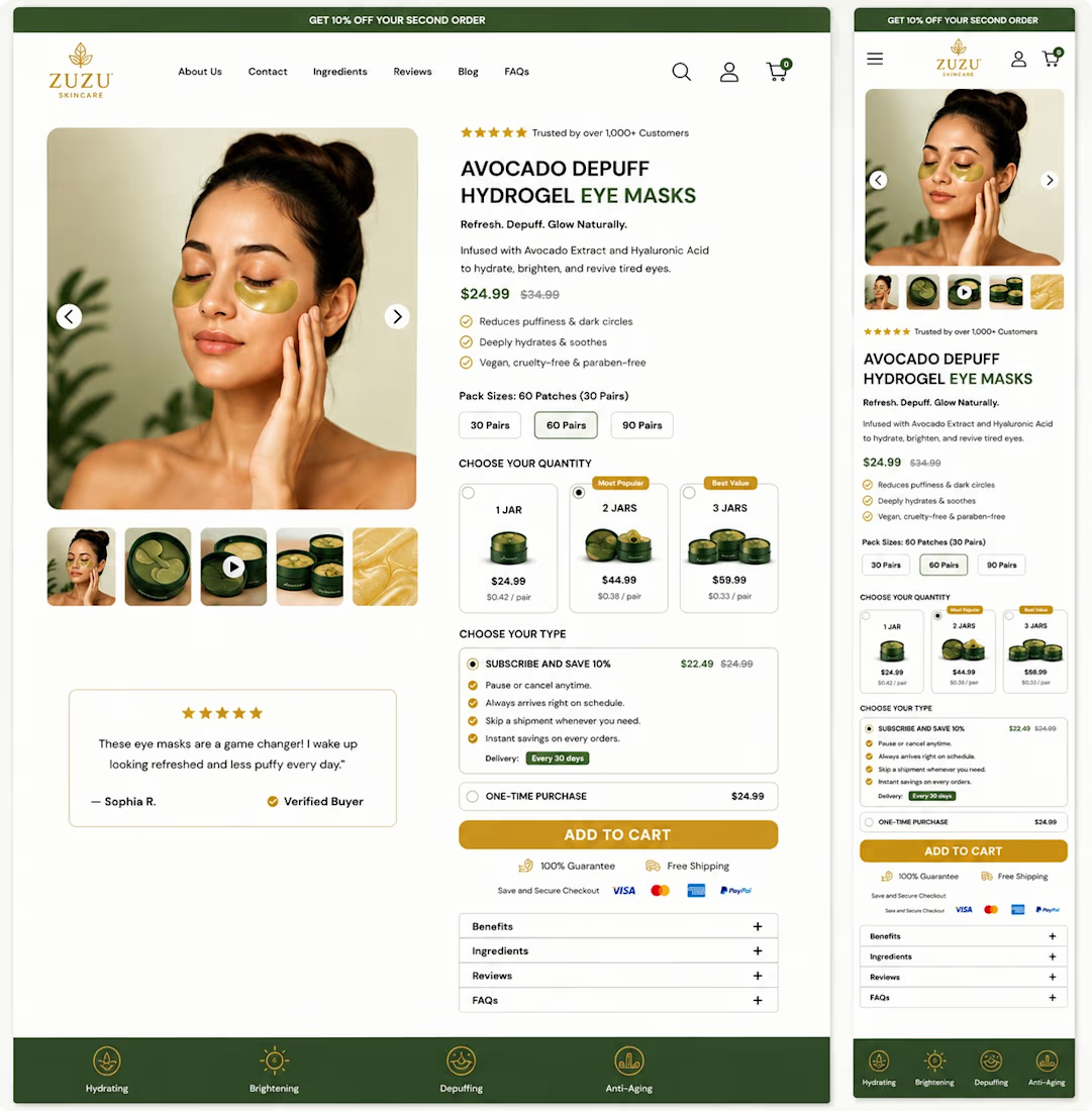
I’d rethink this skincare PDP around one thing: decision architecture.
Three things stand out:
1. Too many choices at once.
Pack size → quantity → subscription → one-time purchase. Each option adds another decision before “Add to Cart".
2. The offer hierarchy needs to do more work.
The shopper should instantly understand:
What should I buy? Why is it the best value? What do I save?
3. Trust should reduce hesitation, not just decorate the page.
Reviews, guarantee, shipping, and subscription flexibility should answer the objections that stop the purchase.
So I’d structure the experience around:
Desire first.
Proof second.
One clear recommended choice.
Simple upgrade path.
Low-friction checkout.
The bigger insight: Conversion isn't always about adding more persuasion. Sometimes it's about removing decisions.
That’s the lens I use when designing Shopify PDPs in Figma: What decision is the shopper trying to make, and how can the page make that decision obvious?
If you run a Shopify/DTC brand, send me your PDP. I’ll show you where I’d look for decision friction.


The network for creativity
Join 1.25M professional creatives like you
Connect with clients, get discovered, and run your business 100% commission-free
Creatives on Contra have earned over $150M and we are just getting started




Related posts

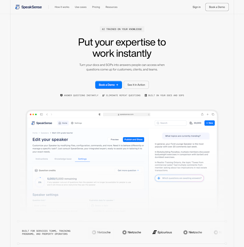
Swiss-clean or midnight-premium? Same content, different vibe. Which one looks better? 🤔

9 voted
33%
18 voted
67%
27 votes
Closed


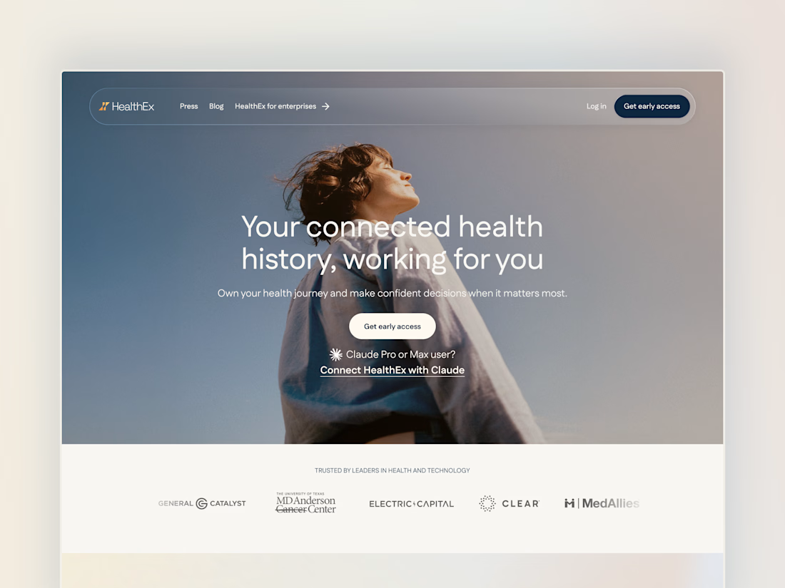
Project back from December 2025: Secret City designed the HealthEx website and hired me to build it in Framer.
P.S. they've gone through several site restructures since then (so it looks different from my snapshots), but it goes to show how easy Framer makes it for clients to manage and update their site independently.

Awesome😍


Always dreamed of being a freelance designer & dev. Pretty amazing to be finally living those dreams! Thanks @Contra HQ @Ben Huffman