The network for creativity
Join 1.25M professional creatives like you
Connect with clients, get discovered, and run your business 100% commission-free
Creatives on Contra have earned over $150M and we are just getting started
Back to feedPost
Taste Test
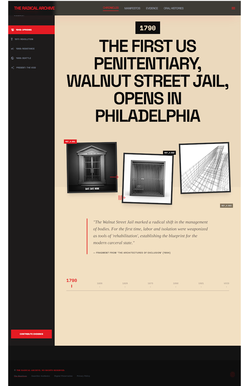
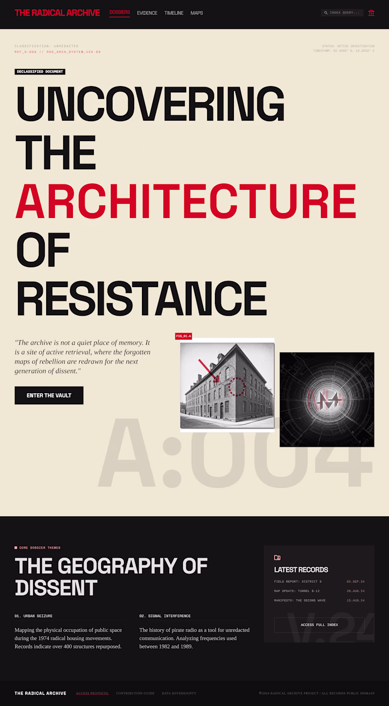
Working on two very different UI directions for this project and need your eyes on it. "The Radical Archive"
A. Chronicles: Dark sidebar navigation, warm parchment content zone, collaged reference images, and a horizontal timeline scrubber. Feels archival, layered, and editorial.
B. Dossiers: Full-bleed typographic hero, mixed red/black headline, classified document metadata, and a dark lower section. Feels like a leaked file from a resistance network.
Same content system, totally different emotional register. Which direction would you explore further — and why?
Drop your vote + reasoning in the comments. All feedback welcome.
4 votes
Ends in 1d
well done bro💯 , I like your design direction though u know renaissance, historical vibe.
generally, i feel archives are meant to be assessed easily, more like a display of a collection and the site should be a direction to that or that from the onset, highlighting all aspect thats why chose B.
The network for creativity
Join 1.25M professional creatives like you
Connect with clients, get discovered, and run your business 100% commission-free
Creatives on Contra have earned over $150M and we are just getting started
Related posts
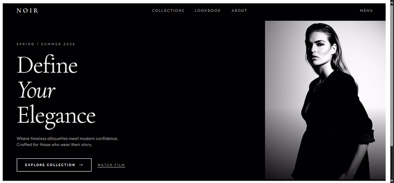
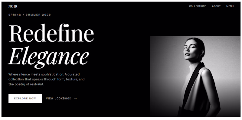
Some more hero explorations. Which one are you shipping? A or B?
69 voted
61%
45 voted
39%
114 votes
Closed
I couldn't choose either, depends on the concept you'Re designing for, both would work great! As you're a great designer, I'd like to follow you but as I see it you're a Webflow developer, I'm a Framer Dev, so I can't follow sorry. Ahah bad joke of course :D
A client came to me after losing her landscaping website due to a fallout with her previous agency. She needed something back online fast, so before committing to one direction we explored different design directions. I love this part of the projects because it gets the conversation going around feeling and personality before we get deep into details.
Which one do you think she went with?
3 voted
38%
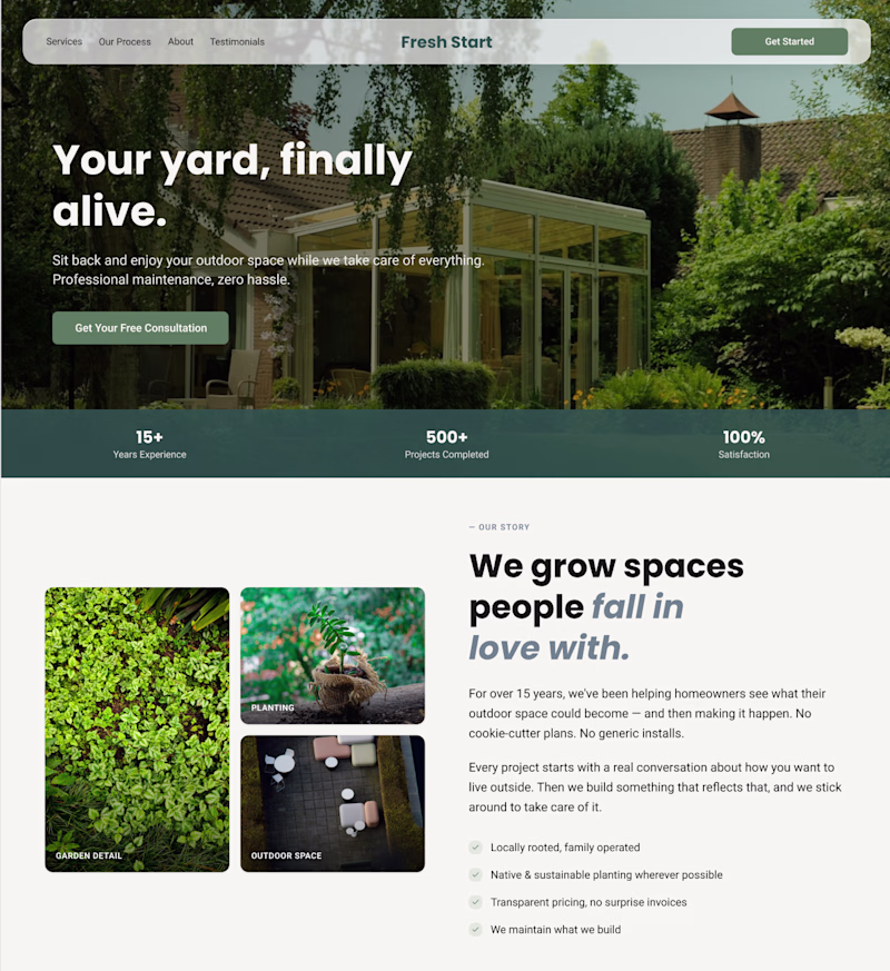
5 voted
62%
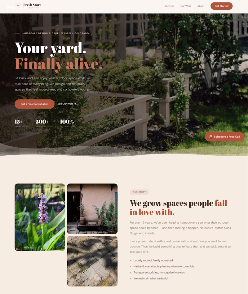
8 votes
Closed
Great design
Trending
Runway
AI video generation is exploding. What are you dreaming up in Runway?
Contra University
Learn from expert creatives how to earn more using next-gen AI tools.
creativeaiflow
Creative AI workflows are evolving. What tools do you use, and what are their strengths and weaknesses?
portfolioreview
The best portfolios tell a story, not just show a grid. Share yours for feedback.
freelancerlife
Freelancer life is wins, pivots, and everything in between. What’s yours right now?