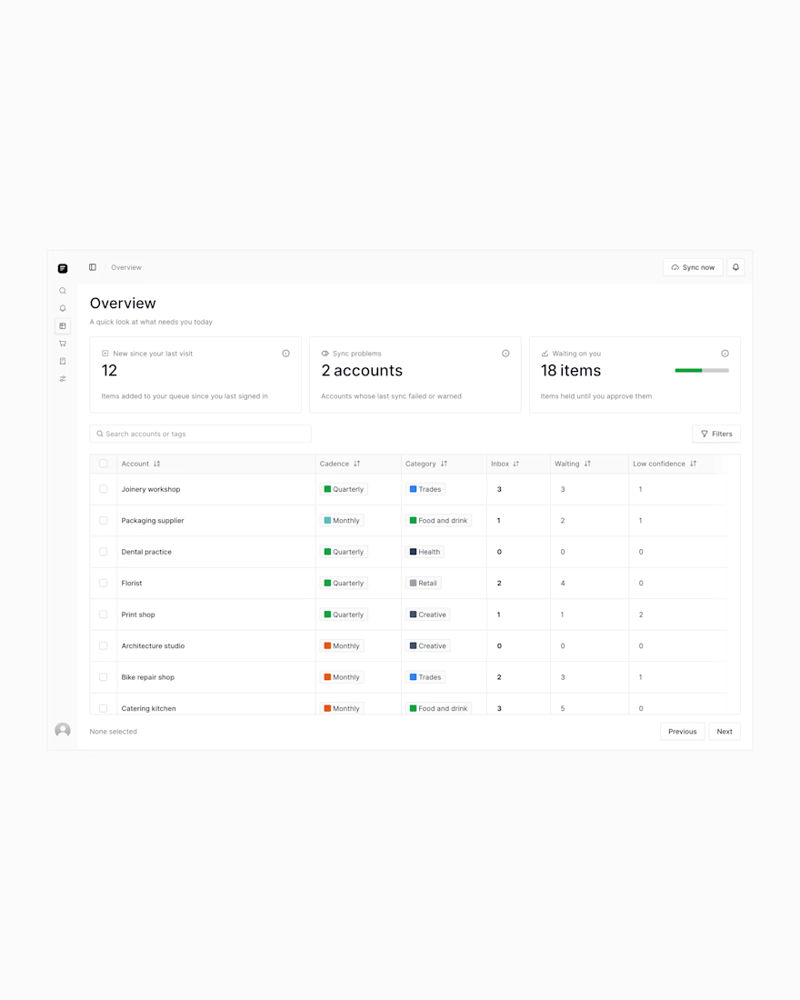
One of the most common problems I see as companies grow isn’t a lack of data — it’s too many disc...One of the most common problems I see as companies grow isn’t a lack of data — it’s too many disc...
The network for creativity
Join 1.25M professional creatives like you
Connect with clients, get discovered, and run your business 100% commission-free
Creatives on Contra have earned over $150M and we are just getting started
I made this project around a pretty data-heavy product, and I actually really enjoyed working with all that information.
A big part of the process was figuring out different ways to organize metrics, charts, and numbers, and deciding what should be more visible, what could stay secondary, and how everything should work together on one screen.
It was fun to explore different layouts and find clearer ways to present complex information without making the interface feel overloaded.
Designed a modern Personal Finance Dashboard UI/UX, focused on making financial management simple, clear, and visually engaging.
The dashboard includes financial overview cards, income and expense tracking, spending analytics, expense breakdown, recent transactions, savings goals, budgets, accounts, and quick actions.
The dark-mode interface combines a clean layout, modern typography, subtle shadows, gradient background, rounded cards, and vibrant accent colors to create a premium SaaS dashboard experience.
ARTHADṚṢṬI — Amazon Sales Intelligence & Business Performance System
What started as an analytics project became an opportunity to build something closer to a real-world business reporting system.
I worked with Amazon sales data and took it through an end-to-end analytics workflow:
Raw Data → Data Cleaning → Transformation → Data Modeling → DAX → Power BI → Business Insights
What I worked on
• Data profiling and quality checks
• Cleaning & transformation using Power Query
• Handling missing and inconsistent data
• Business KPI development
• Data modeling
• DAX measures
• Interactive dashboard design
• Sales, product, fulfilment & geographic analysis
The final system provides visibility into:
→ Sales & revenue performance
→ Orders and units
→ Category & SKU performance
→ Fulfilment operations
→ Monthly trends
→ Geographic distribution
→ Interactive filtering & drill-down analysis
But the biggest lesson from this project was simple:
A dashboard shouldn't just look good. It should make the underlying data easier to understand and act upon.
I’m also available for dashboard projects.
If you have Excel, CSV, or other business data that is difficult to analyze, I can help transform it into a clean, professional and interactive dashboard.
Services I can provide:
→ Power BI Dashboard Development
→ Excel Dashboard Development
→ Data Cleaning & Transformation
→ Power Query Automation
→ DAX & KPI Development
→ Business / Sales Analytics
→ Interactive Reporting Systems
Whether you need a dashboard built from scratch, an existing report improved, or messy data transformed into something usable, I'm open to working on it.
Have a dataset or reporting problem?
Send me a message. Let's turn the data into something useful.