
Cesar Ramos
Data expert turning chaos into insights
Ready for work
Cesar is ready for their next project!
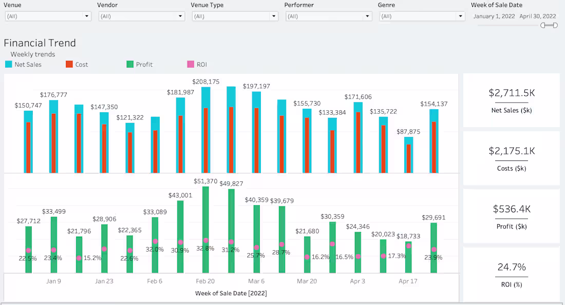
Financial dashboards shouldn’t just show trends — they should explain what’s driving profitability.
In this project, I built a Tableau dashboard that connects weekly sales, costs, profit, and ROI in a single view, allowing leaders to see where and when returns were actually being generated.
What I focused on:
Aligning sales, cost, and profit to the same time grain
Making ROI visible alongside volume, not buried in spreadsheets
Enabling quick comparisons across venues, vendors, and performers
The result:
Teams could identify high-ROI weeks and segments and make informed decisions about pricing, spend, and future bookings.
12
114
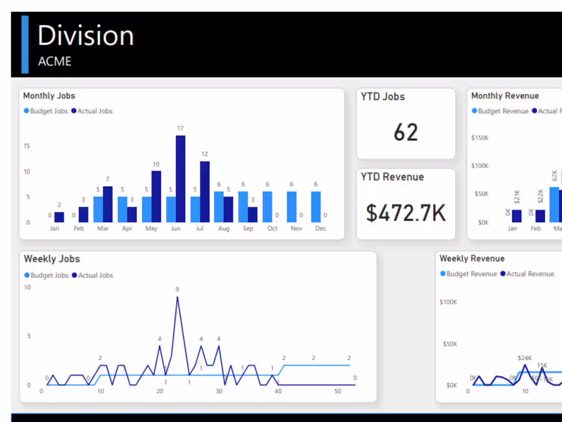
One of the most common problems I see as companies grow isn’t a lack of data — it’s too many disconnected reports.
In this project, leadership relied on spreadsheets and ad hoc reports. Numbers didn’t always line up, and answering basic questions took too long.
What I did:
Centralized reporting in Power BI
Defined clear, decision-driven KPIs
Modeled data so metrics reconciled across teams
Designed dashboards focused on clarity
The result:
Leadership gained a trusted, real-time view of performance they could rely on week after week.
14
153

From Disorganized Reporting to Executive Power BI Dashboards
0
2
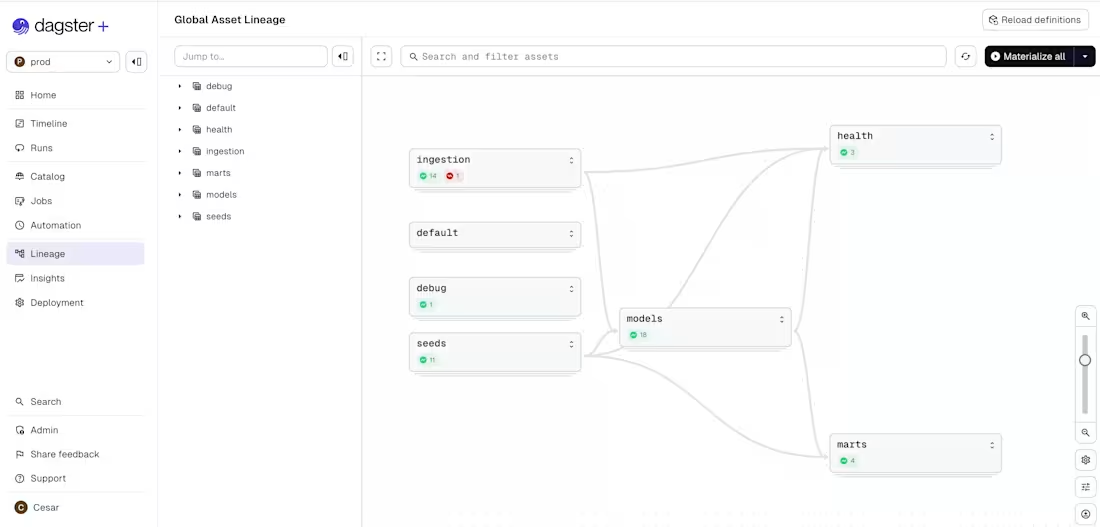
Adding a new company into an existing reporting suite this week as our client continues to grow.
The work isn’t just wiring in new data — it’s making sure metrics stay consistent, historical trends remain intact, and leadership can still compare performance across the business without friction.
Growth is exciting, but it definitely stress-tests your analytics.
0
58