The network for creativity
Join 1.25M professional creatives like you
Connect with clients, get discovered, and run your business 100% commission-free
Creatives on Contra have earned over $150M and we are just getting started
Back to feedPost
Taste Test
Hi, I'm Regina!
Sharing two of my latest birthday backdrop designs
Which one would you pick
1. Kuromi
2. Melody
I’d love to hear your thoughts! And if you’re working on a similar project, let’s connect ^^

2 voted
100%

0 voted
0%

2 votes
Closed

Amazinggg..😊


Thank you, let's connect 😊

Yes of course 😊 Kuromi is more elegant and a bit masculine, Melody is more feminine
The network for creativity
Join 1.25M professional creatives like you
Connect with clients, get discovered, and run your business 100% commission-free
Creatives on Contra have earned over $150M and we are just getting started





Related posts


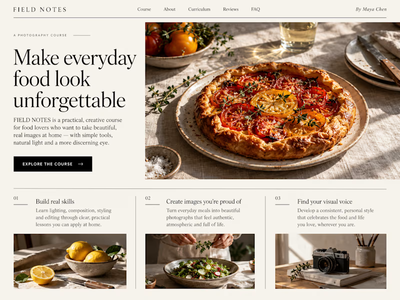
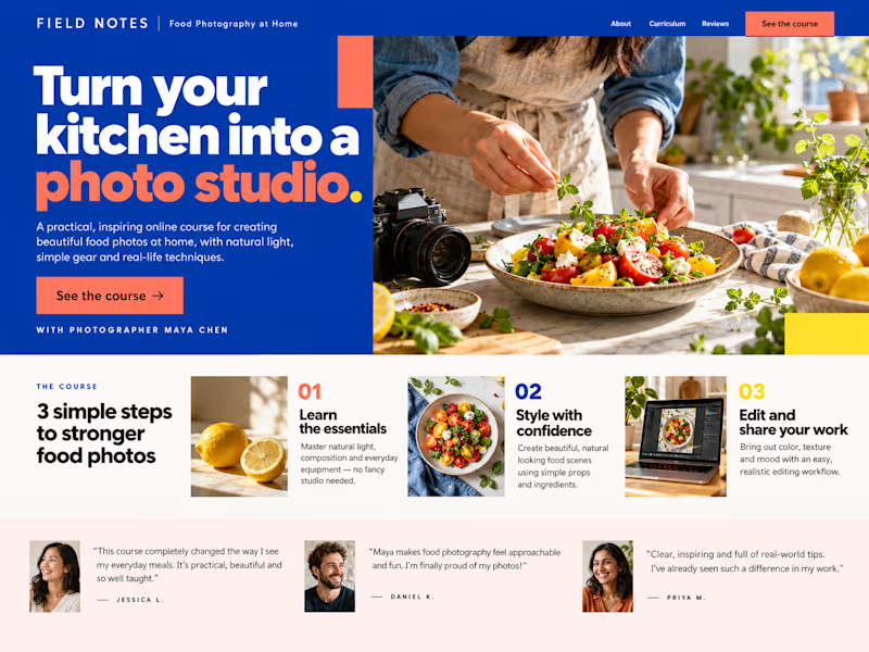
Which Kajabi sales page design would you choose for this course? Vote for A or B and tell me what made the difference.

23 voted
50%
23 voted
50%
46 votes
Closed

B still could be polished though...maybe try giving the text section little bit more real estate..I don't know

Both on-brand. Just two different sides of the same story.
Which color would make you trust "better spaces, a healthier you" more? 👇


44 voted
100%

0 voted
0%

44 votes
Closed


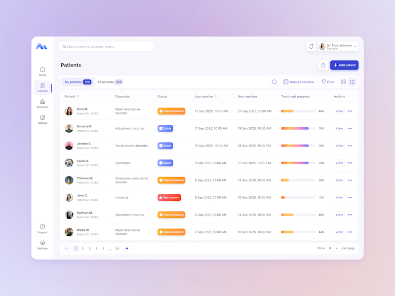
Same data, two different ways to experience it 🤔
I explored two patient list layouts for a mental health platform: a card view and a table view.
Cards feel more visual and personal, but space is limited and adding more information can quickly make them crowded. For complex enterprise products, I often find tables more practical — they’re easier to scan, compare, sort, and can support more columns when users need greater visibility.
For this kind of workflow, I’m leaning toward the table view. Which would you choose — cards or table?
11 voted
55%
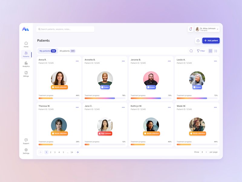
9 voted
45%
20 votes
Closed

For a mental-health patient list the choice isn't really card vs table — it's scan-speed vs context. The card wins the first meeting because the photo and name set the clinician's mental model before they touch the row, but the table is what holds up under the daily rhythm of...