The network for creativity
Join 1.25M professional creatives like you
Connect with clients, get discovered, and run your business 100% commission-free
Creatives on Contra have earned over $150M and we are just getting started
Back to feedPost

Both designs are great but I would choose Option A.🙌

Two ad directions for Aura Aesthetics’ Botox Flash Sale. Same offer, different layout and feel.
Option A: split layout, model left, price card right, olive green accents, bold and direct
Option B: model fills the right, soft rounded cards on the left, all warm neutrals, quieter...


5 votes
Ends in 1d
The network for creativity
Join 1.25M professional creatives like you
Connect with clients, get discovered, and run your business 100% commission-free
Creatives on Contra have earned over $150M and we are just getting started











Related posts

Two Ads, Two Designs but Different Vibes:
Using the hours and the rest day, I came with these ads using the
software of SVGator combined with the transitions from Adobe After Effects.
Vote and let me know your opinions on which one and why?


12 voted
57%
9 voted
43%
21 votes
Closed


Same content, different experience. A few thoughtful design choices can completely change how a presentation feels, flows, and communicates. Which version would you choose?

11 voted
31%
24 voted
69%
35 votes
Closed

Verde Vista 1 is more modern and futuristic specially with blue colors and robotic hand❤️
Great job Rasid🎉🎉🔥🔥

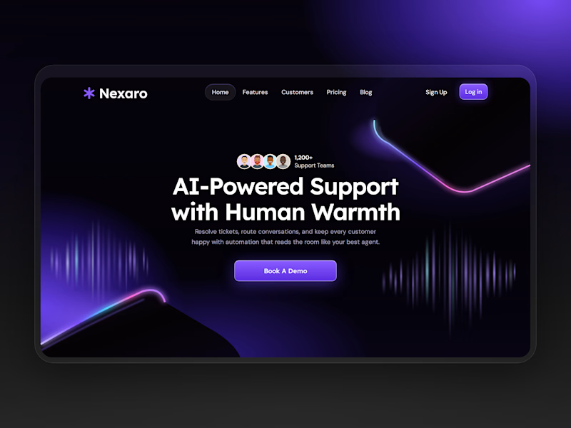
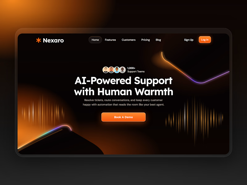
Same design, different energy.
Which one wins? 👇

5 voted
56%
4 voted
44%
9 votes
Closed

Both are fire but Violet Pulse hits different! 💜 That energy feels more modern and premium. Ember Glow is warm though - tough choice!