The network for creativity
Join 1.25M professional creatives like you
Connect with clients, get discovered, and run your business 100% commission-free
Creatives on Contra have earned over $150M and we are just getting started
Back to feedPost


The network for creativity
Join 1.25M professional creatives like you
Connect with clients, get discovered, and run your business 100% commission-free
Creatives on Contra have earned over $150M and we are just getting started




Related posts

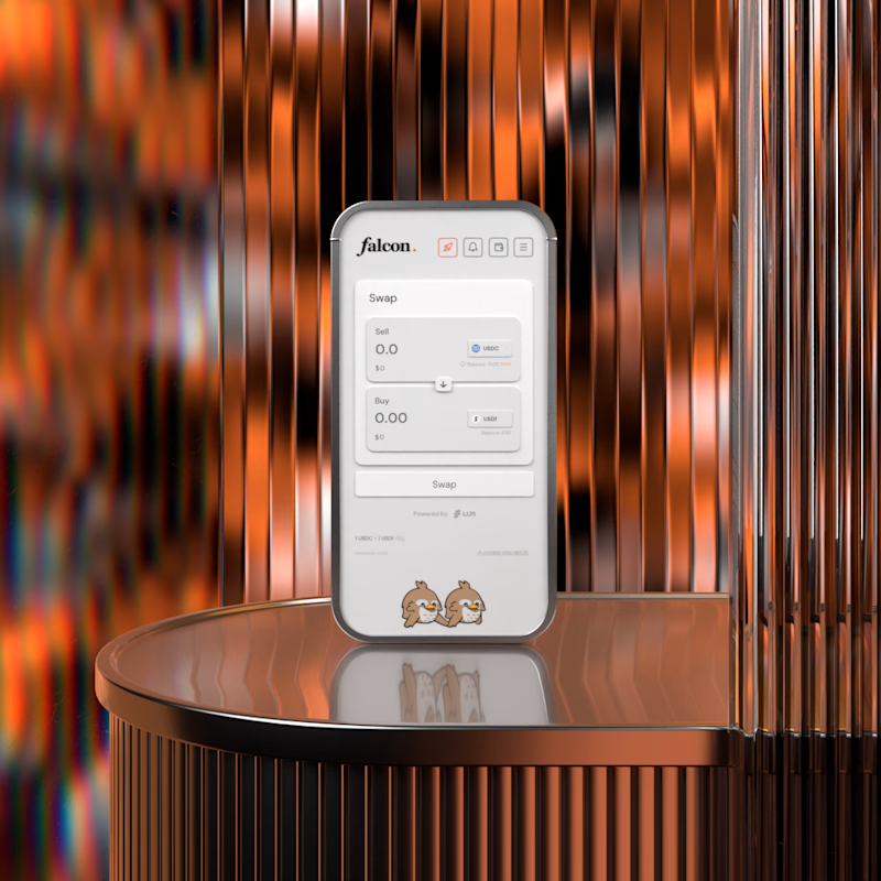
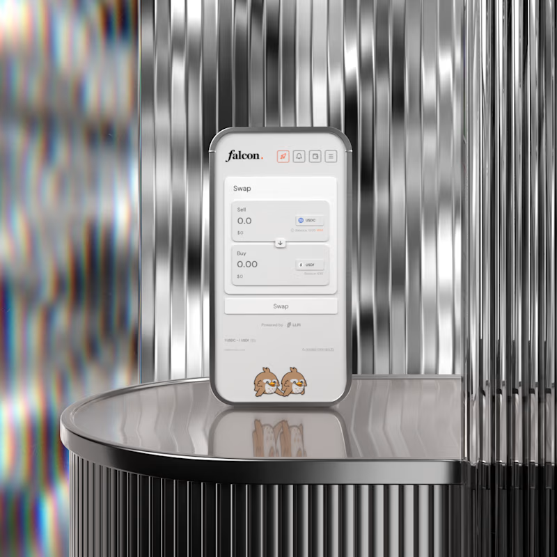

A for me. The warm copper gives the product some heat and makes it feel premium rather than clinical. B is cleaner but silver on silver almost hides the device, the copper actually frames it. Wild that this is no AI.

Animated Event Video Poster | Tag der Clubkultur
Dynamic motion design and video poster created for the "COREspecs" event as part of Berlin's official Tag der Clubkultur festival series.
The visual concept merges an authentic underground Berlin aesthetic—featuring iconic transit motifs, gritty textures, and acid neon accents—with clean, structured typographic hierarchy and a fully synchronized lineup reveal.
Software & Tools: Adobe After Effects (motion design, compositing, visual effects, and expression-driven audio reactivity), Suno AI (custom industrial/EBM sound design and score).
Deliverable: Vertical looping video teaser optimized for social media promotion and digital event boards.
#


the yellow train going across the top is my favourite bit. is that real footage or did you animate it?

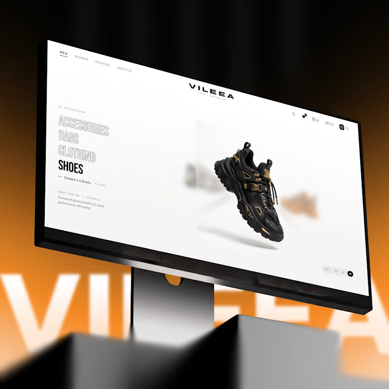
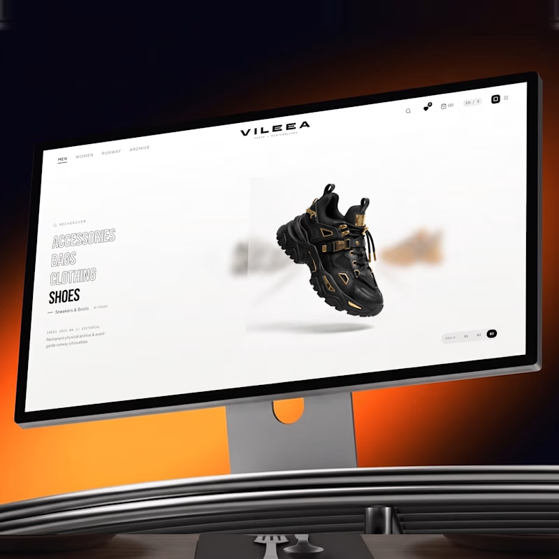
Help me decide the best visual direction for this 3D Product Hero Section:
Option A: Bold red accent with high visual impact
Option B: Subtle orange tone with smooth lighting focus
If you're building luxury e-commerce platforms, which UI aesthetic do you prefer?
Let’s hear your thoughts below! 👇


16 voted
52%
15 voted
48%
31 votes
Closed


Option A commands immediate attention for high-impact visual campaigns, but Option B feels much more aligned with luxury e commerce. A subtle, warmer tone creates a refined, high end look that keeps the product front and center without overwhelming the interface.